 Stephanie Eckles
I was posed a CSS design question via Twitter DM and while I won't guarantee I'll always provide a solution for free, this one I was enticed to try solving.
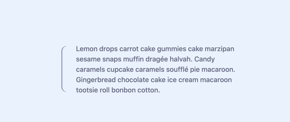
A preview of what we'll make:

Here are a few possible ways to solve this:
- Draw a pseudo element and use
clip-pathto cut off half of it - Use
border-imagewith an SVG to precisely define the curve and the placement of the corners - A somewhat sneaky application of
box-shadow, which we're going to pick
Now, box-shadow is going to be the least precise corners but it does the trick!
We're going to create these styles in the context of a basic blockquote:
<blockquote>
    <p>Lemon drops carrot cake gummies cake marzipan sesame snaps muffin dragée halvah. Candy caramels cupcake caramels soufflé pie macaroon. Gingerbread chocolate cake ice cream macaroon tootsie roll bonbon cotton.</p>
</blockquote>
And the relevant CSS:
blockquote {
  /* Define curve */
  border-radius: 0.75em;
  /* Negative value becomes "border" width */
  box-shadow: -2px 0 #858aaa;
  /* Add space from the "border" */
  padding-left: 2rem;
}
Which produces the following:

The curvature of the border-radius cuts off the box-shadow so that it peeks out just enough to appear like a curved border. And since we didn't define a blur value, the box-shadow appears solid.
But what is that little extra space above and below the paragraph? Well, it has to do with font leading which you can read more about in this fantastic article about a near future solution.
For now, we need to do two steps:
- create a new "block formatting context" (a bit confusing topic, here's the MDN docs)*
- add negative margins to negate the leading
To create a new block formatting context, there are a few options, but for our purposes for wanting negative margins to hike the element sort of both up and down, we'll use grid (flexbox would also work).
/* Add to `blockquote` */
display: grid;
Then, we'll adjust our paragraph rules and add negative margin using a newer CSS unit - ex - which is equal to x-height in the current font. This value is a bit magic and will vary font to font - you may find em to be better until leading-trim properties have full browser support:
blockquote p {
  /* Required to handle "leading" */
  /* May need adjusted per font */
  margin: -0.75ex 0;
}
Demo
Here's the CodePen demo with a bit of extra content for more context for the blockquote:
On my main blog - ModernCSS.dev - I released a tutorial covering various ways to produce borders with CSS with more ideas!
- s/o to Miriam Suzanne for helping identify what was going on when I accidentally made this happen for this demo, haha!


