 Katerina Braide
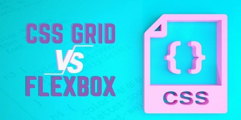
The choice between CSS Grid and Flexbox is like choosing between pizza and tacos – they're both awesome, but you need the right one for the moment. It's a common challenge for web developers trying to create effective and responsive layouts.
After reading this article, you will know and understanding their strengths, use cases, and considerations associated with CSS Grid and Flexbox.
CSS Grid
CSS Grid is a powerful two-dimensional layout system for creating complex grid-based designs. It offers precise control over both rows and columns, making it ideal for organizing content in intricate layouts. With explicit column and row definitions, developers can easily achieve precise element placement, making it well-suited for designs that demand meticulous control.
Code sample
.grid-container {
  display: grid;
  grid-template-columns: repeat(3, 1fr);
  gap: 10px;
}
Flexbox
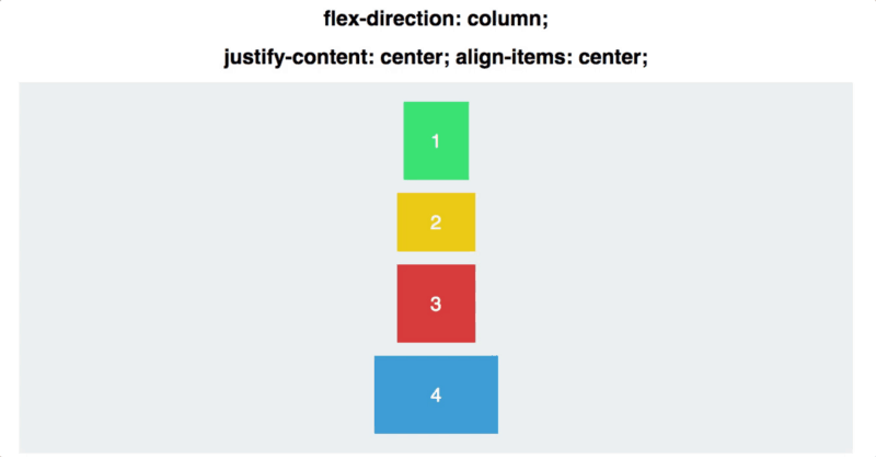
Flexbox, short for Flexible Box, is a one-dimensional layout system designed for handling content distribution in a single direction—either horizontally or vertically. Flexbox excels in creating flexible and dynamic layouts, especially useful for arranging items within a container, accommodating various screen sizes and devices. Its simplicity and powerful alignment capabilities make it an excellent choice for handling the challenges of responsive design.
code sample
.flex-container {
  display: flex;
  justify-content: space-around;
  align-items: center;
  height: 100vh;
}
Use Cases and Strengths
Understanding the use cases and strengths of CSS Grid and Flexbox is important in making informed layout decisions for web development projects.
-
CSS Grid:
- Ideal for complex layouts requiring precise control over both rows and columns.
- Suited for designs with a grid-based structure, such as card layouts, image galleries, and multi-column interfaces.
- Facilitates the creation of responsive layouts with minimal media queries due to its two-dimensional nature.
-
Flexbox:
- Perfect for one-dimensional layouts where content needs to be distributed along a single axis.
- Well-suited for arranging items in a row or column, such as navigation menus, form elements, and flexible content containers.
- Offers powerful alignment properties, making it easy to center content both vertically and horizontally.
Responsive Design Considerations
In the realm of responsive web design, the choice between CSS Grid and Flexbox plays a crucial role in creating layouts that adapt seamlessly to various screen sizes and devices.
-
CSS Grid:
- Excel in handling complex, multi-dimensional layouts for large screens.
- Allows for easy reordering of grid items, enhancing flexibility in adapting to different viewports.
- Enables the creation of responsive designs without excessive reliance on media queries.
-
Flexbox:
- Particularly effective for handling one-dimensional layouts that require flexibility in content distribution.
- Simplifies the creation of responsive designs for smaller screens by easily stacking or aligning items along a single axis.
- Provides an intuitive way to reorder and restructure content based on the available screen real estate.
Browser Compatibility and Support
While both CSS Grid and Flexbox are widely supported in modern browsers, it's essential for developers to consider compatibility when choosing a layout technique.
-
CSS Grid:
- Generally well-supported in modern browsers, including Chrome, Firefox, Safari, and Edge.
- Considerations for partial support in older versions of Internet Explorer may be necessary, depending on the project's target audience.
-
Flexbox:
- Widely supported in modern browsers, making it a reliable choice for most web projects.
- May require vendor prefixes for older versions of certain browsers, and developers should be mindful of potential quirks in Internet Explorer.
Which one is better?
The choice between CSS Grid and Flexbox depends on the specific requirements of your layout. Neither is inherently "better" than the other; they serve different purposes.
CSS Grid is well-suited for complex, two-dimensional layouts where precise control over rows and columns is necessary. It's great for grid-based designs and offers features like item placement and reordering.
Flexbox is more suitable for one-dimensional layouts, providing a simpler way to distribute space along a single axis. It's excellent for aligning items within a container and handling flexible content structures.
In many cases, projects use a combination of both CSS Grid and Flexbox to leverage the strengths of each in different parts of the layout. Understanding the requirements of your design and applying the appropriate technique based on those needs will lead to the most effective and efficient results.
Resources:
For hands on practices and deeper understanding of what you just read, you might consider
Reading this here
Or watching this
Conclusion
Both are perfect choice depending on what you want to achieve.
As I've explained, CSS Grid shines in scenarios demanding intricate two-dimensional layouts. Its explicit control over rows and columns makes it an excellent choice for projects with complex grid structures, reducing the need for extensive media queries. The ability to reorder grid items effortlessly enhances responsiveness across various screen sizes.
In contrast, Flexbox excels in handling one-dimensional layouts, providing an intuitive solution for content distribution along a single axis. Its simplicity and powerful alignment properties make it a go-to choice for responsive designs, allowing easy adaptation to different viewports by stacking or aligning items.
i love reading your comments and knowing what you think too, which one do you use frequently and why?


