 Nick Taylor
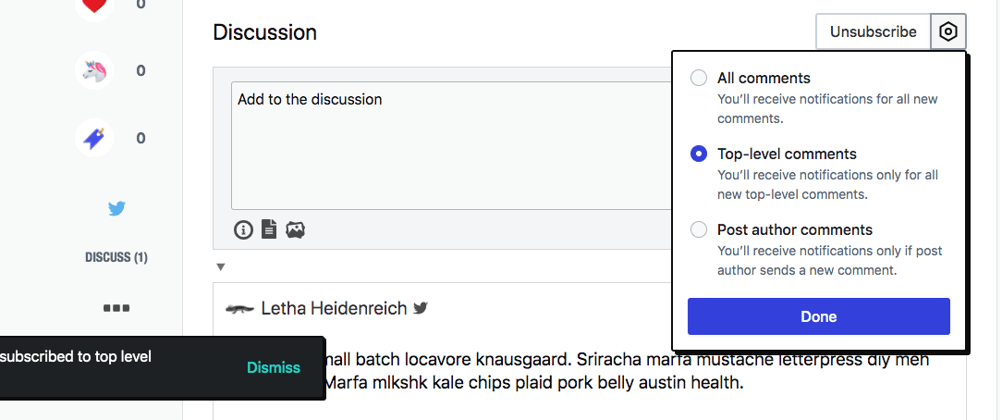
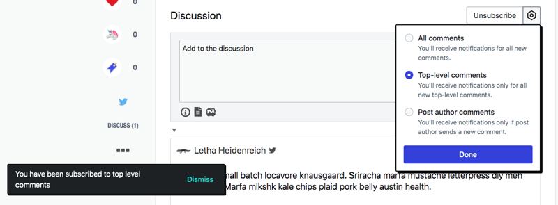
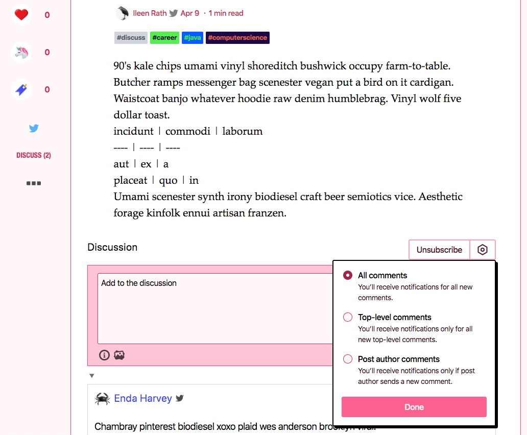
You could already subscribe to a post's comments on DEV, but the problem was many community members were not aware that you could. We had this feature pretty well hidden. From a post page, you had to click on the three dots to see a post's comment subscription options.
With the new comment subscription component, comment subscriptions are front and center in the discussion area of a post.
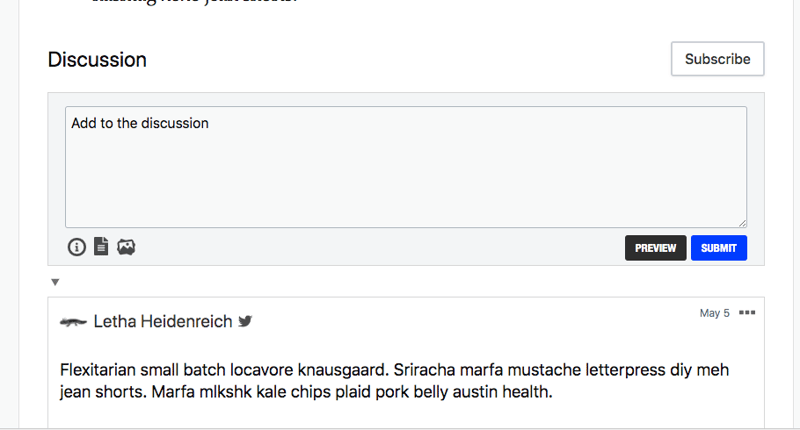
All the existing functionality still exists, it's just easier to find. 😄 You can subscribe to all comments, top comments, author comments or unsubscribe.
Take it for a spin to stay engaged with the posts that interest you.
Here are the PRs related to this feature for those interested.
 Add comment subscription component to article page
#7205
Add comment subscription component to article page
#7205

What type of PR is this? (check all applicable)
- [ ] Refactor
- [x] Feature
- [ ] Bug Fix
- [ ] Optimization
- [ ] Documentation Update
Description
Added the comment subscription feature using then new better surface UI.
Related Tickets & Documents
Mobile & Desktop Screenshots/Recordings (if there are UI changes)
Just some screenshots for responsiveness

The Feature in Action
Added tests?
- [x] yes
- [ ] no, because they aren't needed
- [ ] no, because I need help
Added to documentation?
- [ ] docs.dev.to
- [ ] readme
- [x] no documentation needed
[optional] Are there any post deployment tasks we need to perform?
[optional] What gif best describes this PR or how it makes you feel?

Created Snackbar components
#7415
What type of PR is this? (check all applicable)
- [ ] Refactor
- [x] Feature
- [ ] Bug Fix
- [ ] Optimization
- [ ] Documentation Update
Description
This PR gives us the following application components. <Snackbar /> and <SnackbarItem /> and <SnackbarPoller />.
How the Snackbar works.
- You can have at most 3 snackbar items in the snackbar
- If more than 3 are added, the 3 newest are the ones that remain.
- The last snackbar item added is the first one to appear at the bottom in the snackbar.
- snackbar items have a default lifespan of 5 seconds which is configurable via the lifespan prop on the
<SnackbarPoller />component. Once the lifespan has completed, the snackbar item is removed from the snackbar - If a user mouses over the snackbar, all lifespans of snackbar items are paused.
- If a use mouses out of the snackbar area, the lifespan of snackbar items resumes.
Related Tickets & Documents
Mobile & Desktop Screenshots/Recordings (if there are UI changes)
<SnackbarItem /> Component


<Snackbar /> Component


<SnackbarPoller /> Component

Added tests?
- [x] yes
- [ ] no, because they aren't needed
- [ ] no, because I need help
Added to documentation?
- [ ] docs.dev.to
- [ ] readme
- [x] no documentation needed
[optional] Are there any post deployment tasks we need to perform?
[optional] What gif best describes this PR or how it makes you feel?

Comment Subscription Component
#7136
What type of PR is this? (check all applicable)
- [ ] Refactor
- [x] Feature
- [ ] Bug Fix
- [ ] Optimization
- [ ] Documentation Update
Description
This is the comment subscription component that will be used on the article page. Available on the latest Storybook.
Related Tickets & Documents
Mobile & Desktop Screenshots/Recordings (if there are UI changes)

Added tests?
- [x] yes
- [ ] no, because they aren't needed
- [ ] no, because I need help
Added to documentation?
- [ ] docs.dev.to
- [ ] readme
- [x] no documentation needed
[optional] Are there any post deployment tasks we need to perform?
[optional] What gif best describes this PR or how it makes you feel?

Created the <ButtonGroup /> Preact Component
#7048
What type of PR is this? (check all applicable)
- [ ] Refactor
- [x] Feature
- [ ] Bug Fix
- [ ] Optimization
- [ ] Documentation Update
Description
Converted the design system button group to a Preact component.
Here is the ButtonGroup in Storybook
Related Tickets & Documents
Mobile & Desktop Screenshots/Recordings (if there are UI changes)
An example usage of the component.

Added tests?
- [x] yes
- [ ] no, because they aren't needed
- [ ] no, because I need help
Added to documentation?
- [ ] docs.dev.to
- [ ] readme
- [x] no documentation needed
[optional] Are there any post deployment tasks we need to perform?
[optional] What gif best describes this PR or how it makes you feel?
Created Crayons Button Preact component
#6987
What type of PR is this? (check all applicable)
- [ ] Refactor
- [x] Feature
- [ ] Bug Fix
- [ ] Optimization
- [ ] Documentation Update
Description
Design system buttons are now available as Preact button components. See the latest Storybook to see button components in action.
By default the <Button /> component renders as an HTML button element, <button ... />, but you can also render it as an HTML anchor element, <a ... />, via the as prop of the <Button /> component. I used as as this is what styled-components used. I basically couldn't think of a better prop name.
Related Tickets & Documents
Mobile & Desktop Screenshots/Recordings (if there are UI changes)
Primary
<Button {...props} />

Secondary
<Button variant="secondary" {...props} />

Outlined
<Button variant="outlined" {...props} />

Danger
<Button variant="danger" {...props} />

Added tests?
- [x] yes
- [ ] no, because they aren't needed
- [ ] no, because I need help
Added to documentation?
- [ ] docs.dev.to
- [ ] readme
- [x] no documentation needed