 Francesco Vetere
Hi folks! 👋 Today I wanna talk about a CSS feature that, in my opinion, doesn't get too much attention... but it should! I'm talking about the isolation property! 🪄
➡️ It basically provides more control over how elements interact with the rest of the document, and it is often an elegant solution for z-index issues.
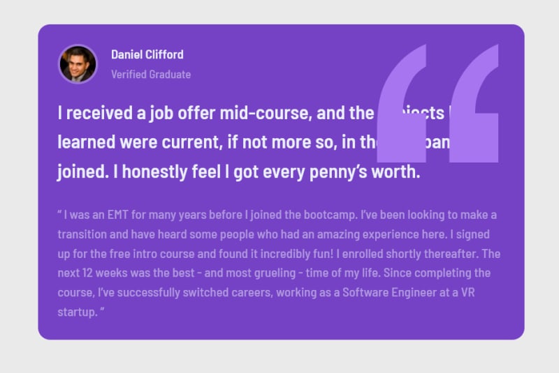
Let's start with a practical example. I've built this simple card:

The HTML for it is pretty straightforward, and it looks something like this:
<article class="card">
  <header class="card__header">
    <img class="card__avatar" src="..." alt="..." />
    <span class="card__name">Daniel Clifford</span>
    <span class="card__role">Verified Graduate</span>
  </header>

  <p class="card__summary">I received ...</p>

  <p class="card__description">I was an EMT ...</p>
</article>
Some styles have been applied too, in order to set up colors, typography and layout. However, we can completely ignore them as they will not play any role in what we are going to do now.
Now, let's say that we want to add a quotation mark image to the top-right corner of the card, as a little decorative element. Something like this:

🤔 How can we achieve that?
💡 We could treat the quotation mark image as a pseudo-element, and use position: absolute to place it over the card! Let's give it a try 💪
.card {
  /* We want the .card element to be the containing block for its children .card::before */
  position: relative;
}

.card::before {
  /* This is a pseudo-element, so we need to give it a content by definition */
  content: "";

  /* We position our image over the card, with a little offset from the right */
  position: absolute;
  right: 2em;

  /* We define a size for our image */
  width: 150px;
  aspect-ratio: 1; /* This makes sure that the image is a square */

  /* We bring in our image through a background-image */
  background-image: url(https://raw.githubusercontent.com/francescovetere/testimonial-grid-section/main/images/bg-pattern-quotation.svg);
  background-repeat: no-repeat;
  background-size: contain; /* This makes sure that the background actually fills all the available space (150px x 150px) */
}
This is the result we get:
It looks good, except for one little issue: we want to push this image behind the text!
Here's where our z-index comes into play. A little z-index: -1 should do the trick, right? Well... not exactly 😕

😱 It... disappeared?!
Well, if you think about it, that makes perfect sense: every element, by default, gets a z-index: 0. So, it's like saying that each element on the page lives on the very same layer, by default.
When we declare a z-index: -1 on our pseudo-element, we are actually pushing it under the defaut layer!
🤔 How can we solve this?
Ideally, we would like to have a local, scoped z-index: when I say that I want my pseudo-element to have a z-index: -1, what I really mean is: "go behind everything, but NOT behind the card itself!"
✅ This concept is actually built-in into CSS, and it's called stacking context!
A stacking context basically is defined by an element, that acts as the root for its children's z-index declarations. In particular, the children can never escape behind their stacking context, no matter how low their z-index are.
By default, a plain HTML document will have a single stacking context, and every element refers to it. That's why, when we assigned z-index: -1 to our pseudo-element, it was pushed all the way back: there was only one, global stacking context!
💡 BUT, of course, we can also create new stacking contexts on arbitrary elements!
There are a number of ways we can create a new stacking context on an element. Some of them are:
- Assigning a
transformto it; - Assigning a
filterto it; - Assigning an
opacityto it; - ...
You can find the full list of properties here.
All these methods have one, big issue: they also come with side-effects! 😢
Yes, they create a stacking context, which is what we want, but they also do something else, which maybe we don't necessarily want!
I mean, why should I be forced to apply an opacity to an element in order to create a stacking context, even if I didn't want to apply any opacity at all in the first place?
🪄 Luckily, there's an easy solution, and it's called isolation!
isolation is a special property whose sole and unique purpose is to create a new stacking context on the element it is applied to, with no other side-effects. 😄
It accepts two values, auto and isolate. Of course, isolate is what we want.
✅ So, that's it! The final solution to this problem reveals to be extremely simple:
.card {
  position: relative;
  isolation: isolate;
}
Here's the result with all the code, if you want to mess around with it! ☺️
And that's all! Feel free to leave a comment and let me know if you already knew about this awesome property! 😉
Till next time! 👋