
 Eden Ella
You have several modules you'd like to share across different projects. These could be UI components, micro-frontends, utility functions, services, or even shared configuration files. However, you soon realize that sharing them is more challenging than you initially expected.
Your shared modules require a proper setup to be developed, tested, packaged, and versioned independently from the projects that consume them. They should also be well-documented and easily accessible, allowing you and other developers to quickly find and use them.
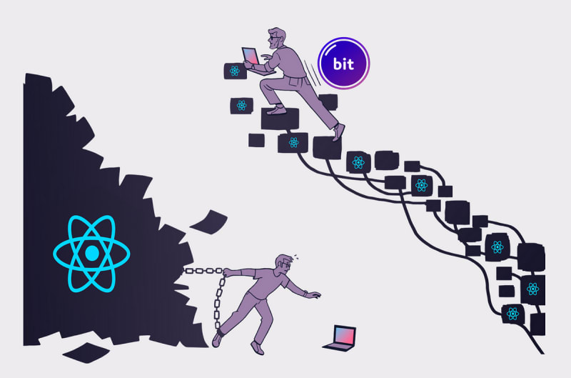
Bit platform simplifies the process of creating, sharing, and managing shared modules by providing a cloud-based solution that allows you to discover, edit, review, test and build a shared module using nothing more than a web browser.
It does that so you don't have to set up a complex monorepo with multiple build pipelines and development environments or maintain separate repositories for each shared module or group of modules.

1. Set up a Bit Platform account
Head to bit.cloud and sign up for a free account.
2. Create an access-controlled scope to store your shared components
Bit components are modules that can be maintained, shared and versioned independently. They are stored in access-controlled scopes on the Bit Platform. Head over to bit.cloud/create-scope to create a new scope.
Note that this workflow frees you from any repository setup or maintenance.
For example, I'll create a scope called cloud-demo.

3. Start a new Bit Cloud Workspace
Once created, you'll be presented with the following options:
- Start locally: To install Bit on your local machine and initialize a new Bit workspace.
- Create a workspace: To create a new Bit Cloud Workspace instance that will be maintainable using a web browser.
I'll choose to create a new Bit Cloud Workspace. My workspace is already configured to use the cloud-demo scope I created earlier as the default scope for my components.

4. Create a new component
Using the standard cmd + shift + p shortcut, open the VSCode command palette and select Bit: Create new component.
This will provide a list to choose the type of component you want to create. I'll choose React option and name my component button.

Nested under my cloud-demo directory, I now have a new component called button that I can start working on.
The component files are already scaffolded for me, These include a generic implementation file, a test file, and a documentation file, and a "composition" file that allows me to create examples of how the component can be used.
The component is already set up with a Bit Reusable Development Environment that defines the development environment and build pipeline for it (you can create your own envs as well).
I've updated my button component and added a few component examples to the composition file:
To see how the component looks and behaves, I can run the bit: start command in the VSCode command panel, or run bit start in my terminal.
This will start a local development server that will allow me to see the component in action. The terminal will output a clickable link that will open the Workspace UI in a new tab in the browser.

The component page which includes the component examples, documentation with live playgrounds, the API reference, and additional details about the component such as dependencies and dependents will also be available for others to view once the component is versioned and stored in the scope.

5. Tag the component with a new release version and store it in the scope
Using the VSCode command palette, I can run the Bit: Snap/tag local changes and export them command to tag the component with a new release version and export it to the scope.

The 'Tag and Export' command run the component's build pipeline in Bit Platform's CI service, Ripple CI, to ensure the component is built and tested correctly before it is stored in the scope.
The component's build also include a 'Package and Publish' step to make it consumable as a standard Node package.

6. Install the component in a project
One the build is done and the component is stored in the scope, it can be installed in a project as a standard Node package using bit/npm/yarn/pnpm.

In addition to that, at any point in time, I can go back to the component in the Bit Cloud Workspace and make changes, test them, and tag new versions of the component using the 'Edit component' button in the component page.
This workflow does not include a review process for the changes made to the component. However, Bit Platform does provide a collaborative environment where you can review and discuss changes to shared modules with your team.
Learn More

Create and Edit Shared Modules in The Cloud | by Eden Ella | Sep, 2024 | Bits and Pieces
Effortless cloud-based component management and Collaboration
 blog.bitsrc.io

Hope AI: A Code Assistant for Composable Software | by Eden Ella | Jul, 2024 | Bits and Pieces
An AI assistant that understands your codebase, generates, builds, tests, and releases reusable components with previews and documentation.
blog.bitsrc.io
A Modern Approach to React Development | Eden Ella | Bits and Pieces
Build composable and modernized React apps with Bit!
blog.bitsrc.io


