Hello, users! 👋
Today I want to share a design process and some resources with you all, in case you still don't know how to face a big/medium design project.
In this example we'll design some screens of a simple CMS, which I think is a pretty common design case in the web-dev community.
Setting up the environment
I'll be using Adobe XD (since it's totally free) and the "Web" option as you can see below:

If you're using Sketch, Photoshop or any other software, the sizes of the document should be 1920x1080, the standard for a web screen.
Our (dummy) client
If you have the chance to speak to your client be sure you know what your client wants.
As for this example, we have the following:
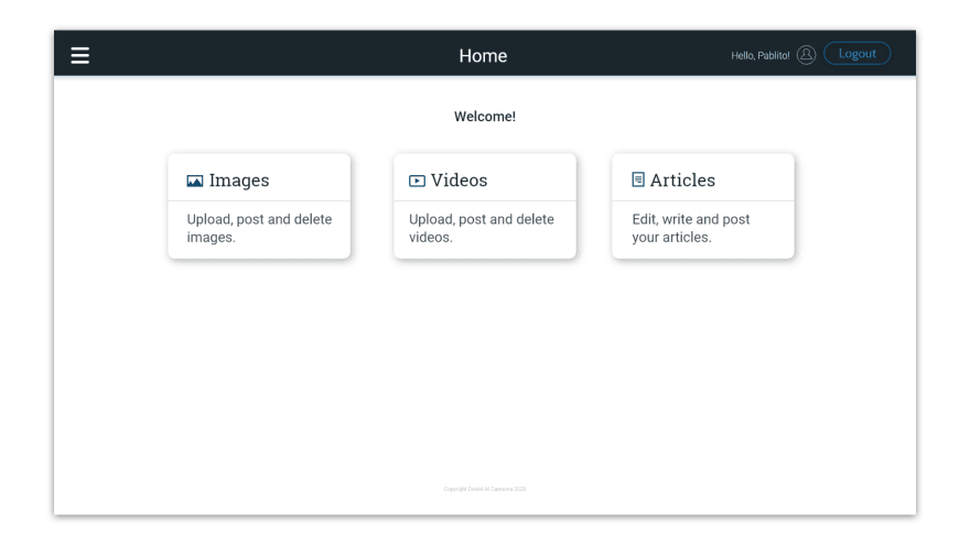
Our client, Pablito, wants a CMS to manage the pictures and videos of his bakery, he also wants to write/edit articles, and also he'd like to post all that content to Twitter and Facebook through the CMS.

So let's enumerate the features of our project, one by one.
What will be the content of our platform?
➜ Images
➜ Videos
➜ Articles
What will be the features of our platform?
➜ Log in; Log out.
➜ Upload images; Delete images; Post images to social media.
➜ Upload videos; Delete videos; Post videos to social media.
➜ Create articles; Edit articles; Post articles to an external blog.
All right! Next step: investigation.
Do not reinvent the wheel
Most people when trying to design something are totally blank, how is that possible? Design is not magic, Everything on the internet has a design, search for it!
In this case we'll be creating a CMS, so we need some inspiration. You'll find inspiration in:
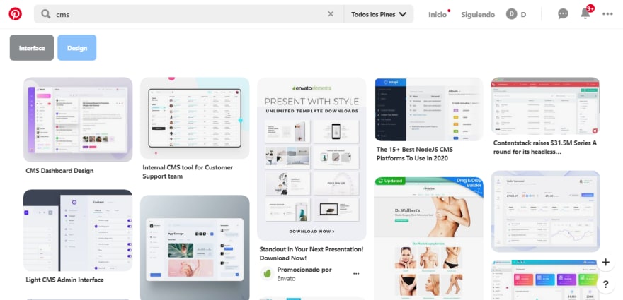
➜ Pinterest:
➜ Bëhance:
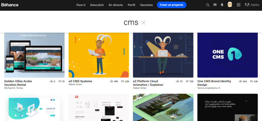
➜ Searching competence:
Do not skip this step. Just type "cms" in Google and start going through different cms, Wordpress, Wix, Joomla, Drupal. Go on, search for it and see how they did what they did.
Sketch up
I'ts time to get pen and paper and start sketching up the ideas you have. My advice is to get a little notebook, it's better to sketch small ideas, if you have a lot of space you won't focus.
I want to show you some sketches I did:
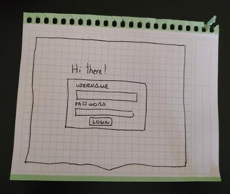
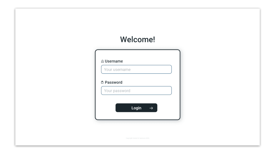
Login:
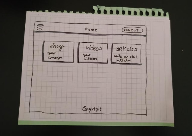
Home screen:
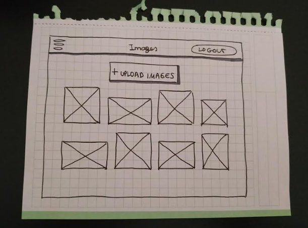
Images screen (will be reused for the videos and articles screen):
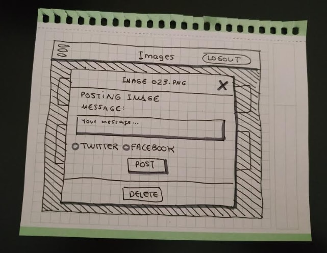
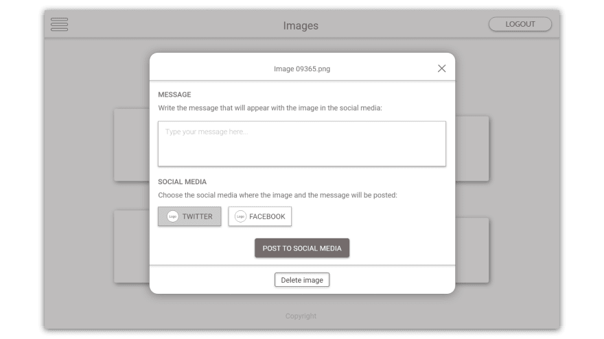
Modal to post/delete content:
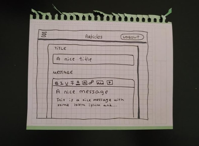
Article writing/editing:
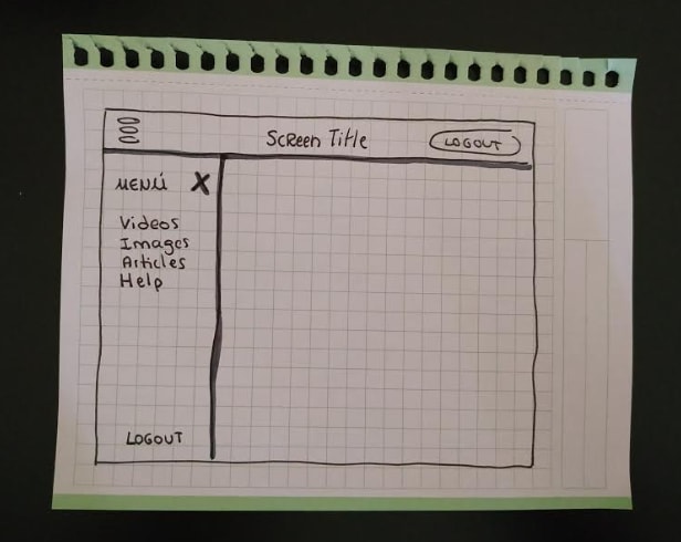
Sidemenu:
If you'd like to show your sketches to your client so he/she can give more ideas or just to get the approval, go for it.
Design. But in gray scale.
We haven't said anything about colors, and we won't until we create our design.
It's time to make our sketches digital. Pick a software and let's go for it. We'll follow simple guides of design, but if you'd like to have some in-deep advices of how to design with usability and accessibility you can check my article, where I give you 5 advices.
Why design in gray scale? Because then we'll be able to focus in the content and how/where we place our elements instead of focusing in the aesthetic side.
1st step: a grid
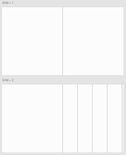
We won't get in-deep about grids. They are useful and necessary to place and position our elements inside the design. You can create your grid as you'd like to, here's mine for this example:
I created it like this: creating a simple line in the right middle of the document. Then copy&paste it in the right side, over and over again. You can make the lines as far as you want to from each other.
Just copy-paste it in the other side to make it symmetrical.
2nd step: place the elements.
I won't make all the screens I sketched because that'd make the article too long. Here are some samples with and without the grid:
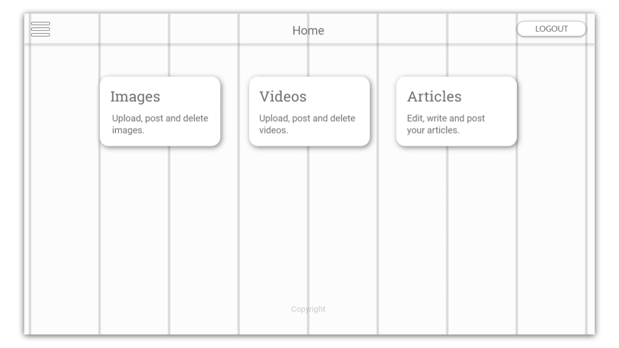
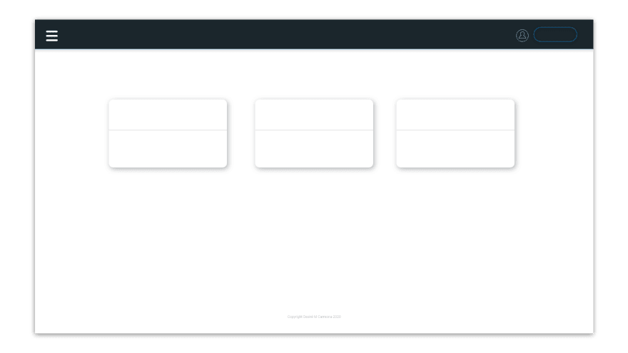
Home screen:
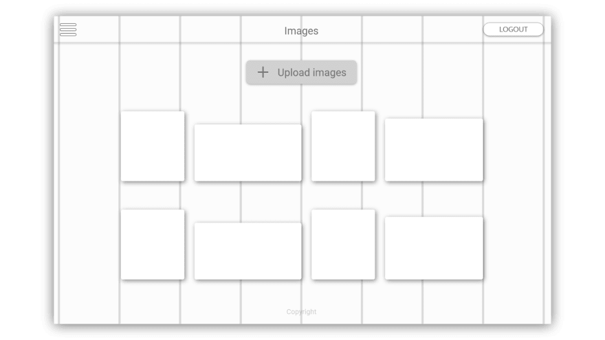
Images screen:
Screen modal:
As you can see, I only use grays. I don't even use black. In case you'd like to highlight a color or a part of the design, use different types of grays.
Colors. Finally.
Okay, it's time to color our designs.
We won't get in-deep in the color palette and color theory. You should get in mind that the "ideal" palette should include: a primary color, a secondary color and a 'highlight' color. If your client has a logo and a brand, the palette should reflect those colors.
Let's say Pablito, our client, doesn't mind the colors you use. If you don't want to invest time in the creation of a palette, you can check this page and get a palette you like and that reflects the essence of the bussiness.
I'll get this one and start doing some samples until I find a combination that I find comfortable.
Here's what I got in 3 samples:
Home screen:
Login screen:
Images screen:
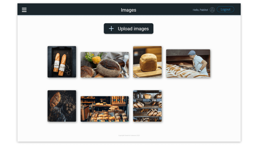
In case you're wondering, I did all the icons in Adobe XD, but you could use any external resource if needed, and got all the images for free in Unsplash.
So that's it!
Let's summarize the process:
📌 Setting up the environment.
📌 Identified the project's content and features needed.
📌 Investigated examples, inspiration and competence.
📌 Sketched up some designs with pen and paper in a little notebook.
📌 Digitalized those sketches in a gray scale and with a simple grid.
📌 Creating a palette.
📌 Color the digital sketches, make final decorations and fixes.
In conclusion
Designing is a complicated process, but figuring out some few steps before jumping into positioning and colors will make your process easier and faster.
How would you design the content if you don't know the content? You'll start just guessing? Or, moreover, how would you plan your screens (sketches) if you don't even know the features that the platform will have?
My last advice, but not less important: design is not about looks, design is about information. Everything you're designing is about information. Without it, design is just...
...nice color and shape positioning.
I hope this could be at least a bit useful for you, thank you for reading until the end!
See you around and let's keep coding 💻!
Complementary to this article
Hello again!
Since I haven't explained anything in deep, here you'll find useful resources: