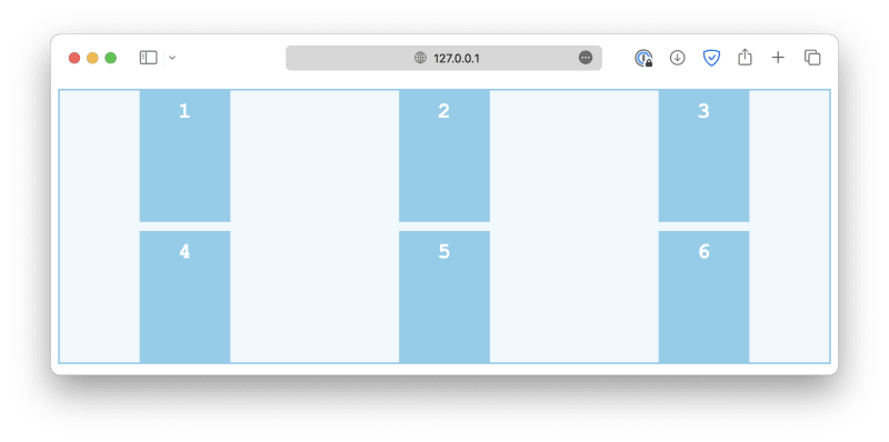
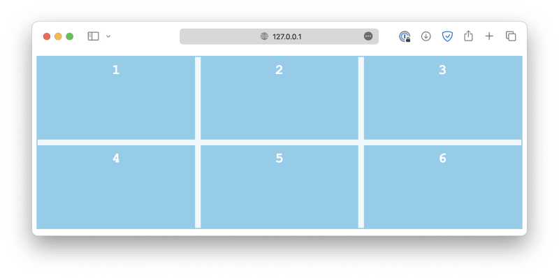
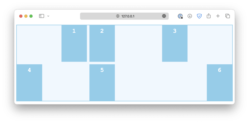
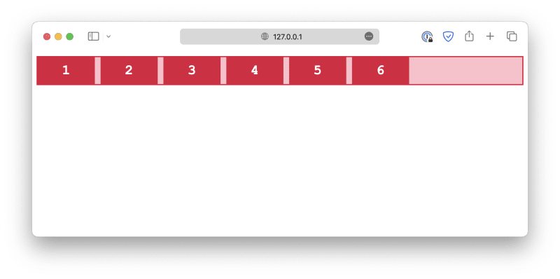
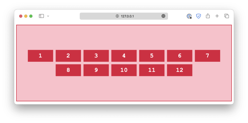
Creating layouts using CSS is one of the most fundamental skills a web developer must possess. A well-designed layout is the backbone of any successful website, as it improves user experience, visual appeal, and overall usability. There are two ways you can create a webpage layout using CSS, either with grids or the flexbox. Let's start with the traditional method and discuss how to create a grid layout.
📧 Subscribe to my newsletter: https://ericsdevblog.ck.page/profile
Creating grids
A grid layout consists of a grid container and several grid items. The grid container must have its display property set to grid or inline-grid. grid creates a block-level grid container, and inline-grid creates an inline-level grid container.
<div class="container">
    <div class="item">1</div>
    <div class="item">2</div>
    <div class="item">3</div>
    <div class="item">4</div>
    <div class="item">5</div>
    <div class="item">6</div>
</div>
.container {
  display: grid;
}
All direct children of this container will automatically become grid items.
Grid columns and rows
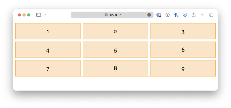
You can then specify how many columns you wish to create using the grid-template-columns property. The property accepts any number of values. The number of values determines the number of columns, and the value itself determines the size of that column. For example:
.container {
  display: grid;
  grid-template-columns: 100px 200px;
}

.item {
  font-family: Georgia, 'Times New Roman', Times, serif;
  font-size: x-large;
  text-align: center;
  padding: 20px;
  border: 1px solid orange;
  background-color: bisque;
}
I also added some styles for the grid items to make the grid look more pleasing, but it is not necessary here, so I will omit them in future examples.
.container {
  display: grid;
  grid-template-columns: 100px 200px 50px;
}
If you want all columns to have equal size, simply set the values to auto.
Similarly, you can specify row sizes using the grid-template-rows property.
.container {
  display: grid;
  grid-template-columns: auto auto auto;
  grid-template-rows: 100px 150px;
}
However, this property does not determine the number of rows in the grid. If you specify extra values, they will be ignored.
Lastly, grid-template is a shorthand property for grid-template-columns and grid-template-rows with the following syntax:
grid-template: <row> <row> ... / <col> <col> ...;
.container {
  display: grid;
  grid-template: 100px 150px / auto auto auto;
}
Grid gaps
When designing a webpage, it is good to leave some space between elements so that they are not too close to each other. By using the grid layout, you can easily add equal spacing between all grid items instead of micromanaging each margin. For example:
.container {
  display: grid;
  grid-template-columns: auto auto auto;
  row-gap: 10px;
  column-gap: 20px;
}
Alternatively, you may use the shorthand property, gap:
.container {
  display: grid;
  grid-template-columns: auto auto auto;
  gap: 10px 20px;
}
If you want equal spacing for column gaps and row gaps, specify a single value:
.container {
  display: grid;
  grid-template-columns: auto auto auto;
  gap: 10px;
}
Grid items
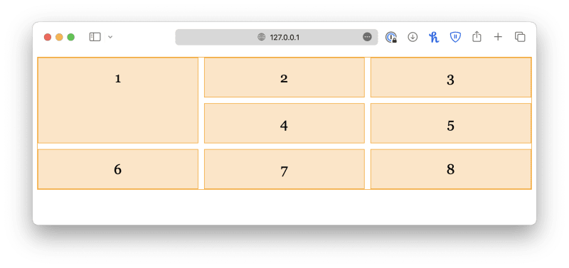
It is also possible for you to customize individual grid items using CSS. In a real-life scenario, it is common for one grid item to take up multiple columns or rows. For example, you can define an item to span across multiple columns by specifying a start point (grid-column-start) and an end point (grid-column-end).
<div class="container">
    <div class="item-2col">1</div>
    <div class="item">2</div>
    <div class="item">3</div>
    <div class="item">4</div>
    <div class="item">5</div>
    <div class="item">6</div>
    <div class="item">7</div>
    <div class="item">8</div>
</div>
.container {
  display: grid;
  grid-template-columns: auto auto auto;
  gap: 10px;
}

.item {
  . . .
}

.item-2col {
  grid-column-start: 1;
  grid-column-end: 3;
}
Keep in mind that the numbers refer to the column lines, not columns, as shown in the chart below.
So, for an item to span across two columns, it should start from 1 and end with 3.
You can also use the shorthand property grid-column to achieve the same result:
.item-2col {
  grid-column: 1 / 3;
}
Similarly, you can define a grid item to span across multiple rows using the grid-row-start and grid-row-end properties, or the grid-row shorthand.
.item-2row {
  grid-row-start: 1;
  grid-row-end: 3;
}
.item-2row {
  grid-row: 1 / 3;
}
If an item needs to span across multiple rows and columns, you can use the grid-area property instead, which is a shorthand for grid-row and grid-column. It has the following syntax:
grid-area: <row_start> / <col_start> / <row_end> / <col_end>
.item-area {
  grid-area: 1 / 1 / 3 / 3;
}
Grid alignment
Just like aligning individual elements in a webpage, when aligning items in a grid, we also have to talk about horizontal and vertical directions. However, things are a bit more complex than that. There are six different alignment properties, as shown in the list below:
align-contentalign-itemsalign-selfjustify-contentjustify-itemsjustify-self
Vertical alignment
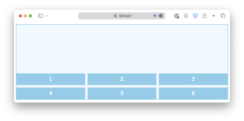
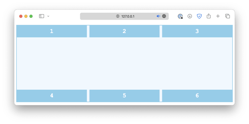
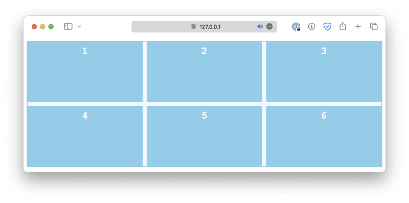
Let's discuss each of them one by one. First of all, the align properties control vertical alignment. As an example, this is a grid with six items, and the grid container is 300px high:
<div class="container">
    <div class="item">1</div>
    <div class="item">2</div>
    <div class="item">3</div>
    <div class="item">4</div>
    <div class="item">5</div>
    <div class="item">6</div>
</div>
.container {
  display: grid;
  grid-template-columns: auto auto auto;
  gap: 10px;
  height: 300px;
}
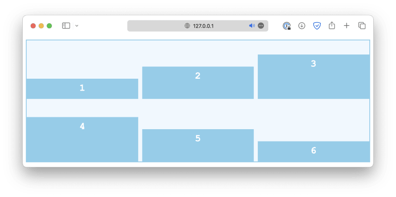
The align-content property is used to specify the alignment of rows when there is available space in the container. Common values include:
-
start
  .container {
    align-content: start;
  }
-
end
  .container {
    align-content: end;
  }
-
center
  .container {
    align-content: center;
  }
-
space-between
  .container {
    align-content: space-between;
  }
-
space-around
  .container {
    align-content: space-around;
  }
-
space-evenly
  .container {
    align-content: space-evenly;
  }
-
stretch
  .container {
    align-content: stretch;
  }
align-items, on the other hand, is used to align individual grid items within their respective grid cells along the block axis. This is especially useful when grid items have different heights. Common values include:
-
start
  .container {
    align-items: start;
  }
-
end
  .container {
    align-items: end;
  }
-
center
  .container {
    align-items: center;
  }
-
stretch
  .container {
    align-items: stretch;
  }
-
baseline
  .container {
    align-items: baseline;
  }
Lastly, the align-self property works just like align-items, except it is used on individual grid cells, not the container. It will overwrite the alignment rule set by align-items.
.container {
  align-items: start;
}

.item-sm {
  align-self: end;
}
Horizontal alignment
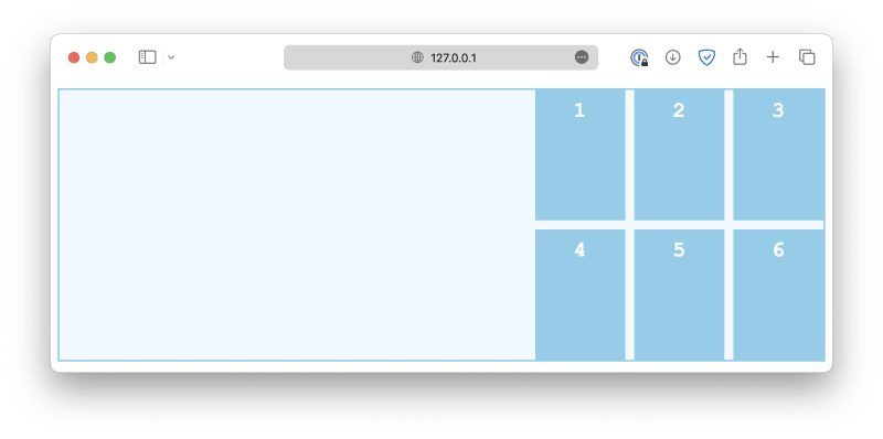
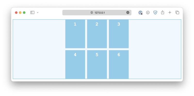
The horizontal alignment, controlled by the justify properties, works in a similar way. First, the justify-content property defines how grid items are distributed horizontally along the main axis. Some common values are:
-
start
  .container {
    justify-content: start;
  }
-
end
  .container {
    justify-content: end;
  }
-
center
  .container {
    justify-content: center;
  }
-
space-between
  .container {
    justify-content: space-between;
  }
-
space-around
  .container {
    justify-content: space-around;
  }
-
space-evenly
  .container {
    justify-content: space-evenly;
  }
The justify-items controls how grid items are aligned horizontally within their cells. Some common values are:
-
start
  .container {
    justify-items: start;
  }
-
end
  .container {
    justify-items: end;
  }
-
center
  .container {
    justify-items: center;
  }
-
stretch
  .container {
    justify-items: stretch;
  }
Similarly, the justify-self property is used on individual grid items to overwrite the default alignment rule set by justify-items.
.container {
  justify-items: start;
}

.item-sm {
  justify-self: end;
}
Flexbox layout
The flexbox is another layout model in CSS that provides an efficient way to design and structure complex layouts, but with a more flexible approach. It is particularly suited for creating one-dimensional layouts, either in a row or a column, as we will see later.
Just like a grid layout, a flexbox layout also consists of a flex container and several flex items. The container should have its display property set to flex, and all its direct children automatically become flex items.
<div class="container">
    <div class="item">1</div>
    <div class="item">2</div>
    <div class="item">3</div>
    <div class="item">4</div>
    <div class="item">5</div>
    <div class="item">6</div>
</div>
.container {
  display: flex;
  gap: 10px;
}
With a flex layout, instead of rows and columns, you must define a flex-direction and a flex-wrap. The flex-direction specifies in which direction the container should stack its flex items. The accepted values are:
-
column
  .container {
    flex-direction: column;
  }
-
column-reverse
  .container {
    flex-direction: column-reverse;
  }
-
row
  .container {
    flex-direction: row;
  }
-
row-reverse
  .container {
    flex-direction: row-reverse;
  }
The flex-wrap property determines whether the flex items should wrap (automatically change to the following line when there is insufficient space).
-
wrap
  .container {
    flex-wrap: wrap;
  }
-
nowrap
  .container {
    flex-wrap: nowrap;
  }
-
wrap-reverse
  .container {
    flex-wrap: wrap-reverse;
  }
The flex-flow is a shorthand for flex-direction and flex-wrap properties.
.container {
  flex-flow: column wrap;
}
Lastly, the alignment properties for the grid layout we discussed before also work for flexbox layouts. For example:
.container {
  flex-direction: row;
  flex-wrap: wrap;

  align-content: center;
  justify-content: center;
}
Next steps
In this article, we explored gird and flexbox, two primary methods you can use to create webpage layouts. In the next article, we will discuss how to use the knowledge we've learned so far to create layouts that work for different screen sizes. This design principle is referred to as responsive design.
If you are interested, here are some of my other articles about CSS and frontend design:


