As a graphic designer, diving into coding is a bit daunting and scary. My coding process is a bit different. I like to start my project off with thinking of a client. By doing so, I can define the theme of my app and figuring out what functionality I can add. From there, I create a wireframe. The wireframe allows me to see the layout of my application. After that, I start coding. I start by building out the functionality and testing to see if it all works. Finally, I start coding the front end and use different CSS frameworks to design my applications.
Below are the concepts that I apply to my design.
1. Wireframes

The term means to sketch out the placements of buttons, images, and text with the most minimal amount of details. This allows you to visually think about how you want your final product to look. This also allows you to physically see how many pages or elements you might need to build into your code.
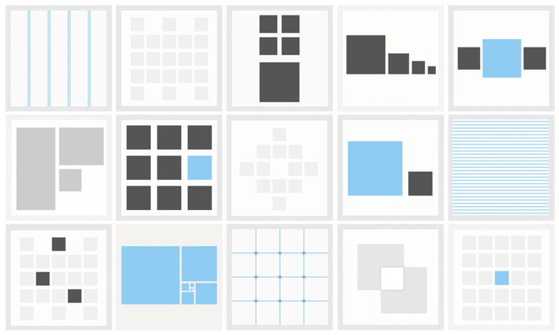
2. Composition
The composition is when elements are arranged to look a certain way. One concept that you should familiarize yourself with is the grid system. It is used with most of the CSS frameworks, like Bootstrap and Foundation. Have contrast with size and color to help information flow better. The best way to have your work look and feel meaningful is to have a focal point. check out this blog for a better understanding of composition.
3. Repetition
Repetition means to reuse the same or a similar image/or style throughout your design. For example, if you are using a round button on the form, that style of the round button should be consistent whenever a button appears on your page.
4. Color
Always have a color palette for your work. This helps your work look cohesive, well-thought-out, and just visually pleasant to look at. There are many tools/websites out there that generate a color palette. The one I usually reach for is color Mind or coolors.
Tip Use three colors at most. One primary color, one secondary color, and one accent color. Use the 60-30-10 rule. 60% should be your brand color, 30% should be your secondary color and 10% is the accent color.
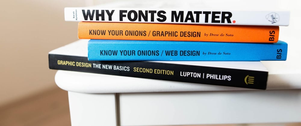
5. Typography
Typography refers art of arranging type to be more legible, and pleasing to look at while conveying information. Some basic types of typographical elements you have seen in the code are:
<h1> This would be the largest text. </h1>
<h2> This would be the second largests text. </h2>
<strong> This would be bold. </strong>
<p> This would be the smallest size of font. </p>
This is where composition comes into play. First, you need an understanding of what the most important information you want the user to see is. For this information, you would most likely go for an h1 tag or maybe make the text bold to make it stand out from the rest.
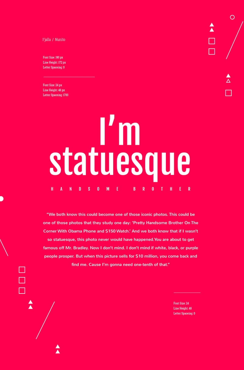
Another way to use typography is by pairing two different font families together and create contrast. The most common pairing is a san-serif typeface paired with a serif font face. Below are some examples:
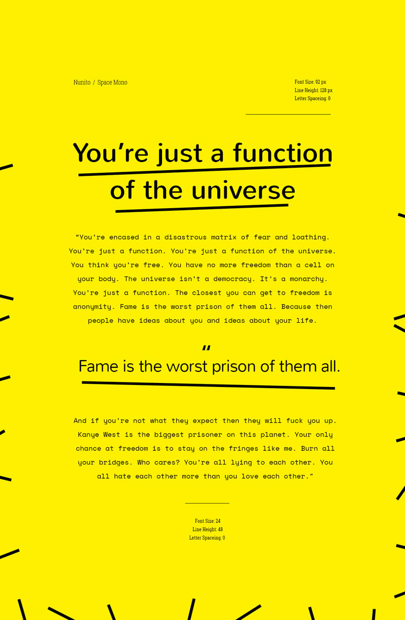
images taken from here
Example of San-serif pairs:
Example of a Serif pairing:
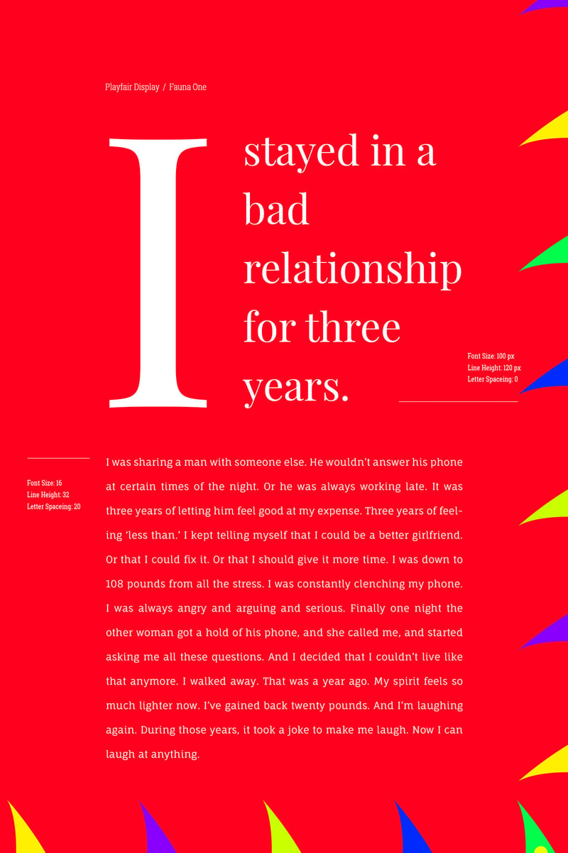
Example of a Serif pairing:
Hopefully, this has helped you become more aware of design in general. The more you practice the better you get. As for now check out these resources.
Here is a list of resources to check out:
Color Combos to avoid
BootStrap Templates Blog
CSS Grid guide MDN
Google Fonts


