
 Will T.
In the first part, we explored the significance of the Strategy pattern in React projects and outlined its implementation. However, the approach presented might have be a little bit of an overkill. This article aims to introduce a more simple and practical way of applying the Strategy pattern.
Example 1️⃣: Unit Conversion
Problem Statement
Consider a scenario where you need to convert weight units (e.g. converting 1000g to 1kg). A straightforward solution involves a recursive function, as shown below:
export enum Weight {
  Gram = 'g',
  Kilogram = 'kg',
  Tonne = 't',
  Megatonne = 'Mt',
  Gigatonne = 'Gt',
}

const WEIGHT_UNIT_ORDER = Object.values(Weight);
const WEIGHT_UNIT_CONVERSION_THRESHOLD = 1_000;

export const convertWeightUnit = (weightInGram: number, unit = Weight.Gram): ConvertUnitResult => {
  if (weightInGram < WEIGHT_UNIT_CONVERSION_THRESHOLD ||
  unit === WEIGHT_UNIT_ORDER.at(-1)) {
    return { newValue: weightInGram, newUnit: unit };
  }

  const nextUnit = WEIGHT_UNIT_ORDER[
    Math.min(
      WEIGHT_UNIT_ORDER.indexOf(unit) + 1,
      WEIGHT_UNIT_ORDER.length - 1
    )
  ];

  return convertWeightUnit(weightInGram / WEIGHT_UNIT_CONVERSION_THRESHOLD, nextUnit);
};
This example sets the stage for our discussion but let's not dwell on the recursive algorithm itself. Instead, let's explore how to apply this logic to another unit set, such as file size, without duplicating code. Here, the Strategy pattern offers an elegant solution.
Applying the Strategy Pattern
First, we'll have to define the additional TypeScript enum and interfaces that are needed for adding the new set of units:
- unit.utils.types.ts:
export enum Weight {
  Gram = 'g',
  Kilogram = 'kg',
  Tonne = 't',
  Megatonne = 'Mt',
  Gigatonne = 'Gt',
}

export enum FileSize {
  Byte = 'B',
  Kilobyte = 'KB',
  Megabyte = 'MB',
  Gigabyte = 'GB',
  Terabyte = 'TB',
  Petabyte = 'PB',
}

export type GeneralUnit = Weight | FileSize;

export interface ConvertUnitResult {
  newValue: number;
  newUnit: GeneralUnit;
}

export interface UnitConversionStrategy {
  [key: string]: {
    unitOrder: GeneralUnit[];
    threshold: number;
  };
}
Now we need to modify the code to apply the Strategy pattern. At the heart of every implementation of the Strategy pattern, there has to be an object that defines the strategies. In this case, it's UNIT_CONVERSION_STRATEGY:
- unit.utils.ts:
import { ConvertUnitResult, FileSize, GeneralUnit, UnitConversionStrategy, Weight } from './unit.utils.types';

const UNIT_CONVERSION_STRATEGY: UnitConversionStrategy = {
  [Weight.Gram]: {
    unitOrder: Object.values(Weight),
    threshold: 1_000
  },
  [FileSize.Byte]: {
    unitOrder: Object.values(FileSize),
    threshold: 1_000
  },
};

// Populate the strategy for each unit in each category
Object.values(UNIT_CONVERSION_STRATEGY).forEach((unitStrategy) => {
  unitStrategy.unitOrder.forEach((unit) => {
    UNIT_CONVERSION_STRATEGY[unit] = unitStrategy;
  });
});

export const convertUnit = (value: number, unit: GeneralUnit): ConvertUnitResult => {
  const unitConversionStrategy = UNIT_CONVERSION_STRATEGY[unit];

  if (!unitConversionStrategy) throw new Error('Unit not supported');

  const { unitOrder, threshold } = unitConversionStrategy;

  if (value < threshold || unit === unitOrder.at(-1)) {
    return { newValue: value, newUnit: unit };
  }

  const nextUnit = unitOrder[
    Math.min(
      unitOrder.indexOf(unit) + 1,
      unitOrder.length - 1
    )
  ];

  return convertUnit(value / threshold, nextUnit);
};
You can try it in the live codesandbox:
By leveraging the Strategy pattern as demonstrated, we circumvent the Shotgun Surgery anti-pattern. This approach keeps the number of conditional statements constant and simplifies the addition of new unit sets by merely extending the UNIT_CONVERSION_STRATEGY object without altering any existing logic, adhering to the Open/Closed Principle in SOLID.
Example 2️⃣: Design Systems in CSS-in-JS Projects
Another great example where the Strategy pattern can be applied in frontend projects is when you have to implement components in a design system.
Problem Statement
Consider implementing a button with various variants, colors, and sizes in a design system:
- Button.types.ts:
export type ButtonVariant = 'contained' | 'outlined' | 'text';

export type ButtonColor = 'primary' | 'secondary' | 'error' | 'success' | 'warning' | 'info';

export type ButtonSize = 'xs' | 'sm' | 'md';

export interface ButtonProps {
  color?: ButtonColor;
  variant?: ButtonVariant;
  size?: ButtonSize;
  children: React.ReactNode;
}
An implementation with simple conditionals might result in a messy component:
- Button.tsx (Before Strategy Pattern):
import { memo } from 'react';
import { Button as ThemeUIButton } from 'theme-ui';

import { ButtonProps } from './Button.types';

const ButtonBase = ({ color = 'primary', variant = 'contained', size = 'sm', children }: ButtonProps) => {
  return (
    <ThemeUIButton
      sx={{
        outline: 'none',
        borderRadius: 4,
        transition: '0.1s all',
        cursor: 'pointer',
        ...(variant === 'contained'
          ? {
              backgroundColor: `${color}.main`,
              color: 'white',
              '&:hover': {
                backgroundColor: `${color}.dark`,
              },
            }
          : {}),
        ...(variant === 'outlined'
          ? {
              backgroundColor: 'transparent',
              color: `${color}.main`,
              border: '1px solid',
              borderColor: `${color}.main`,
              '&:hover': {
                backgroundColor: `${color}.light`,
              },
            }
          : {}),
        ...(variant === 'text'
          ? {
              backgroundColor: 'transparent',
              color: `${color}.main`,
              '&:hover': {
                backgroundColor: `${color}.light`,
              },
            }
          : {}),
        ...(size === 'xs'
          ? {
              fontSize: '0.75rem',
              padding: '8px 12px',
            }
          : {}),
        ...(size === 'sm'
          ? {
              fontSize: '0.875rem',
              padding: '12px 16px',
            }
          : {}),
        ...(size === 'md'
          ? {
              fontSize: '1rem',
              padding: '16px 24px',
            }
          : {}),
      }}
    >
      {children}
    </ThemeUIButton>
  );
};

export const Button = memo(ButtonBase);
Applying the Strategy Pattern
Now let's try applying the Strategy pattern and see how it helps us to clear the mess:
- Button.utils.ts:
import { ButtonColor } from './Button.types';

export const getButtonVariantMapping = (color: ButtonColor = 'primary') => {
  return {
    contained: {
      backgroundColor: `${color}.main`,
      color: 'white',
      '&:hover': {
        backgroundColor: `${color}.dark`,
      },
    },
    outlined: {
      backgroundColor: 'transparent',
      color: `${color}.main`,
      border: '1px solid',
      borderColor: `${color}.main`,
      '&:hover': {
        backgroundColor: `${color}.light`,
      },
    },
    text: {
      backgroundColor: 'transparent',
      color: `${color}.main`,
      '&:hover': {
        backgroundColor: `${color}.light`,
      },
    },
  };
};

export const BUTTON_SIZE_STYLE_MAPPING = {
  xs: {
    fontSize: '0.75rem',
    padding: '8px 12px',
  },
  sm: {
    fontSize: '0.875rem',
    padding: '12px 16px',
  },
  md: {
    fontSize: '1rem',
    padding: '16px 24px',
  },
};
- Button.tsx (After Strategy Pattern):
import { memo } from 'react';
import { Button as ThemeUIButton } from 'theme-ui';

import { ButtonProps } from './Button.types';
import { getButtonVariantMapping, BUTTON_SIZE_STYLE_MAPPING } from './Button.utils';

const ButtonBase = ({ color = 'primary', variant = 'contained', size = 'sm', children }: ButtonProps) => {
  const buttonVariantStyle = getButtonVariantMapping(color)[variant];

  return (
    <ThemeUIButton
      sx={{
        outline: 'none',
        borderRadius: 4,
        transition: '0.1s all',
        cursor: 'pointer',
        ...buttonVariantStyle,
        ...BUTTON_SIZE_STYLE_MAPPING[size],
      }}
    >
      {children}
    </ThemeUIButton>
  );
};

export const Button = memo(ButtonBase);
This refactoring significantly improves code readability and gives us a clear separation of concerns.
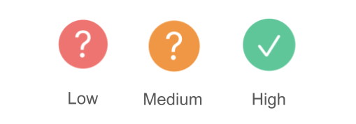
Example 3️⃣: Verification Badge
Problem Statement
We need to create a very simple verification badge component. The requirement is as follows:
- Low: "?" in red, showing "Low verification level" when hovered
- Medium: "?" in orange, showing "Medium verification level" when hovered
- High: "✓" in green, showing "High verification level" when hovered
Without using a strategy object, we can implement the component like this:
- VerificationLevelBadge.tsx:
import { Box, Tooltip } from '@mantine/core';

interface VerificationLevelBadgeProps {
  verificationLevel: 'high' | 'medium' | 'low';
}

export const VerificationLevelBadge = ({ verificationLevel }: VerificationLevelBadgeProps) => {
  return (
    <Tooltip
      label={
        verificationLevel === 'low'
          ? 'Low verification level'
          : verificationLevel === 'medium'
          ? 'Medium verification level'
          : 'High verification level'
      }
    >
      <Box
        component="span"
        sx={(theme) => ({
          display: 'inline-flex',
          alignItems: 'center',
          justifyContent: 'center',
          color: theme.white,
          width: 16,
          height: 16,
          fontStyle: 'normal',
          borderRadius: '50%',
          fontSize: verificationLevel === 'high' ? '0.625rem' : '0.75rem',
          background:
            verificationLevel === 'low'
              ? theme.colors.red[5]
              : verificationLevel === 'medium'
              ? theme.colors.orange[5]
              : theme.colors.teal[5],
        })}
      >
        {verificationLevel === 'high' ? '✓' : '?'}
      </Box>
    </Tooltip>
  );
};
This looks terrible. Imagine the scenario where we have to modify something, or when we have to add a new verification level.
Applying the Strategy Pattern
By introducing the strategy object, the code readability will significantly improve, and we have paved the way for future changes:
- VerificationLevelBadge.utils.ts:
export const VERIFICATION_LEVEL_UI_MAPPING = {
  high: {
    backgroundColor: 'teal',
    text: '✓',
    tooltip: 'High verification level',
    fontSize: '0.625rem',
  },
  medium: {
    backgroundColor: 'orange',
    text: '?',
    tooltip: 'Medium verification level',
    fontSize: '0.75rem',
  },
  low: {
    backgroundColor: 'red',
    text: '?',
    tooltip: 'Low verification level',
    fontSize: '0.75rem',
  },
};
- VerificationLevelBadge.tsx:
import { Box, Tooltip } from '@mantine/core';

import { VERIFICATION_LEVEL_UI_MAPPING } from './VerificationLevelBadge.utils';

interface VerificationLevelBadgeProps {
  verificationLevel: 'high' | 'medium' | 'low';
}

export const VerificationLevelBadge = ({ verificationLevel }: VerificationLevelBadgeProps) => {
  const { tooltip, backgroundColor, text, fontSize } = VERIFICATION_LEVEL_UI_MAPPING[verificationLevel];

  return (
    <Tooltip label={tooltip}>
      <Box
        component="span"
        sx={(theme) => ({
          display: 'inline-flex',
          alignItems: 'center',
          justifyContent: 'center',
          color: theme.white,
          width: 16,
          height: 16,
          fontStyle: 'normal',
          borderRadius: '50%',
          fontSize,
        })}
        bg={backgroundColor}
      >
        {text}
      </Box>
    </Tooltip>
  );
};
Conclusion
This article showcased a simplified application of the Strategy pattern in frontend projects. By adopting this pattern, we can avoid code duplication, improve code readability, and easily extend functionality without modifying existing logic.
Please look forward to the next part of the series where I'll be sharing my personal experience with applying useful design patterns in frontend projects.
If you're interested in Frontend Development and Web Development in general, follow me and check out my articles in the profile below.