 Jennie
It is classic to display data with a table, each row is a record, each column is a data field, and the page could show quite a few data records, which requires user to scroll vertically enable to overlook large amount of data. And this, often requires keeping table header in our sight all the time, aligning with the columns, so we can tell what does each cell mean easily.
My first reaction was to try on <thead>, and it didn't work.
Then I found the blog "Position Sticky and Table Headers" by Chris Coyier, and he explained this clearly:
The issue boils down to the fact that stickiness requires
position: relativeto work and that in the CSS 2.1 spec.
And he provided one solution:
You can’t
position: sticky;a<thead>. Nor a<tr>. But you can sticky a<th>
And a decent example:
Then I tried this on the platform I was working on. It turns out it does not work either. Why??? It turned out thanks to this killer my dear overflow: hidden;.
MDN explained why this happens:
Note that a sticky element "sticks" to its nearest ancestor that has a "scrolling mechanism" (created when
overflowishidden,scroll,auto, oroverlay), even if that ancestor isn't the nearest actually scrolling ancestor. This effectively inhibits any "sticky" behavior (see the Github issue on W3C CSSWG).
Well, this sounds like a case CSS standard forgot to cover. Then you may think OK in this case, let us try to avoid wrapping tables in a overflow:hidden element. But if you maintain this page for a long term, or team working on the same page, can you make sure your sticky element will never been wrapped in an element with overflow:hidden? I bet no.
So I keep searching for a sustainable solution, and what I found was just suggesting giving up on <table> tag, or giving up the table display, and use flex instead like this:
You know unlike table cells, flex elements will not automatically align to each other. Enable to align the "cells", you will need to set a width on each "cell" element.
That's totally fine for one or two tables I have to say. But what if I am working on a data management platform, which does constantly add new tables like that? And sometimes may add a new column into a long lived table which breaks the perfect size setting it has?
That will be a disaster if you does not have a GUI tool like the classic Dreamweaver to help.
Now I think it's time to use some Javascript. I recall that before position: sticky is introduced, it was popular to usea jQuery plugin to clone a component out, hide it by default, and displays when the user scrolls in a calculated range. Like this one.
It perfectly works in jQuery app, which uses css selectors to bind the elements with events, and the cloned elements will keep the original arrtibutes, all you have to keep in mind is to write event binding selectors carefully to make sure the cloned header will still respond to the events you required.
But in framework like react, it is tricky to do this. Imagine that designer designed this kind of fancy table:
How to make sure the cloned header works and looks exactly same as the original header?
So I think instead of clone, why don't I just fixed the size of each header cells when user scrolls the table in and out the viewport, and make them position: fixed to avoid being affected by overflow: hidden, and I may enjoy the flexible cell width? Although it will be affected by position: relative, yet still a lot better.
And here's what I came out:
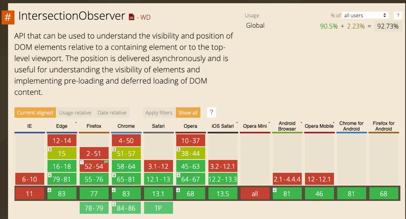
Instead of listening on scroll event, I tried IntersecionObserver API for a better performance, and modern browser has supported IntersectionObserver quite well:
Unlike scroll event, it's a class accept a callback and options:
const observer = new IntersectionObserver(callback, options);
observer.observe(targetElement);
observer.unobserve(targetElement);
And it only calls the callback function when the target element displayed cross a given raitio of the viewport.
Rather than reporting every infinitesimal change in how much a target element is visible, the Intersection Observer API uses thresholds. When you create an observer, you can provide one or more numeric values representing percentages of the target element which are visible. Then, the API only reports changes to visibility which cross these thresholds.
Here's a blog explaining IntersectionObserver in details: An Explanation of How the Intersection Observer Watches. Check it out!
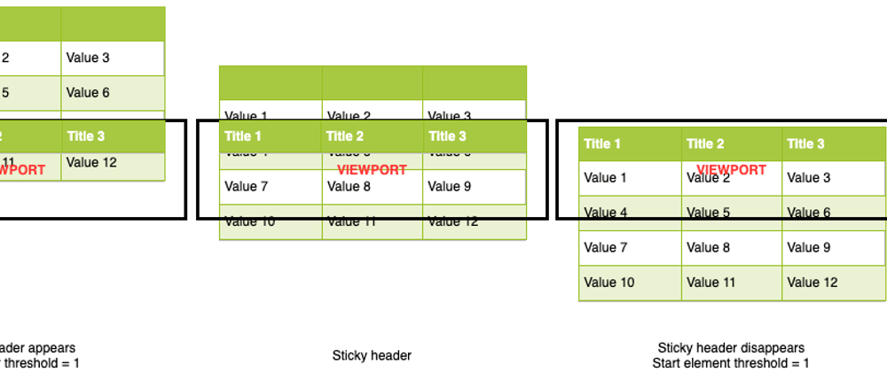
Because of this special setting, I observed 2 empty helper elements as start point, and end point. When the observer callback triggered, I check the top offset of the start point and the end point via element.getBoundingClientRect(). If the top of the start point become negative, it means the table header starts to leave the viewport. By contrast, if the top of end point become negative, it means the whole table almost leaves the viewport.
const startEl = React.useRef(null);
const endEl = React.useRef(null);

React.useEffect(() => {
  const states = new Map();
  const observer = new IntersectionObserver(
    entries => {
      entries.forEach(e => {
        states.set(e.target, e.boundingClientRect);
      });
      const { top } = states.get(startEl.current) || {};
      const { top: bottom } = states.get(endEl.current) || {};
      if (top < 0 && bottom > 0) {
        show();
      } else {
        hide();
      }
    },
    {
      threshold: [0],
    }
  );
  observer.observe(startEl.current);
  observer.observe(endEl.current);
}, [])
The scrolling down experience looks like this:
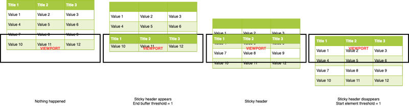
The scrolling up experience looks like this:
The star point is simply placed on top of the table, but the end point is somewhere above the end of the table to create better user experience since I feel it looks wierd when the last row is over half covered by the sticky header in the end. That's why you see this calculation:
const thead = el.current.querySelectorAll('thead');
const rows = el.current.querySelectorAll('tr');
const theadHeight = (thead && thead[0].getBoundingClientRect() || {}).height || 0;
const lastRowHeight = (rows && rows[rows.length - 1].getBoundingClientRect() || {}).height || 0;
endEl.current.style.top = `-${theadHeight + lastRowHeight/2}px`;
Working with CSS:
.end-buffer-area {
  z-index: -1;
  position: relative;
}
Then we toggle a CSS class .stickyHeader on the wrapper to control the displaying of the sticky header:
.header-column {
  ...
}
.stickyHeader .header-column {
  position: fixed;
  top: 0;
}
The first thing you may notice that after the header cell become position: fixed, it no longer aligns to the other cells, everything gets messed. So I need to find a way to keep the header cell size, and position at the same time.
What I did was wrap the header cell content with a div first:
<thead>
  <tr>
    <th><div className="header-column">Name</div></th>
    <th><div className="header-column">Age</div></th>
    <th><div className="header-column">Address</div></th>
  </tr>
</thead>
When it shows, I calculate the sizes, set on both th and .header-column to maintain the table alignment:
const show = () => {
  el.current.querySelectorAll('.header-column').forEach(
    col => {
      if (!col.parentElement) { return; }
      const { width, height } =
            col.parentElement.getBoundingClientRect() || {};
      col.style.width = col.parentElement.style.width = `${width}px`;
      col.style.height = col.parentElement.style.height = `${height}px`;
      `${width}px`;
    }
  el.current.classList.add("stickyHeader");
};
And some CSS to ensure they looks same:
thead th {
  padding: 0;
}
.header-column {
  height: auto !important;
  padding: 10px;
  box-sizing: border-box;
}
.stickyHeader .header-column {
  background: inherit;
}
Next you may notice it will have a wierd jumping out behaviour makes the sticky header appearance look a bit unnatural. This is because when user scroll fast, we will see the header leaves out out of the viewport before IntersectionObserver triggers the callback. Right, our work arounds can never achieve the effect of the browser's native integration.
But we can make it feels better via animation. So I added this simple CSS animation as a finishing:
.stickyHeader .header-column {
  top: 0;
  animation: slideDown 200ms ease-in;
}

@keyframes slideDown {
  0% {
    transform: translateY(-50%);
  }
  100% {
    transform: translateY(0%);
  }
}
Here it goes.
But you can tell this solution is still very rough. Some restrictions like:
- need to carefully style the header
- not responsive
Are able to be fixed via more careful checks and events handling.
Hope you enjoy the exploration of new solutions with me :).


