 Keep Coding
Tailwind CSS is taking the web development world by storm.
It provides a powerful utility-based framework, but at the same time, it's missing lots of very useful prebuilt components.
It's easy to waste lots of time struggling with annoying styling issues, especially if you're working with components like:
- Forms
- Date & time pickers
- Modals
- Complex navigation like mega-menu, scrollspy or sidenav
- Carousels, sliders, galleries & more
Table of contents
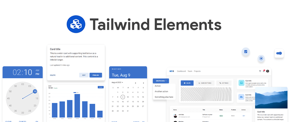
Tailwind Elements
Tailwind Elements is a huge collection of open-source components, templates & plugins for Tailwind CSS.
It covers all of the missing components from Tailwind & more.
In some dynamic components (like dropdowns or modals) Elements adds custom JavaScript. However, they do not require any additional installation, all the necessary code is always included in the example and copied to any Tailwind project - it will work.
How to install Tailwind Elements
There are a couple of ways to install Tailwind Elements.
We will explore 4 of them - npm, mdb-cli, CDN & .zip package.
npm
NPM is a recommended way to work with Tailwind Elements and others libraries.
Make sure that you have Node.js installed. In order to verify that, open a command line and type node -v. If node is installed you should see it's version in a console.
NPM is a recommended way to work with Tailwind Elements and others libraries.
Make sure that you have Node.js installed. In order to verify that, open a command line and type node -v. If node is installed you should see it's version in a console.
Before starting the project make sure to install Node.js (LTS) and TailwindCSS.
Run the following command to install the package via NPM:
npm install tw-elementsTailwind Elements is a plugin and should be included inside tailwind.config.js. It is also recommended to extend the content array with a js files pattern that loads dynamic component classes:
module.exports = {
  content: [
    "./src/**/*.{html,js}",
    "./node_modules/tw-elements/dist/js/**/*.js"
  ],
  plugins: [require("tw-elements/dist/plugin")]
};
- Dynamic components will work after adding the js file:
<script src="./TW-ELEMENTS-PATH/dist/js/index.min.js"></script>
Alternatively, you can import it in the following way (bundler version):
import * as te from 'tw-elements';
MDB GO / CLI
MDB CLI is a command line tool that allows you to create, deploy and host anything with a single command.
To start using MDB GO / CLI install it with one command:
npm install -g mdb-cliLog into the CLI using your MDB account:
mdb loginInitialize a project and choose Tailwind Elements from the list:
mdb init tailwind-elements-freeInstall the dependencies (inside the project directory):
npm installRun the app:
npm startPublish when you're ready & deploy to the web for free
mdb publish
CDN
You can easily test Tailwind Elements by adding CDN scripts to your classic HTML template without the need for installing any packages.
Add the stylesheet files below in the head section:
<link
  href="https://fonts.googleapis.com/css?family=Roboto:300,400,500,700,900&display=swap"
  rel="stylesheet" />
<link
  rel="stylesheet"
  href="https://cdn.jsdelivr.net/npm/tw-elements/dist/css/index.min.css" />
<script src="https://cdn.tailwindcss.com/3.2.4"></script>
<script>
  tailwind.config = {
    darkMode: "class",
    theme: {
      fontFamily: {
        sans: ["Roboto", "sans-serif"],
        body: ["Roboto", "sans-serif"],
        mono: ["ui-monospace", "monospace"],
      },
    },
    corePlugins: {
      preflight: false,
    },
  };
</script>
Require the js bundled file right before the body closing tag:
<script src="https://cdn.jsdelivr.net/npm/tw-elements/dist/js/index.min.js"></script>
.ZIP Starter
In order to quickly test Tailwind Elements simply download our starter. Keep in mind that this is not an optimized for the production version, but only a demo for testing.
You can download the .zip here.
Build something!
You have successfully installed the package. Now it's time to create something awesome.
Search for components
Tailwind Elements offers a vast collection of free components that are all:
- open source
- well-documented
- support dark mode
Go to the Tailwind Elements documentation & find the component you're looking for in the side navigation.
I chose the Tailwind CSS Table component. Specifically, I would like to use a hoverable table to darken the rows that the cursor is hovering over, in order to make reading the data in my project easier.
It will also work on touch for mobile!

After you click "show code" a block of code pops up. In the case of my table, this one:
<div class="flex flex-col">
  <div class="overflow-x-auto sm:-mx-6 lg:-mx-8">
    <div class="inline-block min-w-full py-2 sm:px-6 lg:px-8">
      <div class="overflow-hidden">
        <table class="min-w-full text-left text-sm font-light">
          <thead
            class="border-b bg-white font-medium dark:border-neutral-500 dark:bg-neutral-600">
            <tr>
              <th scope="col" class="px-6 py-4">#</th>
              <th scope="col" class="px-6 py-4">First</th>
              <th scope="col" class="px-6 py-4">Last</th>
              <th scope="col" class="px-6 py-4">Handle</th>
            </tr>
          </thead>
          <tbody>
            <tr
              class="border-b bg-neutral-100 dark:border-neutral-500 dark:bg-neutral-700">
              <td class="whitespace-nowrap px-6 py-4 font-medium">1</td>
              <td class="whitespace-nowrap px-6 py-4">Mark</td>
              <td class="whitespace-nowrap px-6 py-4">Otto</td>
              <td class="whitespace-nowrap px-6 py-4">@mdo</td>
            </tr>
            <tr
              class="border-b bg-white dark:border-neutral-500 dark:bg-neutral-600">
              <td class="whitespace-nowrap px-6 py-4 font-medium">2</td>
              <td class="whitespace-nowrap px-6 py-4">Jacob</td>
              <td class="whitespace-nowrap px-6 py-4">Thornton</td>
              <td class="whitespace-nowrap px-6 py-4">@fat</td>
            </tr>
            <tr
              class="border-b bg-neutral-100 dark:border-neutral-500 dark:bg-neutral-700">
              <td class="whitespace-nowrap px-6 py-4 font-medium">3</td>
              <td
                colspan="2"
                class="whitespace-nowrap px-6 py-4 text-center">
                Larry the Bird
              </td>
              <td class="whitespace-nowrap px-6 py-4">@twitter</td>
            </tr>
          </tbody>
        </table>
      </div>
    </div>
  </div>
</div>
Dark Mode
One of the coolest things about Tailwind Elements is that every component supports dark mode!
You can enable & customize your the dark theme in your Tailwind project, check out the dark mode documentation for Tailwind Elements.
So, what do I have to do in order to make a dark version of the table in my project?
Nothing! The dark mode already works!
Notice that in the code example above, some classes include the dark prefix. Those classes will overwrite the default ones when the dark mode is switched on. You can easily preview this by using the dark mode toggle in the Tailwind Elements documentation (upper right corner), or you can simply shift + D on your keyboard.
This is how my Tailwind Table looks with dark mode enabled.

Not only the base colors changed but also, the hover effect on the table switched to a light mask instead of the dark mask, in order to preserve fine contrast.
Custom Theme
The Tailwind theme config file enables you to create a custom Tailwind Theme very easily.
All properties bound to the theme are in the Tailwind config file located at the root of your project: tailwind.config.js.
You can easily customize the:
- color palette,
- type scale,
- fonts,
- breakpoints,
- border-radius values, & more
Design Blocks
Another great resource is a collection of predesigned Tailwind CSS sections.
You will find templates for:


& much more.
Design Blocks can help you prototype your project quickly & customize the design later.
Support
Tailwind Elements is 100% free, it offers free support on its community on GitHub.
They also welcome contributions & release tutorials.
Updates
Another great aspect of this project is that you can track the progress live.
Updates are pretty frequent & they display a progress bar for every release:

It tracks the Tailwind Elements GitHub project progress.
Summary
I hope that this guide will improve your experience with Tailwind CSS and enable you to create more powerful websites & apps.
Make sure to join the Tailwind Elements open-source community & stay tuned.