When I started developing websites about ten years ago, one of the hardest things was to get someone else's opinion for my pages.
That's why decided to give back to the community by critically reviewing their portfolios. I took a look at things like
- design, UX
- content
- performance.
After having watched over 40 of them, I have come up with 9 main tips I have for building a better portfolio!
1. Define the purpose of your portfolio
Your portfolio must have a purpose. And that purpose defines your target audience. Think about it - is it built for recruiters, other developers, or for yourself?
If it's for other developers, having cool animations may sound reasonable, whereas if the main target audience are recruiters, UX, and the way you structure the content has great importance.
//Tam Sylte commented a really nice tip:
I'd add a small but simple suggestion: develop your 'voice'. Sometimes I see portfolios that use third person - 'John is a Javascript developer ...' for example. Better to say 'I've been a Javascript enthusiast since 2010 ...' or something along those lines. Imagine your audience (as mentioned in this article) and talk to that person - recruiter or fellow developer - as you might do face-to-face.
2. Bring out your skills and projects ASAP
Usually, when people visit your portfolio, it's because they want to know about your skills and projects.
I've seen many great one-pager portfolios where the "about me" gets more attention than the "projects".
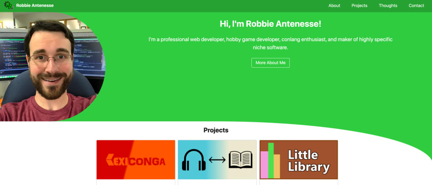
robbie.antenesse.net - In his portfolio, Robbie Antenesse has made "projects" as the second section of his portfolio
My recommendation is to either highlight your specific skills in the "about me" section or even better - make "projects" content block appear before the "about you" one.
3. Minimal, original, or both?
Regarding design and UX, it's important to make a conscious decision - how do you want your portfolio to look like?
If you're less experienced in web design, my recommendation is to go with something simple and functional. Do not use more than 3 main colors, have maximum of 2 different fonts, and keep the content straight-to-the-point.

codewithghazi.com - Code With Ghazi is a good example of a simple, yet a bit different design
Once you've got more experienced with web design, you start to notice what are the good UX and design patterns. That is when originality and creativity can be brought in.
4. Less is more
As with coding, sometimes the simplest design/UX solutions are also the best.
It's especially important to keep in mind when adding animations. Having lots of interactivity and flashing elements on a page can seem cool, but from the UX perspective, it's usually not that good.
My recommendation is to keep things simple and really think if the elements and animations on your page do add any value.
5. Think about what is the first thing people should notice?
It takes less than one second to make up your first impression on the page.
That's why it is super vital to analyze what you want people to notice the first on your page. Is it your name? Is it your skills? Or some animation?

abdessalam-benharira.me - Abdessalam's page highlights the author's passion for web and UI/UX design
As for developer portfolios, my recommendation is to focus on your name + skillset or some nice slogan that gives away you're a developer.
6. Percentages and skill-bars tell me nothing
This is something I loved to do when I started web development - use percentages to display my skills in various technologies.
In reality, having your skills described using percentages or progress bars does not add any value. No one knows what does it actually means. By saying you have "100% skills in Javascript" it would leave the impression that you're the best JS developer in the world. Probably that's not the case.
If you do want to add some numerical value to your skills, use the number of years or projects. These metrics are universally understandable.
7. Do not make me click
A simple yet effective UX rule to keep in mind - reduce the number of clicks.
Each click on your website should have a meaning.
Eg when you have an "about me" link in the main navigation, it should direct me to a section where I can read about you.
There were a couple of cases where I clicked on a link only to be navigated to a section where another click was needed to see the actual content. It frustrating and increases the rate of churn.
Remember to think about it when adding navigations/links.
8. Make it easy to contact you!
Your portfolio is about showing your skills and projects. But do not forget to make it EASY to contact you.
My recommendation is to bring out your email or social media links in both the header and footer.

jamesjacobthomas.com - The author has made social icons fixed on the page
I also liked some of the portfolios that had made their social media icons fixed when navigating the page - that way it was super convenient to contact the authors of the page.
9. Run Google Lighthouse to find the simplest mistakes!
Most of the portfolios I reviewed were in really good shape. How do I know? By running Google Lighthouse.
Google Lighthouse is a tool in Chrome browsers that gives you ACTIONABLE info about your site's performance, usage of best practices, accessibility, and SEO.
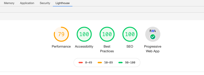
The performance of that page could be improved a bit
Some of the cases where Lighthouse can be really helpful in terms of feedback:
- you need to improve the SEO
- your page performance can be improved by optimizing the images
- the accessibility is not great
So next time before hitting the "deploy" button, do run the Google Lighthouse report.
And these are my main tips for developers regarding building a better portfolio!
I'm genuinely thankful for all the people who submitted their portfolios and also the feedback you provided.
Do you have any points you think I missed?
The reviews are visible in this Youtube playlist:
https://www.youtube.com/watch?v=mX_LrXEUecc&list=PL4gMAGIXQXfvRWZt2n1u_jLwSGd-Ogvi4
Oh and...! If you are interested in coding, growth mindset and are willing to share your experiences, ideas, then please do PM me on Twitter :)!
DeveloperHabits
📷 Youtube: developerHabits
👉 Twitter: https://twitter.com/developerHabits
👉 IG: https://www.instagram.com/developerhabits


