 Lakshmanan Arumugam
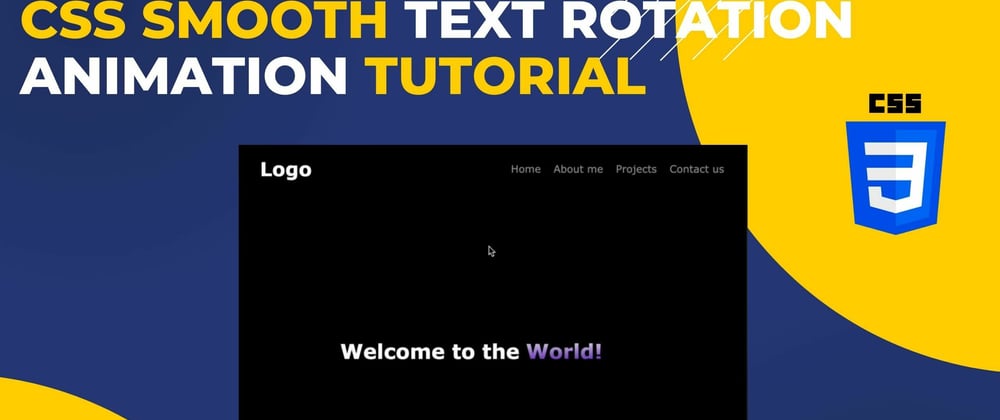
In this comprehensive CSS smooth text rotation animation tutorial, you'll learn how to create eye-catching text rotation effects for your website. We'll walk you through the entire process step by step, so whether you're a beginner or an experienced web developer, you'll find value in this tutorial.
Key Topics Covered:
✅ CSS3 keyframe animations
✅ Creating a seamless text rotation effect
✅ Transition timing and easing functions
✅ Tips for optimizing web typography
HTML and CSS Code:
<html>
    <head>
        <title>Text animation - part 2</title>
        <style type="text/css">
            body {
                background-color: black;
                color: white;
                font-family: Verdana, Geneva, Tahoma, sans-serif;
            }
            .header {
                display: flex;
                align-items: center;
                padding: 40px 28px;
            }
            .brand {
                flex: 1 1 auto;
                font-size: 30px;
                font-weight: bolder;
            }
            .navigation {
                list-style: none;
                margin: 0;
                padding: 0;
                display: flex;
                flex-basis: 80%;
                text-align: right;
                gap: 20px;
            }

            .navigation > li {
                align-items: center;
            }

            .navigation > li > a {
                color: #999;
                cursor: pointer;
            }

            .navigation > li > a:hover {
                color: white;
            }

            .main-section {
                display: flex;
                align-items: center;

                justify-content: center;
                height: calc(100% - 120px);
            }

            .context-content {
                display: flex;
            }

            .running-text {
                list-style: none;
                margin: 0;
                padding: 0;
                margin-left: 10px;
                height: 40px;
                overflow: hidden;
            }

            .running-text > li {
                display: block;
                animation: change 10s infinite;
                transform: translate3d(0,0,0);
            }

            .running-text > li > p {
                margin: 0;
                padding: 0;
                background: -webkit-linear-gradient(#eee, #6d37c5);
                -webkit-background-clip: text;
                -webkit-text-fill-color: transparent;
            }

            @keyframes change {
                0%, 13%, 100% {transform:translate3d(0,0,0);}
                18%, 28% {transform:translate3d(0,-97%,0);}
                35%,46% {transform:translate3d(0,-200%,0);}
                50%,65% {transform:translate3d(0,-97%,0);}
                72%, 100% {transform:translate3d(0,0,0);}
            }
        </style>
    </head>
    <body>
        <header class="header">
            <div class="brand">
                Logo
            </div>
            <div>
                <ul class="navigation">
                    <li>
                        <a>Home</a>
                    </li>
                    <li>
                        <a>About me</a>
                    </li>
                    <li>
                        <a>Projects</a>
                    </li>
                    <li>
                        <a>Contact us</a>
                    </li>
                </ul>
            </div>
        </header>
        <main class="main-section">
            <h1 class="context-content">
                Welcome to the
                <ul class="running-text">
                    <li>
                        <p>World!</p>
                    </li>
                    <li>
                        <p>Developers!</p>
                    </li>
                    <li>
                        <p>Everyone!</p>
                    </li>
                </ul>
            </h1>
        </main>
    </body>
</html>
If you found this tutorial helpful, please give it a thumbs up 👍 and follow 🔔 to our page for more web development tutorials.
Feel free to ask any questions or share your thoughts in the comments section below. We appreciate your feedback and suggestions for future tutorials.
That's all and Thanks for reading my article.
Stay Updated with Our Latest Content!
If you found this article informative and valuable, consider subscribing to our YouTube channel for more insightful content, tutorials, and updates. By subscribing, you'll stay up-to-date with the latest developments in web development, technology, and much more.
Don't miss out on the opportunity to expand your knowledge and skills. Join our growing community of learners and enthusiasts today!


