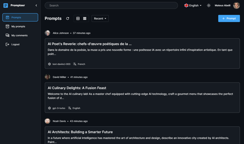
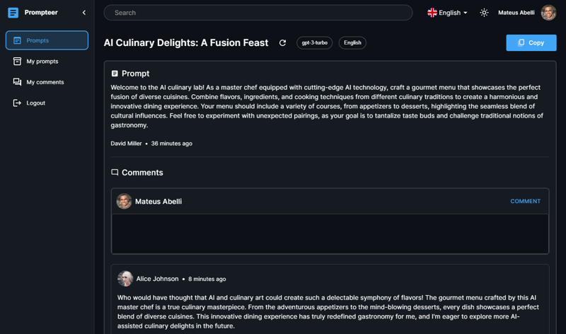
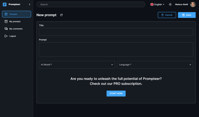
🧪 What I built
I built a prompt sharing platform where users can share their AI prompts and receive comments
🥗 My recipe
- nextjs, because a great SaaS needs server side rendering
- typescript, to stay safe from the javascript horrors
- next-auth, to make authentication with nextjs nice and easy
- prisma, to make databases best friends with frontend devs
- supabase, to store all the data consumed by the app
- refine, to easily handle and manage the app's CRUD operations
- material-ui, for a streamlined look and feel
🏆 Category Submission:
- Best Overall Project
- Most Visually Pleasing
- Most Technical Impressive
- Best Project built using Supabase as the main data provider for the refine app.
- Best Project built using Material UI as the main UI framework for the refine app.
🔗 App Link
https://prompteer.netlify.app/
🖼 Video demonstration
🖼 Screenshots
📋 Description
Prompteer is a web app that allows you to share your creative AI prompts and receive feedback through comments, you can also comment on other peoples prompts.
In the Free plan you're allowed to publish prompts containing a title, the prompt itself, choose the AI Model and language written. Upgrading your account the Pro plan unlocks additional fields to write your prompts, such as Parameters and Details.
The app uses OAuth (GitHub or Discord) to sign in new users, and when it's their first sign in, the app automatically creates a stripe customer based on the email from OAuth. After a successful login, the user is presented with a dashboard-like experience provided by the refine framework. Most of the content are built upon the framework so the development went way faster than starting from scratch.
🔗 Link to Source Code
https://github.com/mateusabelli/prompteer
📜 Permissive License
- MIT
💭 Background
I watched a tutorial from Javascript Mastery where it showed how to make a similar web app so I wanted to do it on my own, when I started doing the design in Figma I saw the Hackathon and decided to hop try to make this a fully fledged SaaS. Looking back at it, it kind of holds up to my expectations, even though I had to cut a few features due to time constraints.
📚 How I built it
refine was great to provide the dashboard-like experience, and I learned a lot of things, I documented most of my progress in my previous post. The tech stack that I used can be seen at the top. Most of my choices didn't had planned reasons, some of them were to just "work" when something else didn't.


