 Nuno Pereira
In this tutorial you will build a simple, responsive and animated navigation bar with React JS. You will use styled-components for the css and react-springs for the animations.
You can check here the final result of this project.
Styled components is a CSS-in-JS styling framework that uses tagged template literals in JavaScript and the awesome power of CSS to provide a platform that allows you to write actual CSS to style react components. In essence, styled components are easy-to-make react components you write with the styled-components library where you can style your components with plain CSS inside your javascript code and React-Spring is a spring-physics based animation library that should cover most of your UI related animation needs in a very simple way.
Lets start !
I will assume that you have node installed on your computer, you can check it by typing in your terminal :
node -v
if you don’t please install the latest version.
OK, all set now ! You will start a new project using create-react-app so open your terminal and type:
npx create-react-app react-navbar
And add the dependencies you will need during the project
npm install styled-components react-spring
Now open your newly created project with your favorite code editor, go to the src folder and delete app.css, index.css and logo.svg.
Open your index.js file and remove the line :
import “./index.css”
Also open your app.js and clean it up to look like this:
import React from “react”;

const App = () =>  {
  return(
    <div>

    </div>
  )
}

export default App;
In your src folder create a directory named styles with a Global.js file inside it, also in your src folder create a components folder, a sub-folder named navbar and inside this folder create this files: Brand.js , BurgerMenu.js, CollapseMenu.js and Navbar.js.
We will also create a folder named assets in the src folder and we will put a image inside of it, you can download the file from here.
Your project tree should look like this:
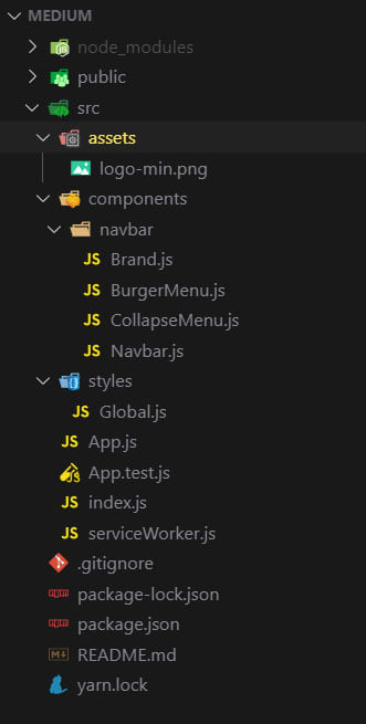
Great, this will be your starting point.
First of all your going to create the global style file using Styled Components, open your Global.js file and add this code:
import { createGlobalStyle } from 'styled-components';

const GlobalStyles = createGlobalStyle`

  @import url('https://fonts.googleapis.com/css?family=Montserrat:400,600&display=swap');;

  *,
  *::after,
  *::before {
    margin: 0px;
    padding: 0px;
    box-sizing: inherit;
  }

  html {
    font-size: 62.5%;
  }

  body {
    box-sizing: border-box;
    font-family: 'Montserrat', sans-serif;
  }
`;

export default GlobalStyles;
Now you will open your App.js file, refactor it to a class component, add the dependencies we will need, add the Global.js and Navbar.js components and the state for the navbar.
import React, { Component } from 'react'
import Navbar from "./components/navbar/Navbar";

import GlobalStyle from './styles/Global';

class App extends Component {
  state = {
    navbarOpen: false
  }

  handleNavbar = () => {
    this.setState({ navbarOpen: !this.state.navbarOpen });
  }

  render() {

    return (
      <>
        <Navbar
          navbarState={this.state.navbarOpen}
          handleNavbar={this.handleNavbar}
        />
        <GlobalStyle />
      </>
    )
  }
}

export default App
Great, before you start working on the Navbar.js component you will deal with the small components, open your Brand.js and make it look like this:
import React from 'react'
import styled from "styled-components";

import logo from "../../assets/logo-min.png";

const Brand = () => {
  return (
    <Image src={logo} alt="Company Logo" />
  )
}

export default Brand

const Image = styled.img`
  height: 85%;
  margin: auto 0;
`;
Now the BurgerMenu.js:
import React from 'react';
import styled from "styled-components";
const Burgermenu = (props) => {
return (
<Wrapper onClick={props.handleNavbar}>
<div className={ props.navbarState ? "open" : "" }>
<span> </span>
<span> </span>
<span> </span>
</div>
</Wrapper>
);
}
export default Burgermenu;
const Wrapper = styled.div`
position: relative;
padding-top: .7rem;
cursor: pointer;
display: block;
& span {
background: #fdcb6e;
display: block;
position: relative;
width: 3.5rem;
height: .4rem;
margin-bottom: .7rem;
transition: all ease-in-out 0.2s;
}
.open span:nth-child(2) {
opacity: 0;
}
.open span:nth-child(3) {
transform: rotate(45deg);
top: -11px;
}
.open span:nth-child(1) {
transform: rotate(-45deg);
top: 11px;
}
`;
Great, now the final to components, first the CollapseMenu.js:
import React from 'react';
import styled from 'styled-components';

import { useSpring, animated } from 'react-spring';

const CollapseMenu = (props) => {
  const { open } = useSpring({ open: props.navbarState ? 0 : 1 });

  if (props.navbarState === true) {
    return (
      <CollapseWrapper style={{
        transform: open.interpolate({
          range: [0, 0.2, 0.3, 1],
          output: [0, -20, 0, -200],
        }).interpolate(openValue => `translate3d(0, ${openValue}px, 0`),
      }}
      >
        <NavLinks>
          <li><a href="/" onClick={props.handleNavbar}>link n1</a></li>
          <li><a href="/" onClick={props.handleNavbar}>link n2</a></li>
          <li><a href="/" onClick={props.handleNavbar}>link n3</a></li>
          <li><a href="/" onClick={props.handleNavbar}>link n4</a></li>
        </NavLinks>
      </CollapseWrapper>
    );
  }
  return null;
};

export default CollapseMenu;

const CollapseWrapper = styled(animated.div)`
  background: #2d3436;
  position: fixed;
  top: 4.5rem;
  left: 0;
  right: 0;
`;

const NavLinks = styled.ul`
  list-style-type: none;
  padding: 2rem 1rem 2rem 2rem;

  & li {
    transition: all 300ms linear 0s;
  }

  & a {
    font-size: 1.4rem;
    line-height: 2;
    color: #dfe6e9;
    text-transform: uppercase;
    text-decoration: none;
    cursor: pointer;

    &:hover {
      color: #fdcb6e;
      border-bottom: 1px solid #fdcb6e;
    }
  }
`;
And finally the Navbar.js;
import React from 'react'
import styled from "styled-components";
import { useSpring, animated, config } from "react-spring";

import Brand from "./Brand";
import BurgerMenu from "./BurgerMenu";
import CollapseMenu from "./CollapseMenu";

const Navbar = (props) => {
  const barAnimation = useSpring({
    from: { transform: 'translate3d(0, -10rem, 0)' },
    transform: 'translate3d(0, 0, 0)',
  });

  const linkAnimation = useSpring({
    from: { transform: 'translate3d(0, 30px, 0)', opacity: 0 },
    to: { transform: 'translate3d(0, 0, 0)', opacity: 1 },
    delay: 800,
    config: config.wobbly,
  });

  return (
    <>
      <NavBar style={barAnimation}>
        <FlexContainer>
          <Brand />
          <NavLinks style={linkAnimation}>
            <a href="/">link n1</a>
            <a href="/">link n2</a>
            <a href="/">link n3</a>
            <a href="/">link n4</a>
          </NavLinks>
          <BurgerWrapper>
            <BurgerMenu
              navbarState={props.navbarState}
              handleNavbar={props.handleNavbar}
            />
          </BurgerWrapper>
        </FlexContainer>
      </NavBar>
      <CollapseMenu
        navbarState={props.navbarState}
        handleNavbar={props.handleNavbar}
      />
   </>
  )
}

export default Navbar

const NavBar = styled(animated.nav)`
  position: fixed;
  width: 100%;
  top: 0;
  left: 0;
  background: #2d3436;
  z-index: 1;
  font-size: 1.4rem;
`;

const FlexContainer = styled.div`
  max-width: 120rem;
  display: flex;
  margin: auto;
  padding: 0 2rem;;
  justify-content: space-between;
  height: 5rem;
`;

const NavLinks = styled(animated.ul)`
  justify-self: end;
  list-style-type: none;
  margin: auto 0;

  & a {
    color: #dfe6e9;
    text-transform: uppercase;
    font-weight: 600;
    border-bottom: 1px solid transparent;
    margin: 0 1.5rem;
    transition: all 300ms linear 0s;
    text-decoration: none;
    cursor: pointer;

    &:hover {
      color: #fdcb6e;
      border-bottom: 1px solid #fdcb6e;
    }

    @media (max-width: 768px) {
      display: none;
    }
  }
`;

const BurgerWrapper = styled.div`
  margin: auto 0;

  @media (min-width: 769px) {
    display: none;
  }
`;
And you are done !
If you don't want to write all this code you can fork the github repo I made for this example.
See you soon for more tips and tutorials !


