 Chiamaka Mbah
Hello everyone. This is my very first article on VueJs. I've been learning Vue for a while now and honestly it has been a bitter-sweet experience for me. I hear people say Vue is easy, yea, it is indeed easy because you feel at home, it's still HTML but with some nice perks and those perks was the bitter part but it's a process so I'm getting there. In this series, all I will be doing is just documenting my learning experience.
On today's episode I will building a full fledged application with a dark mode theme and this is to be sure I really did understand the tutorial I have been on. It's a challenge for me and I'm taking it. This particular article would be in parts because I don't want it so long. I'll just break them into small pieces.
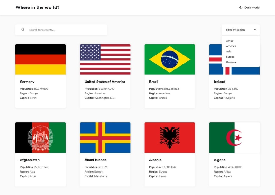
What our final application should look like after we're done:
I am a big believer in writing the actual code than just binge-watching tutorials and not doing anything about them.
I will be building this on codesandbox, of course, you can do this in your IDE after creating a new project in Vue. This tutorial isn't really about how to get started with Vue so I won't be talking about that.
Quick Breakdown
Our app is going to be made up of basically six components which I'll talk about as I progress. They are:
- Header
- Toggle
- Search
- Filter
- Countries
- Country
Project Structure
The image below describes what my file structure looks like. Just create the different files. I'm currently building with Codesandbox, it gives the IDE experience but online. I took out the assets folder since we won't be needing it in this tutorial.

We'll be using the Nunito font, you can copy this link right here and paste in your index.html file, it's found in your public folder:
<link href="https://fonts.googleapis.com/css2?family=Nunito+Sans:wght@300;600;800&display=swap" rel="stylesheet">
Let's begin building out our different components.
A quick one before I dive in. I'll just do a layman explanation of what a component is for my friends who hail from Vanilla JS.
A component is a small, reusable part of an application whether big or small.
Before the advent of frameworks like Vue and the rest, we wrote lots of beautiful HTML for large applications which I must confess can go from mildly confusing to seriously annoying. Why write 50,000 lines of code when you can break them into small pieces and bring them all together into one root element which now represents the whole app? Hopefully, that made sense.
So now, let's dive right in!
Header Component
This component represents our header. It will be holding one component which in this case is the Toggle component.
<template>
  <div class="Header">
    <h2>Where in the world?</h2>
  </div>
</template>

<script>
  export default{
    name: 'Header'
  }
</script>

<style>

  .Header{
    display: flex;
    justify-content: space-between;
    align-items: center;
    padding: 16px 25px;
    background: #ffffff;
    color: #192734;
    box-shadow: 0 0 5px rgba(0,0,0,0.4);
  }

</style>
After adding the styles, import the component into the root component which in this case is our App.vue file. Our app should come alive by now.
Content Component
This component would have three components (country, search and filtersearch) which will be referenced in our components property. Components property is a vue feature that allows a component keep track of all components imported into it.
<template>
  <div class="Content">
    <!-- Country component -->
    <!-- Search component -->
    <!-- Filtersearch component -->
  </div>
</template>

<script>
  export default{
    name: 'Content'
  }
</script>

<style>
  .Content{
    padding: 25px 30px;
    background: #f5f5f5;
    height: 88vh;
  }
</style>
Toggle Component
This component is responsible for the toggle action between dark and light theme when we implement our dark mode feature.
I will be using Font Awesome for my icons, use whatever font icon you love.
  <template>
  <div class="Toggle">
    <button>
     <i class="fa fa-moon-o"></i>
     <span>Dark Mode</span>
    </button>
  </div>
</template>

<script>
  export default{
    name: 'Toggle'
  }
</script>

<style>
  .Toggle{
    color: #197432;
  }

  button{
    background: none;
    outline: none;
    border: none;
  }

  button span{
    font-weight: 600;margin-left: 6px

  }

</style>
Then, import your Toggle component into your Header component and you'll be good.
Now, this is what our root component (App.vue) should look like after importing our Header and Content components. You don't see the Toggle component here because it is a small piece attached to the Header component, in this case, it is a child of the Header component.
<template>
  <div id="app">
    <Header/>
    <Content/>
  </div>
</template>

<script>
import Header from './components/Header';
import Content from './components/Content';

export default {
  name: "App",
  components: {
    Header,
    Content
  }
};
</script>

<style>
*, *::before, *::after{
  margin: 0;
  padding:0;
  outline: none;
  border: none
}

#app{
  font-family: 'Nunito Sans', sans-serif;
  min-height: 100vh;
}
</style>
I'll stop here, then tomorrow, we'll move on to creating the rest of the components. This is what our app looks like: https://12oqz.csb.app/
Be creative with yours, musn't look like mine. Till tomorrow. Byeee!


