Not all web developers are good at design, and that is OK! In the real world, you will often work with a designer on your team to convert their designs into real, responsive websites anyway.
With that said, to get a web developer job, you’ll need your portfolio to stand out and look good. Collaborating with a designer isn’t usually an option at this stage, so what do you do?
Templates are great in a pinch, but it might be a bit awkward if two candidates apply with the same template 😬.
This leaves the question as to what to do if you’re not keen on a generic template but don’t have much design practice either 🤔.
The trick is to keep it minimal and iterate!
Remember, the most important thing about your project portfolio is your projects.
While the design should be pleasing, it should also get out of the way. You can always add pizzazz later 🕺🏻!
To help you build a minimal, effective portfolio, we’ve curated 10 minimal web developer portfolio examples for you to learn from.
Look out for the 🎨 design tips sections where we highlight some of the basic design principles you can specifically notice!
Obviously, these creators wouldn’t like it very much if you copied their designs exactly (don’t do that 🙅🏻), but let them be your inspiration! It’s not uncommon for new creatives to mix and match their favorite 3-4 works to make something unique.
Delba De Oliveria
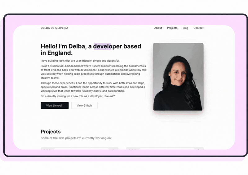
Delba’s project-based portfolio is remarkable. She even made a YouTube video about it!
Understandably, Delba has since updated her website to be more focused on her blog, so the live version looks a bit different today (still looks great.) Make sure to check out the original, minimal-looking version by flicking through the video.
🎨 Design tip: Even though Delba’s website is fairly minimal, she sparks joy in the user with delightful highlighter animation using a JavaScript library called Rough Notation.
Alex Pate
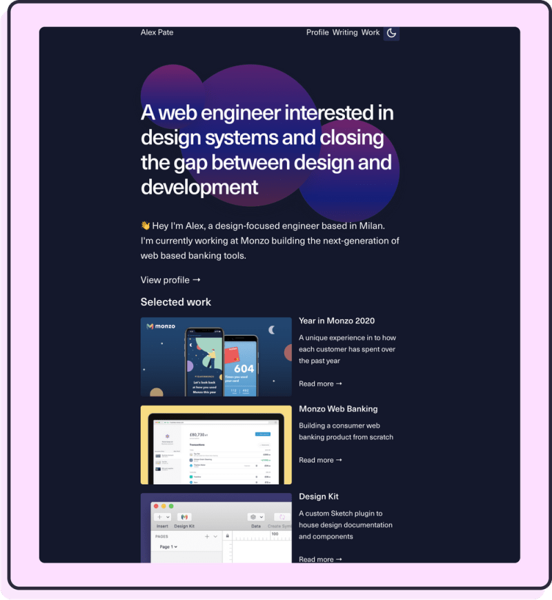
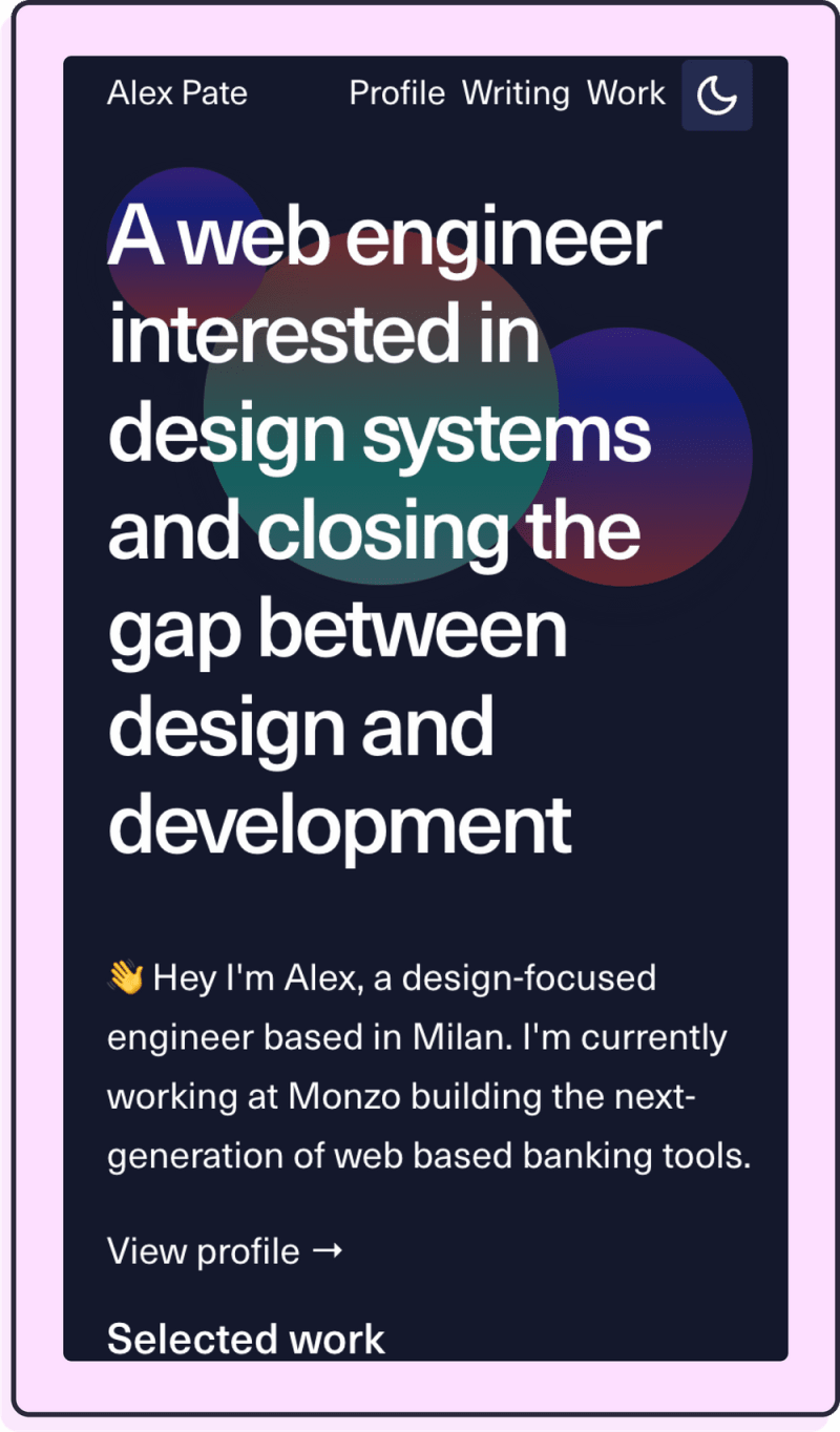
Notice how Alex uses a fairly narrow single-column layout and lists only a few menu items at the top. This removed the need to collapse columns or introduce a hamburger menu on mobile, allowing Alex to ship his website sooner.
The Selected Work section, though minimal, is beautifully designed and effective:
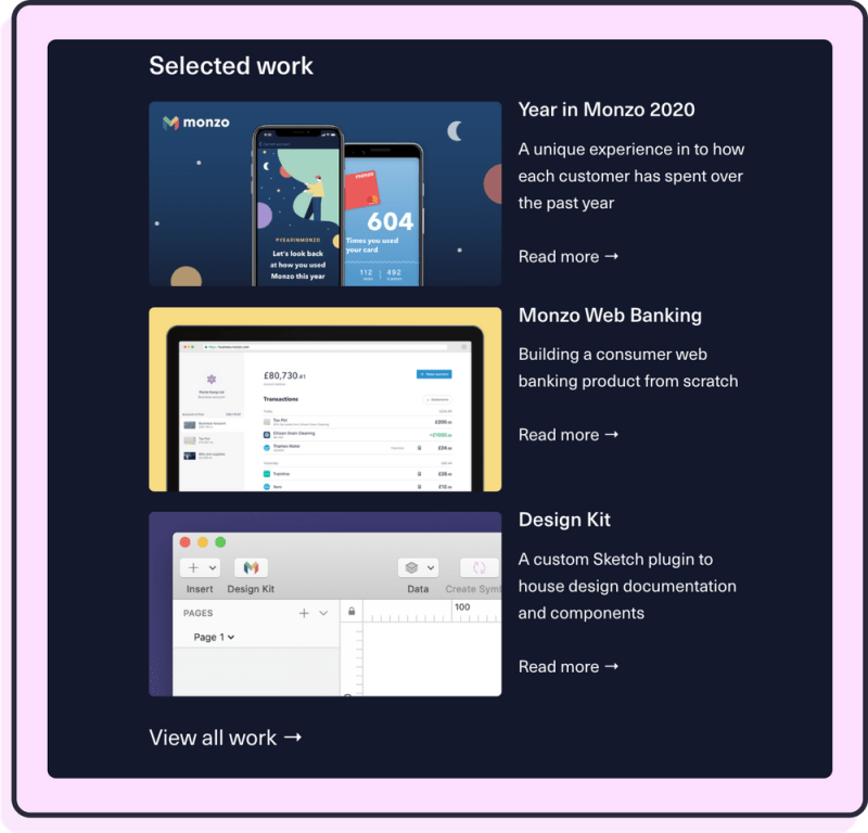
Alex understands someone looking at a portfolio is probably browsing and too many options is overwhelming. He makes it easy by showcasing only his 3 most recent works. For everything else, you can click View All Work →.
🎨 Design tip: Through introducing borders in the project screenshots, Alex introduced a pop of colour, while also making the design breathable.
Lee Robinson
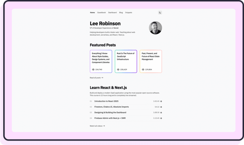
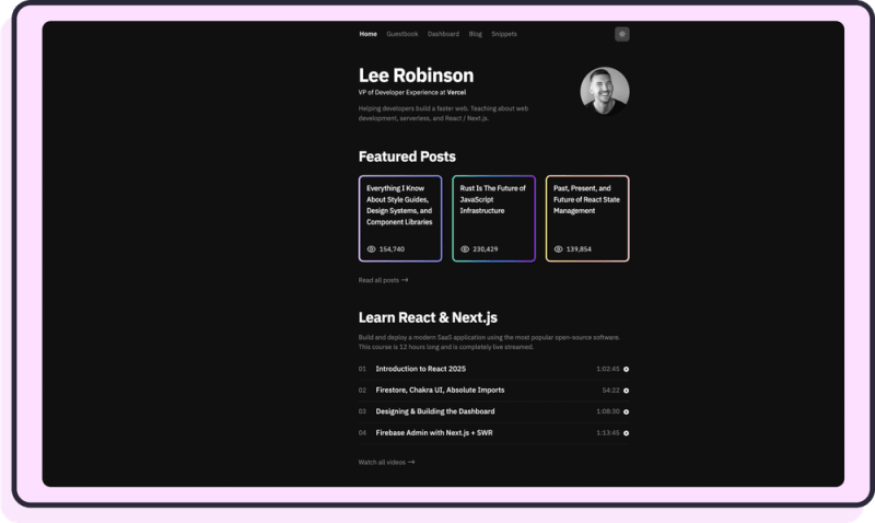
🎨 Design tip: Because the background and Lee’s photo are grey, the gradient really pops!
Franklina Amoah

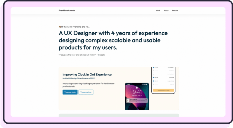
Notice how when you press View case study, Franklkina links to a PDF. This is extremely smart because it saves time and allowed Franklina to put her portfolio in front of employers sooner.
Brian Lovin
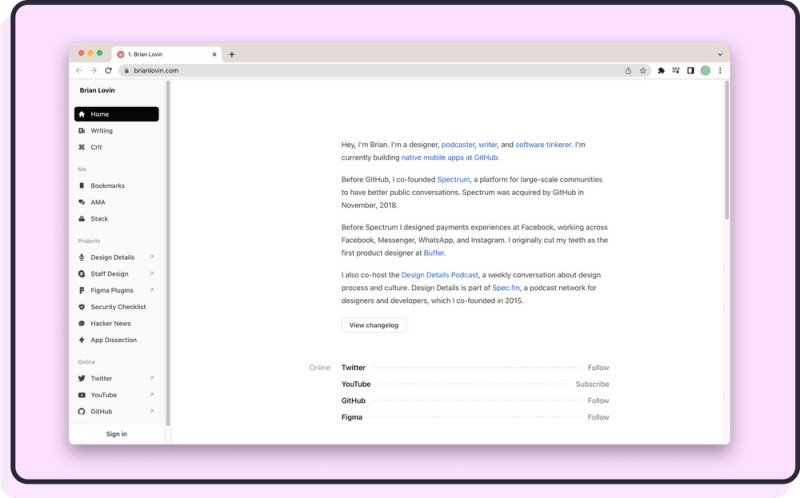
Brian takes a novel approach to a personal website with this Wiki-style navigation.
🎨 Design tip: Using an icon pack is a great way to introduce consistency regardless of your design skill.
Justin Chi

Smart idea to express your personal information in code!
🎨 Design tip: Minimal doesn’t necessarily mean black and white. Justin uses a muted, pastel-y colour scheme to great effect.
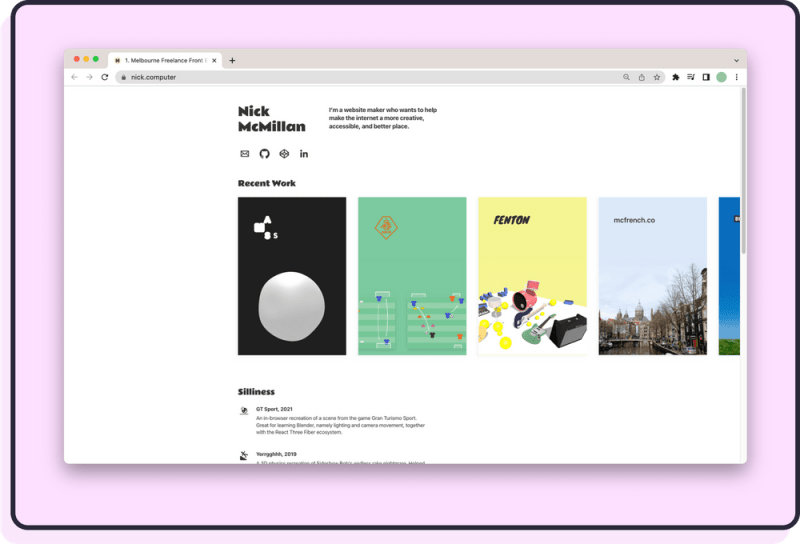
Nick McMillian
Darius Foroux

Ah, you got me! Darius is a writer, not a developer but his website is a great example of getting out of the way of the important stuff.
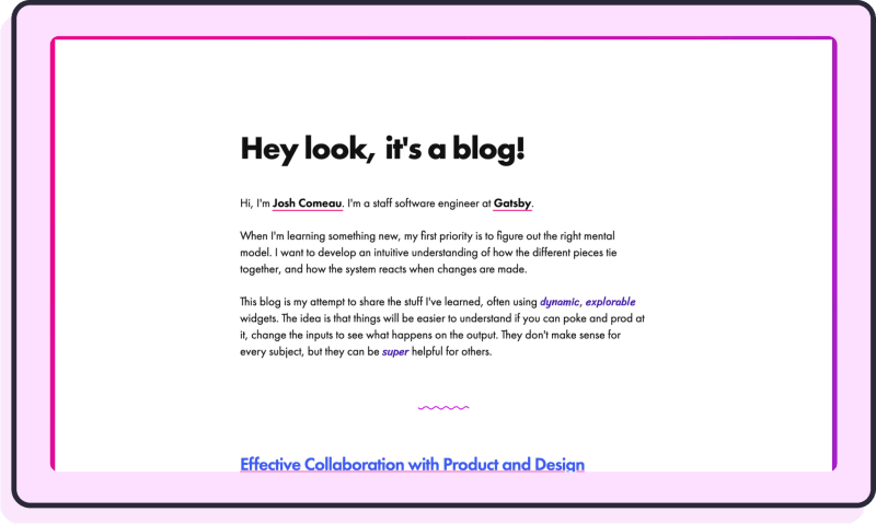
Josh Comeau

Josh’s portfolio is not quite as minimal as the others, but it deserves an honourable mention. After all, the idea for this post was sparked during our conversation on The Scrimba Podcast.
It has delightful interactions:
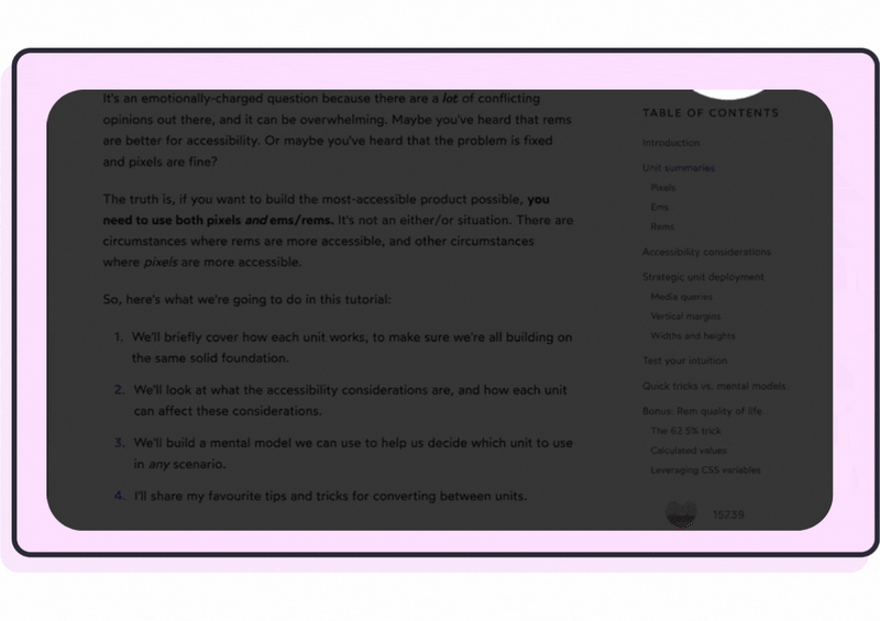
Josh wrote all about how he built his blog here, and includes screenshots of his previous iterations, which aren’t quite as polished:
Coner Dewey
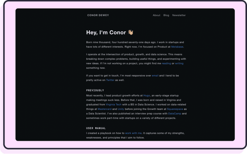

While Coner’s homepage puts an emphasis on blogs, the “recent posts” section could be repurposed to feature projects.