
 Shubham Jain
Highlighting text in the copy is a great way to draw attention to certain phrases in a relatively long text. And there's an even better way to make it more effective: make the highlight look like it's actually marked. An example can be seen on Hotjar's landing page.

I run a side-project called SVGBox, where I offer the simplest way to start using icons. Recently, I added pen-burshes iconset, and using that you can create the same effect by using the brushes as background images and customizing the fill color. Let's see how:
Creating the Marker Effect
I'll use the brush-1 to create the simplest effect possible.
<style>
    .highlight {
        background: url(//s2.svgbox.net/pen-brushes.svg?ic=brush-1&color=ffff43);
    }
</style>

<div>
    This is a <span class="highlight">
        highlighted part
    </span> of the text
</div>
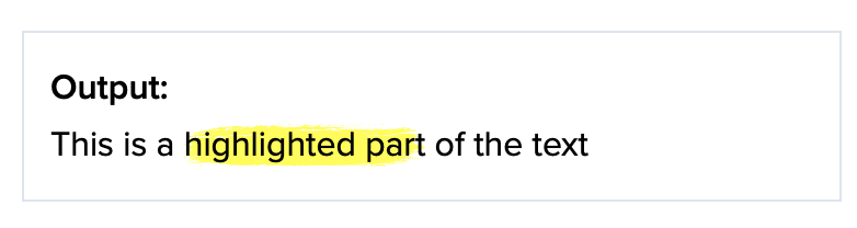
This looks decent but the highlighted background could be positioned and sized better. It should stretch on both sides, and a little bit on the Y-Axis as well.
<style>
    .highlight {
        background: url(//s2.svgbox.net/pen-brushes.svg?ic=brush-1&color=ffff43);
        margin: -2px -6px;
        padding:  2px  6px;
    }
</style>

<div>
    This is a <span class="highlight">
        highlighted part
    </span> of the text
</div>

This looks much better and is already pretty usable. You can also experiment with different colors. I really like using HSL color format here, since I can adjust lightness much more easily. SVGBox supports the most common color formats, making this process easier.
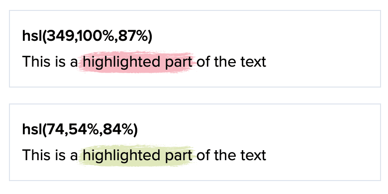
And also different brushes:

And that's it, a really easy way to add this effect to your web page.


