
 Tomasz Łakomy
Before we start - I'm working on https://cloudash.dev, a brand new way of monitoring serverless apps 🚀. Check it our if you're tired of switching between 50 CloudWatch tabs when debugging a production incident.
Last decade, I've tweeted this "free interview question":
Free interview question:
Name all CSS attributes
Bonus points for alphabetical order17:06 PM - 30 Dec 2019


After a short while Tejas created a tool that allows you to list all CSS properties in your terminal (should you ever need to do that for some reason):
18:03 PM - 30 Dec 2019Tomasz Łakomy @tlakomyFree interview question: Name all CSS attributes Bonus points for alphabetical order

Apparently there are some CSS properties out there that I had absolutely no idea about, let's go through some interesting examples:
1. azimuth
azimuth property allows (or rather, allowed, since it's deprecated now) for different audio sources to be positioned spatially for aural presentation.
Wait, audio sources in CSS?
That's correct, apparently you can use azimuth and elevation to control where the audio comes from when users have audio equipment that can handle it. If anyone reading this actually did an experiment like this, please let me know in the comments - I'd love to hear more!
Syntax:
<angle> | [ [ left-side | far-left | left | center-left | center | center-right | right | far-right | right-side ] || behind ] | leftwards | rightwards

Source: MDN
2. bleed
What is this, Twilight?
Not really, bleed is an experimental technology which specifies the extent of page bleed area outside of the page box when printing a document.
Not that useful for Web Design, but may come in handy when your users end up printing documents on a physical paper (invoices, bills etc.)

Source: CSS tricks https://css-tricks.com/almanac/properties/b/bleed/
3. caret-color
This one is actually kinda useful.
A caret is what smart people call the blinking cursor when appears when you try to type something in an input (for instance, when writing a blog post)
Once you notice it's blinking all the time you cannot unsee it
caret-color allows Web Developers to control its color
Syntax:
caret-color: auto;
caret-color: transparent;
caret-color: #123456;
I'm not an accessibility expert, but transparent doesn't seem like a good idea so maybe don't use it.
Magenta looks pretty neat though:
4. ::cue
It's possible to add track tags to video elements on a page, which is useful when you'd like to add subtitles to your video for folks who either don't speak language the video is recorded in very well or have some sort of hearing impediment.
If you'd like to style those captions, this is where the cue pseudoelement comes in. Quoting MDN:
The ::cue CSS pseudo-element matches WebVTT cues within a selected element. This can be used to style captions and other cues in media with VTT tracks.
Syntax:
::cue {
  color: yellow;
  font-weight: bold;
}
5. hyphens
This one is for my German friends.
If your text has extraordinary verbose words and phrases sometimes the content may end up overflowing the container which looks... suboptimal.
A hyphens property allows you to turn this:
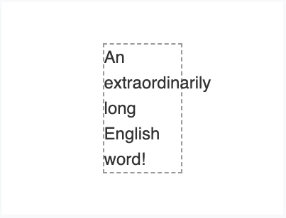
into this:

Source: MDN
The - thingy is called a hyphen and the rules when it can be applied are language specific (you'd split the words differently in English and Hungarian for example).
Huge shout-out for Firefox team because currently they seem to be the only ones to support ALL dictionaries available on the Web.
Syntax:
hyphens: none;
hyphens: manual;
hyphens: auto;
6. will-change
The vast majority of CSS properties are for users, to enhance their experience on the Web so everything is not black text on white background etc.
will-change is different - this property is actually for the browser.
The idea is that will-change is meant to tell the browser how an element is expected to change. For instance you can inform Chrome that the opacity of the element will change at some point and as a result the browser can set up optimizations before an element is actually changed.
Bear in mind that this should be used as a last resort (Papa Roach would be proud), browsers are already doing what they can to optimize everything and by overusing this property you may cause your site to actually be slower.
Syntax:
will-change: auto;
will-change: scroll-position;
will-change: contents;
will-change: transform;        /* Example of <custom-ident> */
will-change: opacity;          /* Example of <custom-ident> */
will-change: left, top;        /* Example of two <animateable-feature> */
7. flex
Oh come on, no one is able to use flex in a meaningful way without opening this (excellent, by the way) CSS Tricks article
Whew, I've learned a lot writing this! Are there any interesting, unique properties I've missed? Feel free to reach out to me on Twitter


