
Heat maps, what are they? Using a color-coding system that represents different values, heat maps are graphical representations of data. They are used in various analytics but are most commonly used to show user behavior on a specific webpage template or certain web pages, and this article will explain how to produce and use them.
Session Replay for Developers
Uncover frustrations, understand bugs and fix slowdowns like never before with OpenReplay — an open-source session replay suite for developers. It can be self-hosted in minutes, giving you complete control over your customer data.

Happy debugging! Try using OpenReplay today.
What are Website Heat Maps?
The information derived from heatmaps helps set up a website in a more user-friendly way. A heat map allows web designers and marketers to visualize how customers and prospects interact with the applications. They, moreover, highlight the most paid attention to by visitors.
Website heat maps aggregate user interactions of a particular kind; for instance, it could measure where users hover their mouse, what they click on, and so on. An area that receives a significant number of clicks or scrolls or mouse hovers gets a warmer color, like orange, red, or white. Areas that receive less attention are usually colored blue or green.

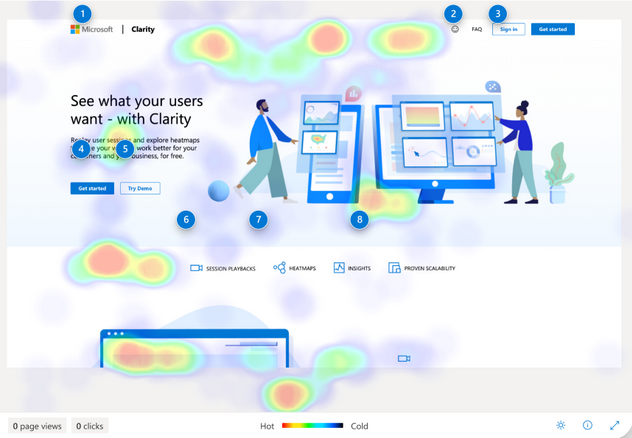
Another example from Microsoft Clarity

Different Types of Heat Maps
Although different kinds of heat maps are trending among website optimization these days, heat map guidelines that are easy to understand have become necessary. There are different types of heat maps with different uses and use scenarios. How web pages are constructed, the means of convertibility and visual style evolve constantly based on available technologies, ongoing trends, and user behavior.
Combining and using different heat maps helps design and build the webpage as best as possible. The following are the various kinds of heat maps.
Click heatmaps
Click maps help see if visitors click where you want them on the landing pages. This kind of map, moreover, will showcase the overall aggregate of the area where visitors click their mouse or tap their fingers on mobile devices or desktops. Gathering clicking data on navigation and on CTA buttons is just a one-use case of click heat maps. You could also see clicks on objects that are not clickable. If people think or expect a link on a text or image, they will click on it, and you can see this on a click map.
When you find something people want to click on but not a link, the best thing to do is turn it into a link or redesign it to appear clickable. Click maps are highly recommended to maximize the user experience. With the click heat maps, you cannot see the mouse movements, but you get to see the pattern the visitors perform with their click patterns—the traditional Z and F patterns.

Scroll maps
A scroll map shows visually how far users scroll down a web page, whether using a desktop, mobile phone, or tablet. A scroll heat map uses color to represent the most and the least viewed parts of a page, from hot or popular to cold or unpopular. Users engage with the color red the most on a product page. Blue, on the other hand, represents low or even no customer interaction at all.
A scroll map records the scrolling behavior of users, which helps you to see where exactly they scrolled on the page. This kind of heat map indicates whether the page length is ideal for user experience or otherwise. In general, they are used for long-form sales pages.

Mouse movement heatmaps
A mouse movement heat map visually represents a visitor's mouse movement data using thermal imaging. Furthermore, it records where users click, hover, scroll, and pause through the web pages. Often, it’s referred to as a mouse-tracking heat map, hover map, attention map, or move map.
By leveraging this type of heat map, you can identify hover patterns, which could help discover places of high reading struggles and visitor frustration. These insights are particularly useful when you are looking to optimize complex web pages made up of images, text, different dynamic elements, and so on. Analyzing the mouse map helps you decide where you should tweak your design.

Benefits of Using Website Heat Maps
With advanced settings, a heat mapping tool could build users’ behavior data on-site, which could be used in analyzing their intent. Heat maps make otherwise impenetrable or dull data understandable. Many people intuitively understand heat maps without being told that the warm colors indicate a denser interaction focus.
More people from an organization could understand the interaction of users with a web app by making data science available in this manner. Indeed, using heat maps is rewarding. A bar graph uses height and weight, but a heat map uses color for its data analysis. Check out the following advantages of using a heat map.
- Provides an instant overview of key web performance parameters. Although other analytics have strengths, heat maps draw instant attention to major website issues. Furthermore, they reveal the clicking patterns of users, expose the average page visibility, and show which parts of the website are most engaging to users. Heat maps add considerable speed to the journey of the problem solver. They reveal the countries or territories where there are good conversions and where there are not instantly. Simply put, heat maps at a glance will inform you what’s working and what needs to be addressed.
- Make it easier to learn from users to build a more user-friendly web design. An effective web design does not happen easily. Anyone good at his/her hobby or job will tell you the long hours they spent learning along the way. When it comes to website design, learning from the users is paramount. Heat maps could help you understand what the audience does and doesn’t do as they respond to your web designs. The navigational patterns of users on a website could be deemed unfiltered feedback. With heat maps and A/B testing, you can make our design predictive without being presumptuous.
- Heat maps provide a visual approach to understanding numeric values. They say that a picture is worth a thousand words. On the other hand, a single heat map could be worth a thousand numbers. While heat maps are as accurate as spreadsheets, they offer undeniable advantages to the rows and columns of numbers in Excel. Viewing data in a properly configured heat map will quickly reveal the problematic click rate because of a link hidden in other misleading elements. Also, a high bounce rate could be explained by a low-visibility page. Heat maps are invaluable because they can conceptualize patterns and data, which makes it easier for analytics specialists and designers to converse with commercially focused clients by showing them easy and clear results.
- Complement other tools in the analytical toolkit. Undoubtedly, heat maps are unique and provide answers that no other tool can. Nonetheless, they don’t have all the answers all the time. A heat map should be considered as another tool in the toolkit that works best along with other tools. When complemented with session replay, you could see your user activity the same as a movie—one you could rewind as you wish and learn from. Furthermore, filters enable you to zero in on particular users. For instance, returning visitors who browse on tablets. The feedback from users tells you in no uncertain terms how users feel about your website and the problems they met along the way.
- Heat maps point to interesting issues. Sometimes, heat maps feel like they’re not offering the answers you want or even add a complicated layer to what you perceive as a simple issue. You could look at dispersed clicks, multi-colored splotches, or cold spaces above links that lead to high view count pages. This could be confusing from time to time, but it's a good thing. UX design can be complicated, and so are people. Heat maps become the opportunity to dig into the content of your website or tricky design problems. This also puts much emphasis on the importance of heat maps when used in combination with other tools.
How to use Heat Maps
Heat maps are invaluable to see what actions users take on your web page and which page elements could engage them. Moreover, they help optimize the conversion journey by building landing pages that engage users successfully. The data derived from heat maps could be used for the following:
- Track visitor behavior The main purpose of creating heat maps is to track visitor activity. The analysis gathered by the heat map helps you understand why visitors are behaving in the way they do on the web pages. Moreover, heat maps explain what occurs when a user comes on the page, where they do or don’t click, and what they read and do not read.
- Optimization of the conversion rate Conversion rate optimization ensures that the marketing funnel successfully works by converting leads to customers with the help of various optimization processes. The processes could include A/B testing, usability tests, boosting on-page experiences, etc. The insights gathered from heat maps could be used to run A/B tests based on real data rather than hunches.
- Make UX decisions Another use of heat maps is to make UX or User Experience decisions on the landing pages. Rather than making assumptions about how visitors see the landing page, you could gather real-time data on the on-page user experience. The data helps you build a landing page with a great user experience.
Now, let's consider several different Heat map tools.
HotJar

The tool has powerful heat maps to understand user behavior. It helps you see what they do after landing on the web pages based on the adjustments you make on your front end. Primarily, it has a color representation of the web elements based on user interaction.
The tool helps web owners determine details of a thing or things that struck a chord with users and help them comprehend the part of the website that’s not so clear to them. It lets you install unlimited clickable heat maps.
Features of HotJar
- Heat maps: This visualizes user behavior and has a brilliant heat mapping feature. It’s the unique go-to feature that most people use the tool for. HotJar creates heat maps that highlight the most and least active areas of your website realistically.
- Surveys and User Feedback: With HotJar, you can access a couple of main features—surveys and feedback widgets. They share the same goal of gathering feedback from customers. Moreover, the feedback widget is a five-level, seamless emoticon satisfaction rating that you could implement on certain websites or product pages.
- Screen Recordings: This feature lets you see actual user interactions. When you install the tracking code, it collects screen recordings of individual website visits. Furthermore, it could detect and highlight things, such as inactivity, engagements, U-turns, and so on, and rank them by relevance, etc.
- User Interviews: The feature is the latest HotJar addition. It’s still currently in beta. The feature aims to directly connect you with website or product users to help you learn more about their expectations and needs. This feature helps to monitor how people use a web-based product, such as a CRM rather than a website.
Take a look at an example of Website Heatmaps from Hotjar:

Another Example of Scroll Website HeatMaps from Hotjar:

Crazy Egg

This tool provides a comprehensive look at user behavior. For instance, the confetti heat map lets you drill down to individual clicks visitors make and segment them using various metrics. The granular user activity level enables you to help customers navigate your web page better.
Features of CrazyEgg
- Recordings: One feature that makes Crazy Egg different from other web analytic tools. With this tool, you can harness the power of standing right beside people when using your website virtually. The audio-visual approach makes work much faster and more efficient.
- Heat Map: The heat map is one of the major features of Crazy Egg. However, this is not the sole data visualization report you get from this tool. Various other tools, such as confetti reports, scroll maps, and overlay reports, could be used to get the best visual data possible. Furthermore, the tool quickly analyzes what’s working and what’s not.
- Error Tracking: You can track exactly when a visitor experiences an error with the automatic detection tool. If you think that website errors are impacting a website's conversion rate and your business, this tool is perfect for you.
- Traffic Analysis: This is another feature that should be mentioned regarding traffic analysis. With this tool, you could understand traffic insights much better. You can also compare the traffic and other related metrics since all the related data are organized.
An example of ScrollMap from CrazzyEgg:

Another Example of Website HeatMaps from CrazzyEgg:

Mouseflow

A behavioral analytics tool that allows you to make decisions by providing visual analytics and heatmap reports. Mouseflow helps track mouse movements, clicks, and scrolls on the website and records the visitor sessions of a website.
Features of Mouseflow
- Session Playback: The feature is useful to record all visitors' activity on the client's website. It showcases the limited number of playbacks of the sessions based on your chosen plan. Furthermore, page-to-page tracking enables us to follow the movement of every visitor within the website.
- Funnels: The tool lets you create reports to determine visitors throughout the journey and allows you to watch visitors' sessions rather than drop out. This helps boost the website's performance and show how visitors browse from one page to another.
- Heatmap: The tool offers five heat maps to track website visitors' behaviors. Moreover, they’re movement heatmap, scroll heatmap, click heatmap, attention heatmap, and Geo heatmap.
Take a look at an example of Live heatmaps from Mouseflow:

VWO

The tool helps keep track of the website, what captures one’s attention, and the elements that distract them. Moreover, the outstanding user interaction visual representation of the website makes it easy for users to identify strategic points for digital business.
Features of VWO
- Hypotheses: Let you manage and prioritize testing ideas in the same way as the Growth Method and other growth marketing platforms. You could build a hypothesis to describe a change proposed and the possible impact of the web conversion change.
- Observations: An area to gather and manage observations and insights. Observations are the things you’ve experienced or seen that could help you boost the website or the app experience. Furthermore, observations could be tested by making a hypothesis.
- Ideas: This feature includes Case Studies, Ideas Gallery, Articles, and Resources. Currently, there are 66 filterable ideas by, for instance, time of implementation, industry, and element tested.
- VWO Chrome Extension: The main function of this VWO Chrome Extension is the ability to add observations from anywhere. If you notice something interesting on your site, make a quick note and build an observation, which could be saved along with a page screenshot and referred to when needed.
Example of Website Heatmap from VWO:

Conclusion
In this article, we have learned more about website heatmaps and their different types. Website heatmaps can help solve complex problems like conversion rate optimization, user behavior analysis, and more. We have also learned about the different tools available and their features. You can choose from the different options according to your requirements. A disciplined approach to incorporating data sets into your strategy can greatly boost your return on investment.


