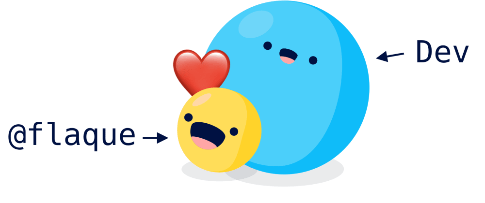
I don't mean to pick on Dev. I like Dev.
I'm a lurker and I've only written one post on here before, but trust me, we're best friends.
But this article is hard to read. As someone who primarily reads, you can see how this could be a problem for our continuing friendship.
Computers are rectangles we tricked into thinking
When designing articles to be read on the interwebs, we run into a fundamental problem with computers. Our screens are rectangles. Our laptop screens in particular, are rectangles that got turned the wrong way.
We can't all be that dude in the office with a vertical monitor for important code reasons.
Part of designing a website is figuring out which way you want your rectangle to rotate. The easiest way to figure this out is to ask what orientation someone on a phone would use.
If someone really went through the trouble of turning off their rotation lock on their phone so your website could be horizontal, then you probably can get away with a horizontally focused websites.
Youtube gets to be a horizontal site, but Github needs to be vertical. That's because Github's primary purpose is to read.
Dev is in dire need of a Childish Gambino flip-the-phone moment.
Did you get all the way down to this?
If you did, it's because your mental model knows that the content on Dev is organized from top to bottom. It's your job as the reader to scroll down and find the rest.
But the orientation of our desktop screens mean we've got wide peripheral vision, but no depth of vision. As designers, we need to make up for that weakness by removing any other blockers on the up-to-down visual highway.
Anything that's in between the bookmarks on my browser and my unused Macbook touch bar that's not ✨the content✨ needs to go.
So that search bar up there?

Yeah. That needs to stop following you.
.top-bar {
  position: absolute
}
You know how to search. You saw the search bar when you walked in the door! You're not gonna lose it right?
Dev it's okay. They're not gonna lose the search bar.
Okay then where does the top right info go?
That "Write a Post" button and the rest? That's pretty easy.
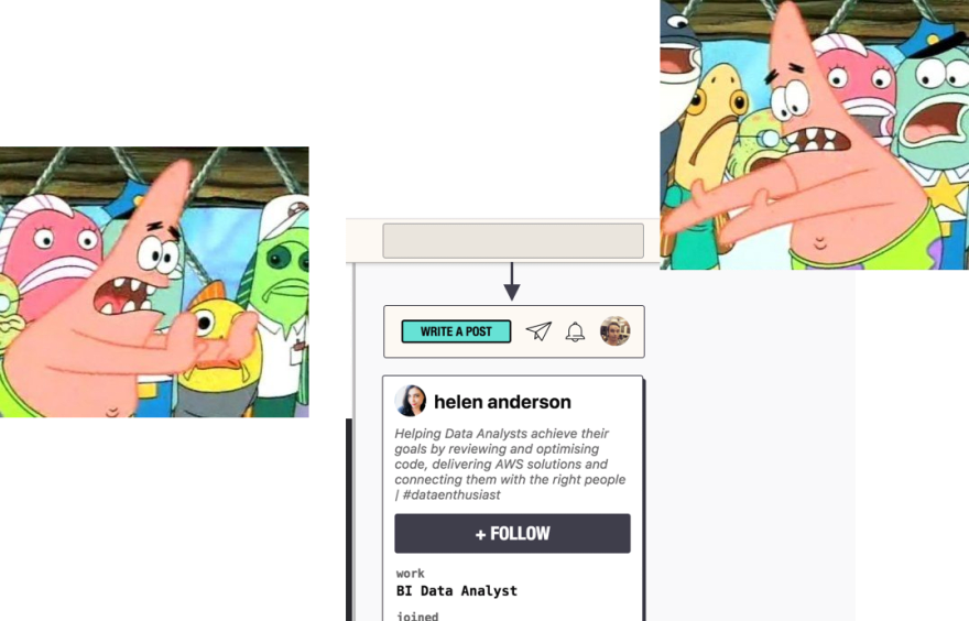
Put it in the .primary-sticky-nav. It can still follow the user around, so you're never more than one click away from posting about date.Now()'s new CSS in JS solution.
And that bottom action bar thingie?
I think you know.
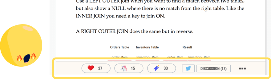
At the very least, it shouldn't be in the main reading vertical highway. If we have to have it follow us, put it on the side. Medium does this just fine.
Otherwise, we should put it at the bottom of the article with the rest of the actions and maybe move it up a few rows in the html order.
.article-actions {
  position: absolute;
}
but why 😬
Dev.to shouldn't be some random internet website. It's got the potential to be a great resource, to generate interesting articles, and to inspire a whole generation of programmers.
But at the moment, Dev is shunning readers and that makes it hard for us to stay best friends.


