As someone who loves and works with CSS on an almost daily basis, DevTools are something near and dear to my heart. Recently, I’ve been seeing updates from both the Webkit and Chrome team about updates to layout-related DevTools features and thought it’d be nice to do a write-up about them.
Even though I’ve never gotten a job at any of the browser companies before, I have been incredibly lucky to have had numerous opportunities to meet and chat with folks from Mozilla, Google and Apple. And they have been really generous with their time and knowledge.
I’m personally convinced that DevTools can be more than just a debugging tool, it can potentially be a source of guidance right in our browsers. And with the way things are going, I think this might be becoming a thing.
I have spoken about DevTools for CSS at a couple of conferences and had always used Firefox for them because it had the most features for CSS layouts since 2019. They came out with the Flexbox inspector in Firefox 65, in January 2019. And now, more than 2 years later, Chrome is adding that feature to its DevTools as well.
Firefox’s grid inspector was pretty full-featured from the get-to and released together with CSS grid in Firefox 52. It was constantly improved upon since. Chrome added a basic grid inspector tool in Chrome 62 that let developers highlight elements using grid layout, but more robust features were only added in Chrome 87. And now, Webkit has joined the party, as Safari Technology Preview 123 adds Grid inspecting features as well.
Okay, enough history. More story in this Smashing Magazine article, if you’re interested. Now, it’s time for what we have on hand in 2021.
Flexbox inspector
Firefox 65 and later (January 29, 2019)
Chrome 90 and later (April 14, 2021)
Flexbox is a feature that has been around for a long time now, but can still be confusing to wrap your head around. I admit I too have made a joke about that on stage but it was to highlight the importance of having a Flexbox inspector in DevTools.
Firefox Flexbox inspector
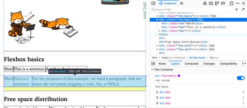
In Firefox, you can toggle the Flexbox overlay by clicking on the flex tag in the Inspector, clicking the little 2-box icon next to the display value of flex in the Rules panel or directly from the Layout panel. The panel will also show you the flex direction and wrap status on the Flex container.
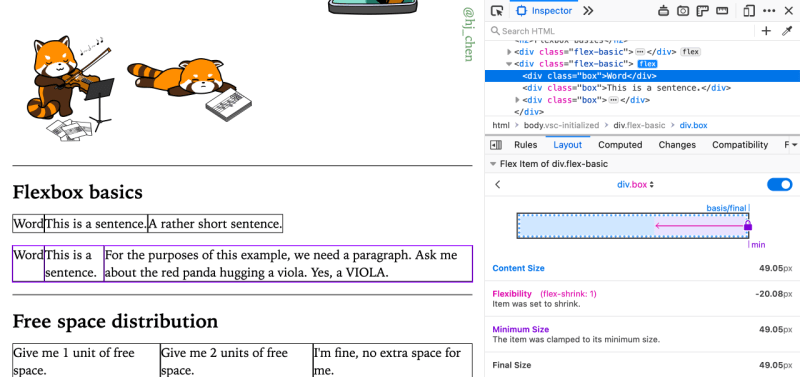
The information about Flex items is my favourite feature of this tool, which shows up when you click on any of the Flex items in the Layout panel. It shows you the starting width from which the browser figures out the size of your flex item, then the subsequent calculations that give you the end size.
Chrome Flexbox inspector
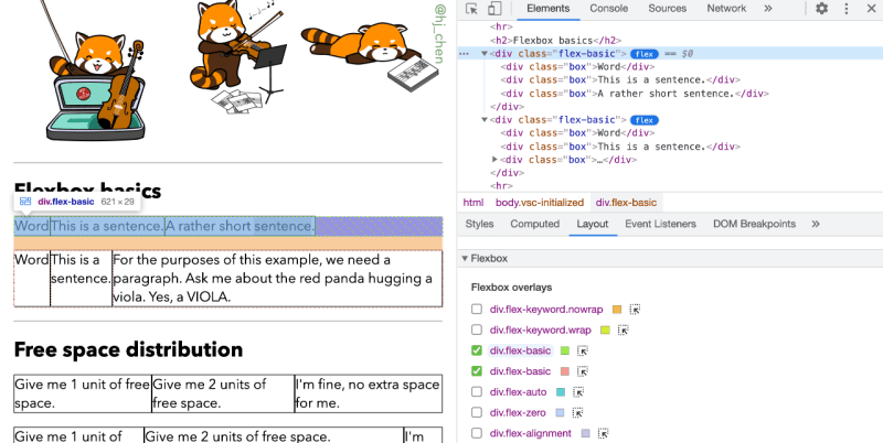
If you already have Chrome 90 (which was stable release as of 14 April 2021), you should be able to see a flex tag in the Inspector on elements which are Flex containers. Clicking that would toggle a Flexbox overlay, and multiple overlays can be active at the same time. You can also do this toggling in the Layout panel.
If you’re in the Styles panel, where all the CSS rules are listed, you should see an icon that looks like a 六索 mahjong tile to my Chinese brain. Chrome made a UX design choice to put the flex information like direction and wrap in a pop-up when you click the icon.
But that’s not all, you can switch up the different alignment properties from this interface directly. And here’s where I think that as people use this feature more and more, they are sort of teaching themselves these alignment properties, and of course, being able to see what happens on the page as they toggle through the different values also helps.
As you can see, there are feature differences between the 2 browsers, but don’t we all have multiple browsers installed on our machines when we’re working in this industry? ¯_(ツ)_/¯
Grid inspector
Firefox 52 and later (March 7, 2017)
Chrome 62 and later (October 17, 2017)
Safari Technology Preview 123 and later (March 31, 2021)
To me, the release of CSS grid will always be a milestone and game-changer for the world of web design. But with it came an unavoidable mindset shift when it came to thinking and designing layouts for the web. Grid is also a fairly meaty module with numerous properties and it’s totally normal for folks to feel intimidated at first.
Firefox Grid inspector
I think Firefox made the absolute right call when they shipped a solid suite of Grid tools together with CSS support at the same time, because it made the on-boarding process of using Grid so much smoother.
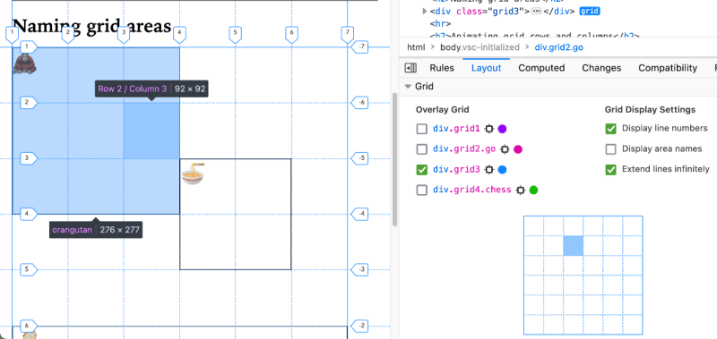
Like the Flexbox overlay, the Grid overlay can be toggled either from the grid tag in the Inspector, clicking the little waffle-like icon next to the display value of grid in the Rules panel, or directly from the Layout panel.
The Firefox Grid inspector had the ability to display line names, line numbers and area names from the start. They gradually added the ability to toggle the overlay for multiple grids, and some UX fixes for labels at the edge of the viewport.
Firefox also displays the sizing of grid items via a slightly different UX from Chrome and Safari (as you will see in the later sections). In the Layout panel, there is a miniature grid of what is being highlighted on the page, and hovering over each grid cell will show you it’s sizing, as well as the size of the grid area, if the cell is a part of one.
What’s nice about Firefox DevTools is that they ship the corresponding DevTools feature with the CSS feature being rolled out, for example, the animating of grid rows and columns. So you can see what exactly is being animated. And I must say, the rendering of overlays and labels seems smoother on Firefox for now.
Speaking of features that are currently only supported in Firefox, we have to mention CSS Grid Level 2, which specifies Subgrid.
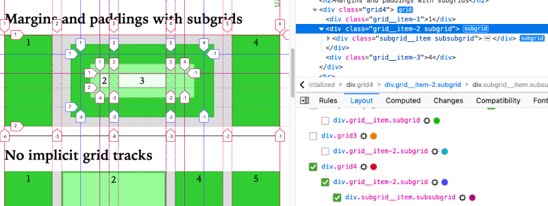
Subgrid is currently only supported in Firefox, which had it since Firefox 71 (released December 3, 2019). The necessary support for subgrid in DevTools was also rolled out at the same time.
Having DevTools show you how the browser is interpreting grid lines is really helpful for understanding how subgrid works. Because the line numbers for each subgrid start from 1, even if they are in some other position on the parent grid. Margins, paddings and borders for nested subgrids are also easier to understand if you can visually see them on the overlay.
Chrome Grid inspector
I was pretty pleased when Chrome 87 rolled around in November last year (2020, for folks who are somehow reading this years later). Because they shipped features to their Grid inspector tool that brought it on par with Firefox’s.
Chrome DevTools also added a Layout pane with options to toggle line numbers, names, grid area names and extend grid lines. The ability to display overlays for multiple grids at once and change their colour is also available now. Displaying the sizing of grid cells on the overlay directly has its pros and cons, because if the grid cell is small, the label gets cut off.
But overall, it’s a good thing that Chrome DevTools has much better support for Grid now and I hope all DevTools teams continue to iterate on them. As an aside, because Edge is now powered by Chromium, it too has the same Grid DevTools support now.
Safari Grid inspector
Again, immense joy when I saw the release notes for Safari Technology Preview 123 that announced Grid support in their DevTools. The way the Webkit team does things is that as long as a feature is released in Technology Preview, it will 100% make it into the next Safari stable release.
If you don’t have Safari Technology Preview installed, you’re really missing out because the Webkit team has consistently been putting out cutting edge CSS features in Safari TP. It’s really THE browser for CSS early adopters, IMHO.
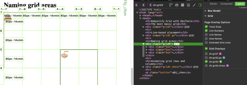
This new update adds a Layout panel and you can trigger the Grid overlays by clicking the grid tag on Grid containers from the Elements pane. The interface is straightforward, with checkboxes that let you toggle the various grid-related labels. Multiple grid overlays are also supported here.
With folks like Jen Simmons and Razvan Caliman (who have done tremendous work on DevTools for layouts) now with the Webkit team, I’m looking forward to even more DevTools enhancements in future shipping in Safari.
Wrapping up
It’s taken a little while, but browsers are really iterating on each other’s useful features, which is all the better for web developers and designers like you and I. I’m looking forward even more exciting advances in the world of CSS this year, because I don’t have much else to look forward to anywayz.
Meanwhile, wash your hands and mask up always 😷. Stay safe, everyone!

