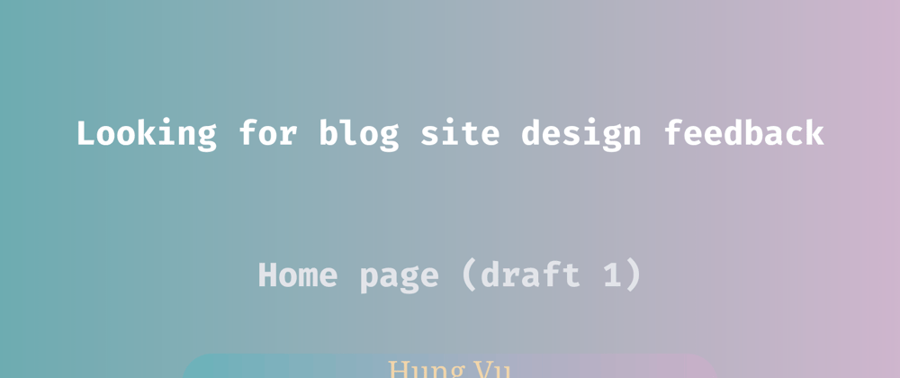
Hi all, I'm in the progress of building a new self-hosted blog site. I'm not really well-versed in web design, so I figured it will be better to gather feedback from the community. The first draft is shown below.
For context:
- This is my first (serious) try using Figma.
- My goal is to have a minimalistic website, while not being so bland. I'm not fond of excessive effects or animation.
- This is my first draft.
Here is some information regarding the current design:
- Font is Roboto.
- Font sizes are 32, 24, 16, and 12 depending on the content.
- Border radius is 24.
- Spacing is based on a 4 pt. grid. The common gap distance is 16, and 32.
Here are some of my questions/concerns:
- I use Roboto because it is a de facto choice for the initial design, but it is a bit generic to me. What are other alternatives?
- Is the Hero section kind of bland (waste of space)?
- What would be a way to make a smooth transition between sections (e.g., from Hero to All Articles)? At the moment, I feel like they are visually disconnected.
- I feel like the article section is clustered, or is it?
- For the article filter, how should the choices be presented when there are multiple of them (for visual, and a11y)? For example, 10-choice is 10-row, or drop box, or something else (like Tags filter)
- I prefer a website with a neutral theme, so there is no light/dark mode. Or do I still consider a light/dark version of a neutral theme?
These are on top of my head at the moment, any other feedback is greatly appreciated!


