 Ingo Steinke, web developer
In this article, I will try to summarize relevant resources about measuring, monitoring, and optimizing web page speed, usability, and search engine optimization at the same time. Google's "Core Web Vitals", Largest Contentful Paint (LCP), First Input Delay (FID), and Cumulative Layout Shift (CLS) will help us along our way. Thanks to Addy Osmani and Houssein Djirdeh from Google and to everybody else for their explanations.
Core Web Vitals: Web Performance and Usability
Measuring and Monitoring Core Web Vitals
Many web performance tools already highlight the new core web vitals. Being a real user metric, First Input Delay is not available in lab test results. WebPageTest and GTMetrix list Total Blocking Time (TBT) as a third vital metric instead. So we will cover that metric later on as well.
Handy tools for web performance and web vitals measurement include
- Lighthouse
- Web Vitals Chrome extension
- Google PageSpeed Insights
- Google Search Console
- WebPageTest
- GTMetrix
While Lighthouse can be used directly inside the Chrome browser's developer tools, PageSpeed Insights, WebPageTest, GTMetrix, and Google Search Console have their own websites.
Addy Osmani's Web Vitals is a free extension for the Chrome web browser.
Current versions of Lighthouse, PageSpeed Insights and Google Search Console are based on the same engine, but the presentation and focus of their reports differ slightly. Search console only shows "field data" based on real user activity and it can help you constantly monitor your website over time.
Understanding and Optimizing Core Web Vitals
Largest Contentful Paint measures Interruptions due to Waiting
The chromium blog post on the science behind web vitals concludes that "from the user's point of view, loading a particular page doesn’t represent a natural break: they haven’t yet achieved their goal, which may make them less tolerant of delays."
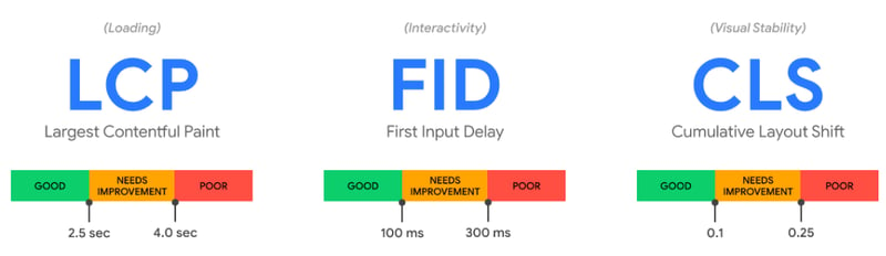
The Largest Contentful Paint (LCP) metric tries to measure when page-to-page navigation appears complete to a user. The recommended LCP should stay below 2.5 seconds for 75% of page loads.
Difference between Largest Contentful Paint and First Contentful Paint (FCP)
"First Contentful Paint (FCP) measures how long it takes for initial DOM content to render, but it does not capture how long it took the largest (usually more meaningful) content on the page to render." (Houssein Djirdeh, Google)
Poor LCP: Common Causes and Remedies
Slow Server Response Times
While you might have a problem on the server-side, there are possible solutions both on the server as well as on the client-side. You can try to
- optimize your server,
- cache assets,
- use a CDN,
- use resource hints (
preconnect,dns-prefetch).
Example: raise time to expire for JPG images (server-side)
<IfModule mod_expires.c>
ExpiresActive on
ExpiresDefault "access plus 5 minutes"
ExpiresByType image/jpeg "access plus 1 month"
ExpiresByType image/png "access plus 1 month"
ExpiresByType image/svg "access plus 1 month"
Fix server-side file compression, if necessary:
<IfModule mod_filter.c>
<IfModule mod_deflate.c>
AddOutputFilterByType DEFLATE text/plain text/html text/xml text/css text/javascript
AddOutputFilterByType DEFLATE application/javascript application/x-javascript
# handle edge cases that you care about
BrowserMatch \bMSIE\s7 !no-gzip !gzip-only-text/html
</IfModule>
</IfModule>
Ilya Grigorik and Jeff Posnick have more details on how to prevent unnecessary network requests with the HTTP Cache, and Dave Gash knows what to put in your Apache server configuration.
Example: using resource hints in HTML (client-side)
<link rel="dns-prefetch" href="https://fonts.gstatic.com/" >
<link rel="preconnect" href="https://fonts.gstatic.com" crossorigin />
Drew McLellan wrote a useful article about optimizing performance with resource hints in Smashing Magazine.
Slow Resource Load Times
You should
- optimize, compress, and minify your assets,
- allow them to be cached (see above),
- preload, lazyload,
- use responsive images and adaptive serving
Example for responsive images using native lazy loading
<img loading="lazy"
     srcset="a.jpg b.jpg 2x"
Adaptive serving is a client-side technique to decide which resource to load or whether to load any resource at all, based on detected client capabilities like network speed.
The navigator object offers performance information:
-
navigator.connection.effectiveType(e.g. "4g") -
navigator.connection.saveData(data-saver setting) -
navigator.hardwareConcurrency(CPU core count) -
navigator.deviceMemory(Device Memory)
Many optimizations are also offered as a service. On Netlify, you can activate CSS and JS modification as well as image compression in your site settings, and Netlify will automate those optimizations at the next deployment.
Render-Blocking Assets
Split, inline, minify, and defer CSS according to its role and importance.
Use the Coverage tab in your Chrome browser's developer tools to find possibly unused CSS on your web page. Be careful to remove it, as it might be used on a separate page or only in certain situations like an error or a form submission.
The most critical styles should be inlined in your HTML head, while the most optional styles can be deferred by setting the proper media type only after loading has completed:
<style>
.hero-image { background-size: cover; } /* inline critical css */
</style>
<link rel=stylesheet media=screen href="styles.css">
<link rel=stylesheet media=none onload="this.media='screen'" href="later.css">
Deferred loading is usually done by setting the initial media type to print, which might interfere with your actual print styles. At least modern browsers seem to load the invalid media none stylesheet nevertheless, as I found out when relaunching my own website in 2021.
You can use loadCSS to automate this technique.
Tools to help you extract critical CSS:
Client-Side Rendering and Hydration
You can try to use pre-rendering or server-side rendering (SSR), but this may only move the problem to a later stage. A server-rendered page may look like it can be interacted with, but it cannot respond to any user input until it is "hydrated" (which means all the client-side JavaScript has executed). This can make Time to Interactive (TTI) worse.
Cumulative Layout Shift measures Instability
Layout shift is like "a giant chicken that kicks your content away", Addy Osmani explained in this video:
"If an element suddenly moves, their eyes have to find its new position. If the user is trying to tap an element that then moves, they may end up clicking a link or ad unintentionally and significantly disrupting the user's intended journey. Cumulative Layout Shift (CLS) measures how frequent and severe unexpected layout shifts are on a page." Google recommends the CLS to be less than 0.1 for 75% of page loads.
Preventing Layout Shift
- define image dimensions (
width,height), - reserve fixed height containers for portals / ads / third-party content,
- use web fonts properly or not at all to prevent flashing invisible or unstyled text.
Setting dimensions is especially important for the content "above the fold", which is displayed to your users before they scroll down.
Defining a minimal height for a third party container:
<style>
  .portal-billboard {
    min-height: 250px; /* critical height definition */
   }
 </style>
 <aside class="portal-billboard" aria-hidden="true">
The same strategy can be useful everywhere. Giving your page header a minimum height will also prevent web fonts inside this header to change your header's height and make all subsequent content shift.
No matter if you like hero headers, starting your page with a container that fills up the entire viewport height, might solve many layout shift problems that would otherwise occur unless you perfectly control your page content.
Using web fonts properly can be hard unless you are lucky to find a font that closely resembles the web-safe fallback in every way. Zach Leatherman's article about optimizing font loading for CSS-Tricks.com will show you all the tricky issues around FOIT (invisible text), FOUT (fallback text), font-display and font annotations.
Using First Input Delay (FID) and Time To Interactive (TTI) to measure Low Responsiveness
Time to Interactive measures the time it takes for a page to be fully interactive when event handlers are registered for most page elements, and user interaction is processed within 50ms. As I learned from Ziemek Bućko, First Input Delay is different in that it’s able to track user input that happens before the page is fully interactive. As a purely real user metric, it cannot be simulated in a lab test. It requires user interaction in order to be measured.
Input Delay Optimization
Optimizing input delay comes with no surprise. The official recommendations include some JavaScript-specific tips, otherwise, keep transfer sizes small and follow the usual web performance optimization advice found on the web and inside your Lighthouse report.
- Reduce the impact of third-party code
- Reduce JavaScript execution time
- Minimize main thread work
- Keep request counts low and transfer sizes small
To trick the metric, you might be tempted to implement asynchronous event handling. That "would improve the metric but likely make the experience worse", Philip Walton remarks in his FID guide. Try that and probably get punished by an upcoming 2022 Web Vitals update. Just don't do it!
First Input Delay (FID) and Total Blocking Time (TBT)
Lab tests cannot show the first input delay, so most display total blocking time instead. In practice, you can use TBT as an alternative metric for FID.
GTMetrix states that "Total Blocking Time (TBT) is a Lighthouse Performance metric introduced in 2020 that quantifies your page's load responsiveness to user input. In the simplest terms, TBT measures the total amount of time your webpage was blocked, preventing the user from interacting with your page. It is one of the Web Vitals and is a replacement for the field-only First Input Delay (FID) metric."
Discussion
What’s new if you already optimize your page speed? Not much, unless you haven’t cared about usability and user experience as well?
Disturbed by weak empirical evidence, Peter Hedenskog took a critical stance on Core Web Vitals, questioning Google's monopoly on web performance metrics.
What I personally value about Google's page experience approach is the current focus on usability, and maybe Google's influence will help to reduce not only involuntary layout shift but also dark patterns and intentionally bad UX that seems to prevail on many commercial websites these days.
Google should use its current position not only to promote human-centred usability but rather add environmental metrics like a website's carbon footprint the sooner the better.
Credits
This article is mostly based on other people's work, mainly by Google's Addy Osmani and Houssein Djirdeh, but I also owe to the German WordPress community, especially WordPress Düsseldorf meetup #52 earlier this year!
Conclusion
Care about your users, optimize time to interactive, and prevent layout shift!
My personal prediction: also care about sustainability and reduce your website’s carbon footprint! Hopefully, this might become another important ranking factor in the future.


