 Chris Jarvis
Alvaro Montoro post's "Drawing an egg with CSS" had a tip to make the eggs look more egg like. I took his advice to modify the oval I used in previous egg posts. CSS Eggs are Back

After reading his post I changed the Border radius which made the egg look more like an egg. See the code changes.
.egg {

    background:
    height: 364px;
    width: 225px;


    border-top-right-radius: 51%;
    border-top-left-radius: 51%;
    border-bottom-left-radius: 40%;
    border-bottom-right-radius: 40%;
}
Changed to this.
.egg {

    border-radius: 100% / 125% 125% 80% 80%;
}
Changes these eggs...

..to this. That gave them a more realistic slope.

Time to paint the eggs
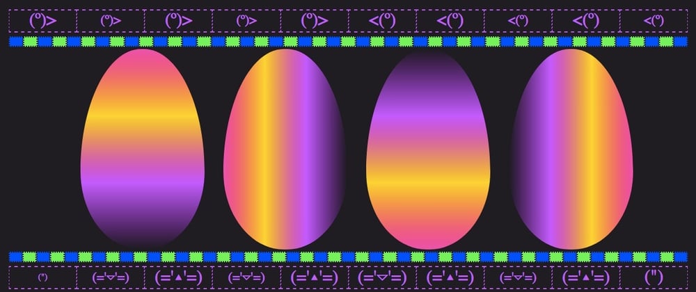
Looks like I need to paint some more. I stated at the end of my last post I should have used the same gradient through out the article. That's what I'm doing here.
Same gradient Pink, Yellow, Purple, Dark Purple. The only change between eggs, is the direction of the gradient.
Starting at default of top to bottom and moving clockwise around the egg.
<div class="character">

        <div class="egg egg_gradient_bottom"></div>

        <div class="egg egg_gradient_right"> </div>

        <div class="egg egg_gradient_top"> </div>

        <div class="egg egg_gradient_left"></div>

    </div character>
.egg_gradient_bottom {
  background: linear-gradient(
    var(--Pink),
    var(--Yellow),
    var(--Purple),
    var(--DarkPurple));
}

.egg_gradient_right {
  background: linear-gradient(to right,
   var(--Pink),
   var(--Yellow),
   var(--Purple),
   var(--DarkPurple));
}


.egg_gradient_top {
    background:
    linear-gradient(to top,
       var(--Pink),
       var(--Yellow),
       var(--Purple),
       var(--DarkPurple));
}

.egg_gradient_left {
    background:
    linear-gradient(to left,
       var(--Pink),
       var(--Yellow),
       var(--Purple),
       var(--DarkPurple));
}

The linear-gradient(to right, Changes the direction to flow from left to right and Pink to Dark Purple. The to direction controls which way the colors flow. It's where you want the final color to end.
You notice that the first egg is the same gradient as the previous post.

This was a nice way to improve my CSS eggs and fix a couples thing I didn't like about the previous post.
Thanks Alvaro Montoro for the tip.
Thanks for reading.


