
 Justin Schroeder
Using Tailwind with Vue Formulate
Watching Vue Formulate begin to gain traction in the Vue ecosystem in the last few months has been a real thrill. Sadly, we've also watched citizens of the Tailwind world struggle to @apply their beloved styles to Vue Formulate’s internal elements. I'm happy to announce that with the release of 2.4, that just changed for Tailwind (and any other class-based CSS framework).
Mobile users: The demos in this article are on codesandbox which breaks on mobile. If you’re on mobile, you might want to revisit on desktop.
Missions aligned
Tailwind’s core concept of writing “HTML instead of CSS” is aimed at improving the developer experience, increasing maintainability, and making developers more efficient. Tailwind achieves this by reducing the decision making process around class names, tightly coupling styles with their usage, and abstracting away the complexity of the underlying framework.
These goals are nearly identical to how Vue Formulate approaches another one of web development’s least favorite necessities: forms. Vue Formulate’s objective is to provide the best possible developer experience for creating forms by minimizing time consuming features like accessibility, validation, and error handling.
In “Introducing Vue Formulate,” I described how there are several good pre-existing tools in the Vue ecosystem that handle various aspects of forms. Some of these handle validation, some handle form generation, some form bindings — Vue Formulate aims to handle all of these concerns. I believe they’re tightly coupled issues and call for a tightly coupled solution, not unlike Tailwind’s approach to styling.
Defaults matter
This coupling means form inputs come with markup out of the box. The out-of-the-box DOM structure is well suited for the vast majority of forms, and for those that fall outside the bell curve, Vue Formulate supports extensive scoped slots and (“slot components”). Still — defaults matter. In my own development career I've learned that, as frequently as possible, it’s wise to “prefer defaults”, only deviating when necessary (I can’t tell you how many times I’ve debugged someone's fish shell because they saw a nifty article about it).
Vue Formulate’s defaults are there for good reason too. Actually, lots of good reasons:
- Value added features: Labels, help text, progress bars, and error messages require markup.
-
Accessibility: How often do developers remember to wire up
aria-describedbyfor their help text? - Styling: Some elements just can’t be styled well natively and require wrappers or decorators.
- Consistency: How often do developers write tests for their project’s forms? The default markup and functionality of Vue Formulate is heavily tested out of the box.
Personally, my favorite feature of Vue Formulate is that once you’ve setup your styles and customizations, the API for composing those forms is always consistent. No wrapper components, no digging through classes to apply (hm... was it .form-control, .input, or .input-element 🤪), and no need to define scoped slots every time.
So what’s the downside? Well, until now, it's been a bit tedious to add styles to the internal markup — especially if you were using a utility framework like Tailwind. Let’s take a look at how the updates in 2.4 make styling easier than ever.
Defining your classes (props!)
Every DOM element in Vue Formulate’s internal markup is named. We call these names element class keys — and they’re useful for targeting the exact element you want to manipulate with custom classes. Let’s start with the basics — a text input. Out of the box this input will have no styling at all (unless you install the default theme).
<FormulateInput />
In this case, we want to spice that element up by adding some Tailwind mojo to the <input> element itself. The class key for the <input> is input 🙀. Sensible defaults — what! Let’s slap some Tailwind classes on the input element by defining the new input-class prop.
<FormulateInput
  input-class="w-full px-3 py-2 border border-gray-400 border-box rounded leading-none focus:border-green-500 outline-none"
/>
Ok! That’s a start, but Vue Formulate wouldn’t be very useful if that’s all it was. Time to flex. Let’s make a password reset form with a dash of validation logic, and for styling we’ll use the input-class prop we defined above.
<FormulateForm v-model="values" @submit="submitted">
  <h2 class="text-2xl mb-2">Password reset</h2>
  <FormulateInput
    type="password"
    name="password"
    label="New password"
    help="Pick a new password, must have at least 1 number."
    validation="^required|min:5,length|matches:/[0-9]/"
    :validation-messages="{
      matches: 'Password must contain at least 1 number.'
    }"
    input-class="border border-gray-400 rounded px-3 py-2 leading-none focus:border-green-500 outline-none border-box w-full"
  />
  <FormulateInput
    type="password"
    name="password_confirm"
    label="Confirm password"
    help="Just re-type what you entered above"
    validation="^required|confirm"
    validation-name="Password confirmation"
    input-class="border border-gray-400 rounded px-3 py-2 leading-none focus:border-green-500 outline-none border-box w-full"
  />
  <FormulateInput type="submit"/>
</FormulateForm>
Ok, clearly it needs a little more styling. We’re dealing with a lot more DOM elements than just the text input now. Fortunately, the documentation for our element keys makes these easily identifiable.
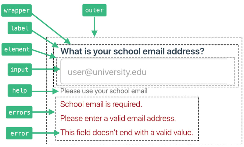
So it seems we need to define styles for the outer, label, help, and error keys too. Let’s try this again.
<FormulateInput
  ...
  outer-class="mb-4"
  input-class="border border-gray-400 rounded px-3 py-2 leading-none focus:border-green-500 outline-none border-box w-full mb-1"
  label-class="font-medium text-sm"
  help-class="text-xs mb-1 text-gray-600"
  error-class="text-red-700 text-xs mb-1"
/>
Ok, that’s looking much better. But while it’s a relief for our eyes, the beauty is only skin deep. Those were some gnarly class props and we had to copy and paste them for both our inputs.
Defining your classes (base classes!)
So what’s a Tailwinder to do? Wrap these components in a higher order component, right!? Heck no. Please, please don’t do that. While wrapping is sometimes the right choice, Vue Formulate is clear that it’s an anti-pattern for your FormulateInput components. Why? Well lots of reasons, but just to name a few:
- It makes props unpredictable. Did you remember to pass them all through? Will you update all your HOCs to support newly released features?
- Form composition no longer has a unified API. Now you need to start naming, remembering, and implementing custom components.
- You can no longer use schema defaults when generating forms.
So let’s avoid this Instant Technical Debt™ and instead use Vue Formulate’s global configuration system. We can define all of the above Tailwind classes when we first register Vue Formulate with Vue.
import Vue from 'vue'
import VueFormulate from 'vue-formulate'

Vue.use(VueFormulate, {
  classes: {
    outer: 'mb-4',
    input: 'border border-gray-400 rounded px-3 py-2 leading-none focus:border-green-500 outline-none border-box w-full mb-1',
    label: 'font-medium text-sm',
    help: 'text-xs mb-1 text-gray-600',
    error: 'text-red-700 text-xs mb-1'
  }
})
That really cleans up our inputs!
<FormulateInput
  type="password"
  name="password"
  label="New password"
  help="Pick a new password, must have at least 1 number."
  validation="^required|min:5,length|matches:/[0-9]/"
  :validation-messages="{
    matches: 'Password must contain at least 1 number.'
  }"
/>
<FormulateInput
  type="password"
  name="password_confirm"
  label="Confirm password"
  help="Just re-type what you entered above"
  validation="^required|confirm"
  validation-name="Password confirmation"
/>
If you viewed the working code in CodeSandbox, you might have noticed we’re still using the input-class prop on the submit button — and to be crystal clear — setting classes with props is not discouraged at all. Generally you’ll want to pre-configure default Tailwind classes for all of your inputs first and then use class props for selective overrides.
In this case, however, the desired styles for our password input is nothing like our submit button. To account for this, we can change our classes.input option to be a function instead of a string allowing us to dynamically apply classes based on contextual information.
import Vue from 'vue'
import VueFormulate from 'vue-formulate'

Vue.use(VueFormulate, {
  classes: {
    outer: 'mb-4',
    input (context) {
      switch (context.classification) {
        case 'button':
          return 'px-4 py-2 rounded bg-green-500 text-white hover:bg-green-600'
        default:
          return 'border border-gray-400 rounded px-3 py-2 leading-none focus:border-green-500 outline-none border-box w-full mb-1'
      }
    },
    label: 'font-medium text-sm',
    help: 'text-xs mb-1 text-gray-600',
    error: 'text-red-700 text-xs mb-1'
  }
})
We can use Vue Formulate’s “classifications” from the provided context object to change which classes are returned. These class functions give efficient, precise, reactive control over the classes you want to generate for any input (in any state). For more details on how to leverage them, checkout the documentation.
Our example form is now fully styled, and our inputs contain no inline classes or class prop declarations at all. Any additional FormulateInput will now also have base styles. Great success!
Oh, the places you’ll go
There’s a lot more to love about the new class system in Vue Formulate that is covered in the documentation. You can easily reset, replace, extend, and manipulate classes on any of your form inputs. You can apply classes based on the type of input, the validation state of an input, or whenever or not a value equals “Adam Wathan”. To top it off, once you’ve landed on a set of utility classes for your project, you can package them up into your own plugin for reuse on other projects or to share with the world.
Dropping the mic
One last demo for the road? Great! Let’s combine Tailwind with another Vue Formulate fan favorite: form generation. With this feature, you can store your forms in a database or CMS and generate them on the fly with a simple schema and 1 line of code. First our schema, which is just a JavaScript object:
const schema = [
  {
    component: "h3",
    class: "text-2xl mb-4",
    children: "Order pizza"
  },
  {
    type: "select",
    label: "Pizza size",
    name: "size",
    placeholder: "Select a size",
    options: {
      small: "Small",
      large: "Large",
      extra_large: "Extra Large"
    },
    validation: "required"
  },
  {
    component: "div",
    class: "flex",
    children: [
      {
        name: "cheese",
        label: "Cheese options",
        type: "checkbox",
        validation: "min:1,length",
        options: {
          mozzarella: "Mozzarella",
          feta: "Feta",
          parmesan: "Parmesan",
          extra: "Extra cheese"
        },
        "outer-class": ["w-1/2"]
      },
      {
        name: "toppings",
        label: "Toppings",
        type: "checkbox",
        validation: "min:2,length",
        options: {
          salami: "Salami",
          prosciutto: "Prosciutto",
          avocado: "Avocado",
          onion: "Onion"
        },
        "outer-class": ["w-1/2"]
      }
    ]
  },
  {
    component: "div",
    class: "flex",
    children: [
      {
        type: "select",
        name: "country_code",
        label: "Code",
        value: "1",
        "outer-class": ["w-1/4 mr-4"],
        options: {
          "1": "+1",
          "49": "+49",
          "55": "+55"
        }
      },
      {
        type: "text",
        label: "Phone number",
        name: "phone",
        inputmode: "numeric",
        pattern: "[0-9]*",
        validation: "matches:/^[0-9-]+$/",
        "outer-class": ["flex-grow"],
        "validation-messages": {
          matches: "Phone number should only include numbers and dashes."
        }
      }
    ]
  },
  {
    type: "submit",
    label: "Order pizza"
  }
];
And our single line of code:
<FormulateForm :schema="schema" />
Presto! Your form is ready.
If you’re intrigued, checkout vueformulate.com. You can follow me, Justin Schroeder, on twitter — as well as my co-maintainer Andrew Boyd.


