 Ken Bellows
It's been quite a while now since CSS Grid Layout Module Level 1 was released. It's been almost two years since that time all the major browsers sort of got together and pushed it out nearly simultaneously (March 2017, ICYMI).
And IMHO, it's the best thing in CSS in a super long time. Don't get me wrong, I love me some Flexbox, and Flexbox is clearly the better choice in many circumstances, but man, Grid just makes so many things so much easier.
But one thing still missing from the Level 1 spec is the ability to create a subgrid, a grid-item with its own grid that aligns in one or both dimensions with the parent grid. It was originally planned to be in Level 1, but the working group decided they needed more time to work out the details, so it was removed, and it will ship in CSS Grid Layout Module Level 2, which seems to be nearing completion.
There has been a lot of discussion over the last 2 years about the use cases for subgrid, how it should be implemented, and even some debate over whether you even need it. A lot of that discussion was centered around two other approaches that can handle many of the same problems as subgrid: nested grids and display: contents. This article will explore both of those approaches, and I hope to demonstrate that there are still some very valid cases where a subgrid is truly needed, and others where it is not strictly needed, but would make for a much cleaner solution.
As with my previous article, I'll present a scenario and implement a solution with these different approaches to explore their strengths and weaknesses.
Scenario: A bunch of cards with numbers on them
Today's scenario: I want a section on my personal site that displays my most recent Dev articles, along with their reaction counts. Let's put together a mockup.

Pretty straightforward stuff. Each card has a border with a box-shadow, a user avatar to the left, a title left-aligned along the top, and three reaction counts below. Shouldn't be difficult, right?
Let's code it up.
v1: Good ol' floats
This seems simple at first glance, so let's start out with an old-school float-based layout and see how things go.
Okay, pretty good! I am good at CSS. 👏👏👏 (Actually, I just inspected the cards on the dev.to homepage, stole the CSS from there, and tweaked a bit as needed.)
Anyway, I'm satisfied. Everything is looking exactly like the mockup, except... hold up a sec. What's the deal with those reaction counts? Why is the reading list icon on the third card so far off from that of the second card? Why aren't they aligned between the cards?
What I want is for the counters of the same type, e.g. all the unicorn counters, to be aligned across cards, so that the smallest unicorns counter takes up as much space as the largest unicorn counter.

So why don't my counters behave like that?
Because I didn't write them that way, I guess. Hm. How would I do that? I want the counts with smaller numbers to have as much horizontal space as the larger ones of the same type from other cards. But this means that some elements are going to need awareness of their... cousin elements? Like, unicorns ↗︎ card 1 ⟶ card 2 ↘︎ unicorns. Parent's sibling's child. Cousin. Yeah.
But old-fashioned float-based layouts don't allow that. I can only size an element based on its parent, and sort of its siblings... Hey, I know, Flexbo— nope, Flexbox doesn't do this either. Same problem. What's left?
Of course, I'm sure you already know the answer. There's only one layout system that can accomplish the task. It is... HTML Tables!

I'm just kidding. Never use tables for layout.
Unfortunately, the current answer is that we can't, not perfectly, not without either setting the <span> widths with JavaScript or else, yes, invoking some uncomfortably hackish and brittle tables-based approach.
But we can get pretty close. Spoiler, if you haven't figured it out, at the end of this article I'm going to tell you how you can do it trivially with subgrid, but for now I'll talk about just how close we can get with current tech.
A brief aside about tables
To address the elephant in the room, yes, this can actually be solved with HTML tables. And the reason I know is that... sob... I had to solve exactly this problem for my day job: laying out a column of cards, each containing a title and 3 dynamic counters, with the counters and their labels kept aligned across the separate cards. And the only way you can currently do it in pure CSS is with tables.
It works, but it's brittle, finicky, very verbose, and nearly unreadable to any other devs that might need to interact with or tweak that CSS (including future me). So for those reasons, I refuse to show you how to do it, because I will not be a part of the problem! (It's not my fault! They made me! 😭)
v2: CSS Grid and display: contents
The most common argument I hear against adding subgrids to CSS is that display: contents fills the gap that subgrid is meant to fill, so subgrid is rendered unnecessary.
For the uninitiated, one of the main constraints of CSS Grid Layout is that only the direct children of the grid container can be placed on the grid. This is why we can't use a simple display: grid on the cards' container to solve our problem; we could position the cards on the grid, rather boringly, but we can't position the cards' contents on the grid, because those elements are not direct children of the grid container element.
Or can we?
Enter display: contents. If you give a container element the rule display: contents, the element sort of... vanishes... at least for layout purposes. The surrounding elements are no longer aware of that container; instead, they see its direct children. What this means in a grid context is: if a grid item is given display: contents, its child elements become grid items instead!
The big advantage here is really semantics and readability in the HTML document. You can still group elements logically and semantically in your markup, but lay them out on the grid as though they were direct grid items.
So lets see if we can apply this to our cards! We'll define a grid on the container holding the cards, then give the root card elements display: contents and lay out the contents of the cards on the grid. (Can you anticipate the problem we're about to have?)
Well, that... that's not right. The counts do line up correctly now, but... where are the cards? Where are the nice borders with box shadow? It's almost as though the cards themselves are gone and all their contents were dumped directly on the — oooohhh...
Yes, that's exactly what happened. This is the limitation of display: contents: it's awesome if you really do only need the contents of an element (hence the name), but if you want any kind of styling on the container itself, well... you're out of luck; as far as the layout is concerned, it's missing.
The Manual Approach
So what if we dipped a toe into slightly... dirtier waters and created our own empty "backdrop" element within each card to make it look like there's a container? You can, of course, but the tricky bit is placing it on the grid. One thing I love about CSS Grid is how easy it is to layer elements on top of one another: just attach them to the same grid areas, and apply z-index as needed!
But the trick here is that the cards are dynamic. We don't know ahead of time (or won't once we actually hook this thing up to an API) how many cards we'll have, so we can't, for example, give them each an id and assign them each to a certain row in the grid. This would work for the first few, but once you have more cards than you have ids in your CSS, you're out of luck. And anyway, the point is to find something reusable, scalable, and dynamic.
In the solution above, we're relying on Grid's auto-placement behavior to add new rows as needed. This only works as long as your elements all sit next to each other; there's no way to auto-place elements on top of each other. There's also no way (tragically) to position elements on a grid relative to their auto position, a la position: relative.
It appears we've run out of CSS-based solutions. So we must turn to the only option remaining (besides tables): JavaScript!
v3: JavaScript
Now, I know I rejected JavaScript as an option earlier, but that was about using JavaScript to calculate the width of the count elements, and recalculating each time the window is resized. This is just a tiny bit of JavaScript to place our elements on the correct rows in the grid, just one time, nothing that will repeat with each resize of the window or anything. So it's not as bad. (Still not ideal, though.)
We'll add a <div class="backdrop"></div> to each card, move the container styles to a .backdrop { } block, then use JavaScript to set the grid-row rule for each backdrop element.
That's a lot better. It pretty much matches the mockup down to the pixel.
This works, but there are two main flaws to this approach:
Take a look at the CSS in there. Look at all the
paddingandmarginrules. Notice that there's an empty first column with a width defined by a crazycalc()expression. This is the downside of manually adding everything to a flat grid with no containers to use to manage padding and margin more naturally. I spent like 20 minutes fiddling with those values to get it to match the mockup.This is not responsive. These cards are small, it's true, and they're all sitting in a single column, so it's not a huge deal. But imagine if you wanted to use cards for a search results grid, with both rows and columns of cards. This becomes very messy very fast. You can't just use
@mediaqueries or auto-placement to move the cards around at smaller resolutions; you'll have to do the very thing we wanted to avoid from the start: rearrange your items in JavaScript on each window resize event.
So in summary, that will get you a basic solution, but it's messy and brittle, and a full solution would require more JavaScript that I'd prefer.
Okay, okay, enough with the lead-in. Let's talk about subgrid!
v4: 🎆🎇 Subgrid FTW!!! 🎇🎆
So. It has come to this.
As I mentioned in the intro, subgrids were originally supposed to be a part of CSS Grid Layout Module Level 1, but were retracted toward the end so the working group could spend more time hammering out the details. Now a lot of that work has been completed, and the CSS Working Group is in the process of specifying CSS Grid Layout Module Level 2 (aka Grid Level 2). A Public Working Draft is already out there for review, although as Rachel Andrew, my favorite resource for all things CSS Grid, wrote in her April 2018 blog post "Grid Level 2 and Subgrid", further developments have occurred since the draft was released, and indeed are constantly occurring, so it may be better to refer to the Editor's Working Draft instead.
Note: At time of writing, there is no subgrid implementation in any major browser...
UPDATE: Subgrid support has shipped in Firefox nightly! Still no movement from Chrome, though; maybe click the star on this subgrid implementation ticket to show community desire for it! (I'm so excited!!! 🎆🎈🎈🎈🎆)
But let me answer the main question I haven't yet: What is subgrid, anyway? How does it work?
The idea of a "sub-grid" is a grid defined within an item laid out on a surrounding grid that has some relationship to that larger grid. I'll talk about "the parent grid" and "the subgrid" to keep things simple. The simplest sort of relationship is to lock the grid tracks of the subgrid along a single axis onto the tracks of the parent grid, while keeping the tracks along the other axis separate. It's also possible to go 2D and lock both axes of the subgrid onto the parent for total integration. (EDIT: This paragraph has been updated from its original text, see endnote below!)
The declaration that a certain axis of a grid should align with a surrounding grid is done using the subgrid keyword in either the grid-template-columns or grid-template-rows rule:
#parent {
    display: grid;
    grid-template-columns: 1fr 2fr 3fr 2fr 1fr;
    grid-template-rows: 1fr 2fr 2fr 1fr;
}
#subgrid {
    grid-column: 2 / 5;
    grid-row: 2 / 4;

    display: grid;
    grid-template-columns: subgrid;
    grid-template-rows: repeat(3, 1fr);
}
Since the above demo currently doesn't work (Update: except in Firefox nightly!), here's what it should look like once the subgrid keyword is implemented for grid-template-columns:
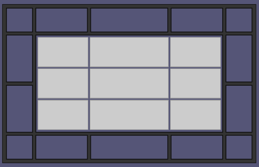
Note that the columns line up with the parent grid, but the rows are completely independent.
Which turns out to be exactly what we need for our card demo!
We'll simply make the cards container a grid with 5 columns, then make each card a subgrid along the column axis, and boom! Problem solved cleanly and simply, mockup met down to the pixel, without sacrificing semantics, readability, or responsiveness, and without needing to introduce empty structural elements (like the backdrop) or JavaScript!
Here it is, in all its not-yet-working(-except-in-Firefox-Nightly!) glory:
It's all a little wonky for now; if you want a picture of what it should look like... check the mockup at the top. 😉
More thoughts on subgrid
Subgrid is so simple, yet so powerful. I think once we have subgrid, especially if we get subgrid on both axes in Grid Level 3 (or 4, or...), it will very quickly become indispensable to us.
Here are some of the things that are getting me excited about subgrid:
If we combine subgrid with
grid-template-areaswithin the cards (read my last post if you don't know about Grid Areas, it'll blow your mind), complex responsive card-based layouts become trivial.The prospect of a subgrid on both axes gives us a way to sort of accomplish relative grid positioning, at least for semantically grouped items, like I wished I had above! Group your stuff in a container, position your container on the grid, make that container a subgrid on both axes, and declare your tracks relative to the subgrid element's grid position!
Between Flexbox, Grid,
display: contents, and subgrids, we will finally have everything we need to write very slim, clean, semantic markup with basically no fluff or purely structural elements. It will be a huge boon for accessibility, SEO, and just developers trying to understand your markup!
Conclusion
I'm pumped about subgrid. I'm pumped about the future of the web in general. The improvements made to CSS over the last 5 years or so have been, IMHO, on par with those made to JavaScript in ES6+ in terms of how much they've improved the language. They haven't been quote as extensive, but they have been just as transformative.
The web is an increasingly beautiful platform to write for, and I'm just really excited about it you guys.
Hopefully I've passed a bit of that on to you here. 😁
Resources
- W3C Public Working Draft
- W3C Editor's Draft
- "Grid Level 2 and Subgrid" - Rachel Andrew
- "CSS Grid Level 2: Here Comes Subgrid" - Rachel Andrew, Smashing Magazine
- Browser implementation status for subgrids
Endnote 1: Correction about double axis subgrids!
January 9, 2019
When this article was first published, it contained a very incorrect statement based on a very silly misunderstanding on my part. The paragraph above where I defined subgrid originally read, in part, as follows (emphasis added):
... The simplest sort of relationship, the relationship being specified right now for Grid Level 2, is to lock the grid tracks of the subgrid along a single axis onto the tracks of the parent grid, while keeping the tracks along the other axis separate. Future levels of Grid may allow for locking both axes of the subgrid onto the parent, but we have to start somewhere.
Please note: this is wrong! CSS Grid Module Level 2 will allow for subgrid on both axes, as well as on a single axis! In fact, it seems that the more controversial decision was whether to allow a subgrid on only a single axis, rather than restricting to always requiring both axes to be subgridded!
I have updated the paragraph, as well as the second bullet point in the "More thoughts on subgrid" section, to remove this incorrect information.
This misunderstanding came from a ridiculous repeated misreading of the second paragraph in Rachel Andrew's article "Grid Level 2 and Subgrid". I had read that paragraph (and the surrounding text) about eight times while writing this article, and every time I thought it said:
At the CSS Working Group meeting in Berlin we resolved that subgrids should be single axis only.
But that's not what it says! What it actually says is:
At the CSS Working Group meeting in Berlin we resolved that subgrids should be able to be single axis only.
Which is a very different thing! 🤦🤦🤦
I actually discovered this mistake thanks to a comment below from @dan503 , after which I tweeted at Rachel to ask... and only after she responded did I finally reread that paragraph again and finally realize my mistake!
 Rachel Andrew@rachelandrew
 @ken_bellows that's right. You can do one or both, that's what single axis means. Double axis means you HAVE to do both, no opportunity to only do one.16:15 PM - 09 Jan 2019
0
1
Entire embarrassing thread starts here: https://twitter.com/ken_bellows/status/1083032646123483136
Endnote 2: CSS Tables
January 10, 2019
@tigt_ brought up another approach that I didn't consider in this article: CSS Tables. I know I railed against HTML tables above in the article, but I think CSS Tables can be a clever solution to many problems, because they allow you to somewhat mix and match table and block behaviors, and because they retain the semantics and accessibility benefits of typical HTML elements.
That being said, CSS Tables unfortunately won't solve this particular challenge, for various reasons. I tried a few different approaches and linked to some pens, but each approach had a flaw. Regardless of the outcome, though, it was a very interesting and fun investigation, and I recommend reading the thread!