 Vic Shóstak
Introduction
Hi, DEV friends! 😁
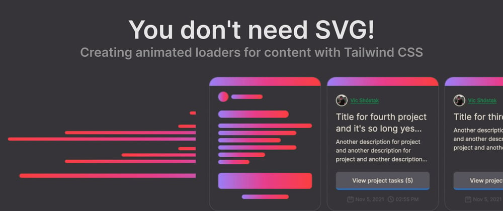
Today we'll talk about how to improve the UX of your project by several times by implementing just a content loader in the right format.
It's not some kind of SVG or JavaScript “magic”, it's just pure HTML, Tailwind CSS built-in classes and some gradient colors.
🔥 Disclaimer: No one is going to CANCEL the use of technology (SVG) on a global scale. Only on a project scale where the Tailwind CSS framework is ALREADY used. If you don't use this framework in your project, you may find the information provided less useful.
Here we go! 🚀
📝 Table of contents
- The main advantage
- Explanations of the code
- A simple content loader
- Loader for the card in the list
- Conclusion
The main advantage
As you have already guessed from the title, this is a purely CSS solution using the Tailwind CSS v2.2.x framework. And the main advantage of this approach is that in fact it is just plain HTML and CSS, which is loaded very first in the user's browser.
There's no “jagged” user experience (UX), where they first see a blank page, then a JavaScript or SVG loader flashes and content shown immediately.
🔥 Attention! UX improvement works should be the highest priority for every frontend developer! Especially when customer loyalty to the business and the brand as a whole depends on it.
Explanations of the code
In order not to dwell later on the explanation of some general points in the code, I decided to tell at once about the classes that will be used in the layout of the loaders.
The first of these is the gradient class itself .gradient-purple-pink-red:
/* ./src/assets/css/tailwind.css */

/* ... */

@layer utilities {

  /* Gradient color */
  .gradient-purple-pink-red {
    @apply bg-gradient-to-r;
    @apply from-purple-400 via-pink-500 to-red-500;
  }

  /* ... */
}
I'm used to defining groups of properties, like colors or gradients, in the @layer utilities {} layer. E.g., “I add a utility to change the color of an element”.
😉 By the way! It would be interesting to read in the comments how you work with
@layerand@applyin your Tailwind CSS projects.
Okay. Let's take a closer look at all the properties:
-
bg-gradient-to-{direction}this property indicates the direction of the gradient (in our caserequals toright); -
from-{color}this property indicates the first (start) color of the gradient (in our casepurplewith weight400); -
via-{color}this property indicates the second (middle) color of the gradient (in our casepinkwith weight500); -
to-{color}this property indicates the third (end) color of the gradient (in our caseredwith weight500);
The second class I would like to show is .animate-pulse (which is a standard Tailwind class). Just this class does the magic animation that turns a simple gradient background into a loader:
/* Animation keyframe */
@keyframes pulse {
    50% {
        opacity: .5;
    }
}

/* Class for element with animation */
.animate-pulse {
    animation: pulse 2s cubic-bezier(0.4, 0, 0.6, 1) infinite;
}
A simple content loader
The most common loader you'll find on websites is a content loader. It is usually enabled after navigating to a page that has not yet pulled content from the backend.
A good UX is to show the loader in full compliance with the structure of the content to be loaded. Thus, the user does not have the feeling that he got somewhere wrong. He will have a visual placeholder instead of content that will be displayed to him in a couple of moments.
The final version of our loader will look like this:
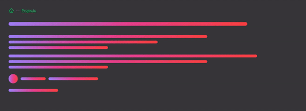
It seems simple, right? Lines are just div containers with a given height and width… But how do you make a circular element without SVG? Easy! Add any block element symmetric dimensions and the built-in .rounded-full class.
Now let's put it all together and build the content loader:
🎯 Note: Please follow comments in the code!
<div class="animate-pulse">
  <!-- First line heading -->
  <div class="mt-8 h-4 gradient-purple-pink-red rounded-full w-4/5"></div>
  <div class="py-6">
    <!-- Text block 1 -->
    <div class="my-4">
      <div class="h-3 my-3 gradient-purple-pink-red rounded-full w-4/6"></div>
      <div class="h-3 my-3 gradient-purple-pink-red rounded-full w-3/6"></div>
      <div class="h-3 my-3 gradient-purple-pink-red rounded-full w-2/6"></div>
    </div>
    <!-- Text block 2 -->
    <div class="my-6">
      <div class="h-3 my-3 gradient-purple-pink-red rounded-full w-5/6"></div>
      <div class="h-3 my-3 gradient-purple-pink-red rounded-full w-4/6"></div>
      <div class="h-3 my-3 gradient-purple-pink-red rounded-full w-2/6"></div>
    </div>
    <!-- User card (avatar + username) -->
    <div class="my-6 flex items-center space-x-3">
      <div class="h-10 w-10 gradient-purple-pink-red rounded-full"></div>
      <div class="h-3 gradient-purple-pink-red rounded-full w-1/12"></div>
      <div class="h-3 gradient-purple-pink-red rounded-full w-1/6"></div>
    </div>
    <!-- Post data -->
    <div class="my-6 h-3 gradient-purple-pink-red rounded-full w-1/6"></div>
  </div>
</div>
📺 Live demo: https://play.tailwindcss.com/a7Pp2l65hF
This example illustrates perfectly how simple and flexible it is to customize the loader to your needs. To consolidate the material, let's look at the following loader.
Loader for the card in the list
Let's move on. Another kind of uploader you've seen, for example, when scrolling through your Instagram feed or your favorite social network.
Such techniques help high-loaded web services improve the user experience while the data in the feed is being loaded.
Let's take the feed from the projects on some web service as an example:
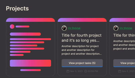
This loader looks maximally organic and doesn't make you want to close the page, does it? This is achieved because the loader almost exactly repeats the content of the card (we talked about this earlier).
All right, let's implement this loader:
<div class="animate-pulse">
  <!-- Head line -->
  <div class="gradient-purple-pink-red h-6 rounded-t-3xl"></div>
  <div class="py-4 px-6">
    <!-- User card (avatar + username) -->
    <div class="flex items-center space-x-2">
      <div class="h-7 w-7 gradient-purple-pink-red rounded-full"></div>
      <div class="h-3 gradient-purple-pink-red rounded-full w-1/3"></div>
    </div>
    <!-- Text block -->
    <div class="my-6">
      <!-- Heading -->
      <div class="h-5 gradient-purple-pink-red rounded-full w-3/4"></div>
      <!-- Description -->
      <div class="my-4">
        <div class="h-3 my-2 gradient-purple-pink-red rounded-full w-full"></div>
        <div class="h-3 my-2 gradient-purple-pink-red rounded-full w-5/6"></div>
        <div class="h-3 my-2 gradient-purple-pink-red rounded-full w-4/6"></div>
        <div class="h-3 my-2 gradient-purple-pink-red rounded-full w-5/6"></div>
        <div class="h-3 my-2 gradient-purple-pink-red rounded-full w-3/6"></div>
        <div class="h-3 my-2 gradient-purple-pink-red rounded-full w-2/6"></div>
      </div>
    </div>
    <div class="my-4">
      <!-- Button -->
      <div class="h-11 gradient-purple-pink-red rounded-lg w-full"></div>
      <!-- Post data + time -->
      <div class="h-3 my-4 mx-auto gradient-purple-pink-red rounded-full w-1/2"></div>
    </div>
  </div>
</div>
📺 Live demo: https://play.tailwindcss.com/msRdcHcKne
Again there is nothing complicated, thanks to the built-in Tailwind CSS classes, we can do any block variations in a matter of seconds.
Conclusion
Use your forms and styles for the loader to improve the UX of your project. It's simple, but believe me (in my 12+ years of the practical experience), will bring a lot of positive feedback.
Share your loaders through the Tailwind Play service in the comments!
And think of the users first! 👍
Photos and videos by
- Vic Shóstak https://shostak.dev
P.S.
If you want more articles (like this) on this blog, then post a comment below and subscribe to me. Thanks! 😻
❗️ You can support me on Boosty, both on a permanent and on a one-time basis. All proceeds from this way will go to support my OSS projects and will energize me to create new products and articles for the community.
And of course, you can help me make developers' lives even better! Just connect to one of my projects as a contributor. It's easy!
My main projects that need your help (and stars) 👇
- 🔥 gowebly: A next-generation CLI tool that makes it easy to create amazing web applications with Go on the backend, using htmx, hyperscript or Alpine.js and the most popular CSS frameworks on the frontend.
- ✨ create-go-app: Create a new production-ready project with Go backend, frontend and deploy automation by running one CLI command.


