 Andrew Bone
Recently, I found myself craving to make something interesting. So I sat down and scrolled through dribbble to see if there was anything on there that I'd like to make. I came across a card that could be swiped to reveal some action buttons and set to work.
As you've, no doubt, gathered I'll be building a reveal card, I have no idea if they have an official name, in this post but I must preface this with, I'm not an A11y expert I like to think I have some idea what I'm doing but I could well have got some of this wrong. If you notice something wrong or want to ask questions about why I've done certain things feel free to leave a comment and I'll get back to you.
This is what I'll be making. It works with mouse, touch, keyboard and, I hope, screen readers read from it correctly too.

The structure
For the structure, which we will later describe in HTML, we'll need a base that can be tabbed to, a layer for options, or buttons in our case, and the info card that sits on top of the options obscuring them until we slide them out of the way.
For a11y think the base should also have aria-expanded to indicate the section can be expanded also the buttons should have aria-hidden on them or a wrapper to prevent screen readers from reading them.
I think something like that matches my description but really doesn't look great as of yet. Which neatly leads us on to styling.
The look
For the look I'll be sticking to a quite material design, which means we'll use open sans fonts, buttons are transparent circles that become translucent on mouse over and we have a box shadow on the while thing. Quite simple when you explain it like that really isn't it. Here's the SCSS:
Whilst this now looks passable there are a few things to consider, the card is white but behind it needs colour too and we really should let potential users pick from a few colours, the default outline is ok but it different across browsers and doesn't really look that great and finally other than the cursor changing there's no real indication to the user that the panel slides.
Adding variants
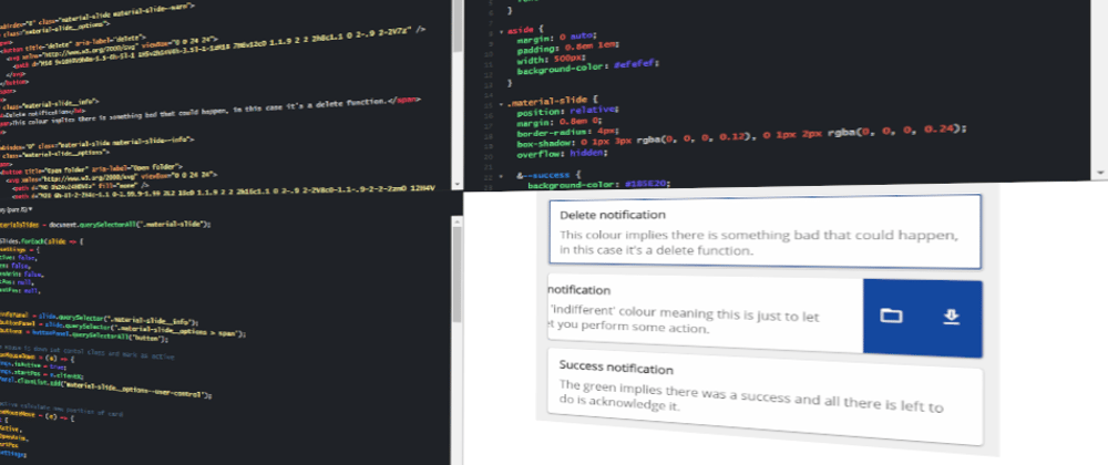
You may have noticed in the above SCSS I was using BEM which is just a style guide. In BEM when you add a variant you use -- followed by the variant name. So let's add success, info and warn as our three colour variants.
Because we're using SCSS we can easily just add the variants to our material-slide styles like so.
.material-slide {
  position: relative;
  margin: 0.8em 0;
  border-radius: 4px;
  box-shadow: 0 1px 3px rgba(0, 0, 0, 0.12), 0 1px 2px rgba(0, 0, 0, 0.24);
  overflow: hidden;

  &--success {
    background-color: #1B5E20;
    color: #fefefe;
  }

  &--info {
    background-color: #0D47A1;
    color: #fefefe;
  }

  &--warn {
    background-color: #B71C1C;
    color: #fefefe;
  }
}
I've stated the background colour and the text colour so if someone wants to add a new variant to the code they can follow the pattern and add a better contrast colour if they need one.
Nice outline
Now this is quite an interesting topic lots of A11y purest say the default outline should be left alone and for a long time I agreed with that but over the years I've considered alternatives and I think as long as you let the user know they have focus of your element it's ok to be a little adventurous.
The method I've been using for a while now is to use a box shadow in an after, though in this case I've had to use a div, which has opacity 0 until the element is focus-visible.
Again we add this to the material-slide styles.
// inside .material-slide
& .material-slide__outline {
  content: '';
  z-index: 2;
  border-radius: 4px;
  position: absolute;
  top: 0;
  right: 0;
  bottom: 0;
  left: 0;
  pointer-events: none;
  box-shadow: inset 0 0 0 1px #fefefe, inset 0 0 0 3px #01579B, inset 0 0 0 4px #fefefe;
  opacity: 0;
}

// inside .material-slide__options
&:focus-visible {
  outline: none;

  & ~ .material-slide__outline {
    opacity: 1;
  }
}
The outline is made of three lines a two white ones sandwiching a blue one, this helps with keeping the outline noticeable on top of different colours.

Gesture hints
Finally for the styles I don't think it's obvious when you see a card that it can be dragged even if you cursor changes to 'grab'. I had a think about this for a while and decided that if someone hovers over the card we should move it over by 5px just so show that the card moves.
To do this I simply added the transform to hover inside material-slide__info.
&:hover:not(.material-slide__options--user-control) {
  transform: translatex(-5px);
}
You'll also notice there is material-slide__options--user-control this is a class we will be adding with JS so let's move on to that now.
The functionality
We've made it to the final part adding some JS to make the whole thing function. Mostly this will be event listeners with a little bit of state management. For the listeners we'll want to listen for keyboard events, mouse events and touch events.
State management
For this I will just have an object which contains all the variables I need, then I will update and check against that object as I need to.
const state = {
  isActive: false,
  isOpen: false,
  isOpenLast: false,
  startPos: null,
  currentPos: null,
}
Event listeners
I'll need to listen for mouse down, move, leave and up to keep track of how far the card has been dragged. I've also decided to add double click to open an close fortunately there is a event for that. For keyboard support I'll just need to listen of key up and for touch I'll listen for touch start, move, end and cancel which are basically the same as mouse but slightly different (because of multitouch).
Sign off
Well there we have it we've made a cool little sliding panel that we can hide buttons behind. We've made it so a keyboard user can use it and so that a screen reader can read it.
I was thinking I might do another part to this series where I convert this to a React component and put it on Git/NPM, would there be any interest for that?
Thank you for reading to the end I hope you got something from this and as I said at the top of the article feel free to leave any comments or come shout at me over on twitter.
Thanks again 🧠🧙♂️❤️🦄🧠🦄❤️🧠🧙♂️🧠🧙♂️


