 Andrew Bone
For a while, I've been musing over how to take the un-customisable select element and make an accessible, jQuery-esc select menu. Of course if you can get away with not needing a custom select go for it, native always wins.
jQuery's implementation:

I had a good "proof of concept" down and decided I'd flesh it out for a post but that was when @emmabostian released her great post on a similar note. I suggest you read her article too, it's really good.

Here's my finished product, I'll go over what I've made and why below:
Requirements
We're going to need to support keyboard as well as mouse for this, so let's look to the spec to see what the expected behavour is.
Keyboard
- Enter Key, Toggle the listbox visibility
- Escape Key, Hide the listbox
- Down Arrow, Select the next option in the list
- Up Arrow, Select the previous option in the list
- Home Key, Select the first option in the list
- End Key, Select the final option in the list
Mouse
- Click input, Toggle the listbox visibility
- Click off input, Hide the listbox
- Click option, set option as active and hide the listbox
Looking at the spec I think this is all we need but I'm always open to correction.
Markup
For this, I'm using the <details> element which has the show and hide functionality I want built in.
I'm also using radio buttons in a group to allow me to store which value is correct. You can simply add checked to the default option if you want one.
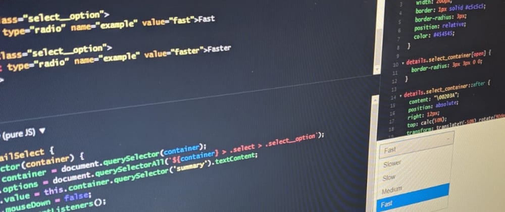
<details id="example_select" class="select_container">
  <summary>--</summary>
  <div class="select">
    <label class="select__option">
      <input type="radio" name="example" value="slower">Slower
    </label>
    <label class="select__option">
      <input type="radio" name="example" value="slow">Slow
    </label>
    <label class="select__option">
      <input type="radio" name="example" value="medium">Medium
    </label>
    <label class="select__option">
      <input type="radio" name="example" value="fast">Fast
    </label>
    <label class="select__option">
      <input type="radio" name="example" value="faster">Faster
    </label>
  </div>
</details>
Without the styles you can really see how this works. We just have a list of radio buttons, simple.
Styles
As usual, I won't go into to much detail here, this is just my preference. You may have noticed I made it look like it's jQuery counter part but you can do what you like.
details.select_container {
  display: inline-block;
  width: 200px;
  border: 1px solid #c5c5c5;
  border-radius: 3px;
  position: relative;
  color: #454545;
}

details.select_container[open] {
  border-radius: 3px 3px 0 0;
}

details.select_container summary::after {
  content: "\00203A";
  position: absolute;
  right: 12px;
  top: calc(50%);
  transform: translateY(-50%) rotate(90deg);
  pointer-events: none;
}

details.select_container[open] summary::after {
  content: "\002039";
}

details.select_container summary {
  cursor: pointer;
  padding: 6px 12px;
  background: #f6f6f6;
  list-style: none;
}

details.select_container summary::-webkit-details-marker {
  display: none;
}

details.select_container summary:hover {
  background: #ededed;
}

details.select_container .select {
  position: absolute;
  display: flex;
  flex-direction: column;
  border: 1px solid #c5c5c5;
  width: 100%;
  left: -1px;
  border-radius: 0 0 3px 3px;
  background: #fff;
}

details.select_container .select__option {
  cursor: pointer;
  padding: 6px 12px;
}

details.select_container .select:hover .select__option.active {
  background: #fff;
  color: #454545;
}

details.select_container .select__option.active,
details.select_container .select:hover .select__option.active:hover,
details.select_container .select__option:hover {
  background: #007fff;
  color: #fff;
}

details.select_container .select__option input {
  display: none;
}
The smart stuff all happens with the javascript anyway.
JavaScript
Unlike past projects I use the JS to set all the aria properties, this just means you don't have to remember to do it, which is a win. As always I've used a class, not because you have to but because I like them.
I won't go into too much detail you can have a read for yourself if there's anything you don't understand feel free to ask, but I will mention this.mouseDown and why it exists.
I decided to use focusout to close the select menu when it lost focus but discovered my click events no longer worked. After a little digging, I realised focus was lost on mouse down but click was fired on mouse up. In order to negate this I had to listen for mouse down on my options and prevent focusout from causing trouble.
class detailSelect {
  constructor(container) {
    this.container = document.querySelector(container);
    this.options = document.querySelectorAll(`${container} > .select > .select__option`);
    this.value = this.container.querySelector('summary').textContent;
    this.mouseDown = false;
    this._addEventListeners();
    this._setAria();
    this.updateValue();
  }

  // Private function to set event listeners
  _addEventListeners() {
    this.container.addEventListener('toggle', () => {
      if (this.container.open) return;
      this.updateValue();
    })

    this.container.addEventListener('focusout', e => {
      if (this.mouseDown) return;
      this.container.removeAttribute('open');
    })

    this.options.forEach(opt => {
      opt.addEventListener('mousedown', () => {
        this.mouseDown = true;
      })
      opt.addEventListener('mouseup', () => {
        this.mouseDown = false;
        this.container.removeAttribute('open');
      })
    })

    this.container.addEventListener('keyup', e => {
      const keycode = e.which;
      const current = [...this.options].indexOf(this.container.querySelector('.active'));
      switch (keycode) {
        case 27: // ESC
          this.container.removeAttribute('open');
          break;
        case 35: // END
          e.preventDefault();
          if (!this.container.open) this.container.setAttribute('open', '');
          this.setChecked(this.options[this.options.length - 1].querySelector('input'))
          break;
        case 36: // HOME
          e.preventDefault();
          if (!this.container.open) this.container.setAttribute('open', '');
          this.setChecked(this.options[0].querySelector('input'))
          break;
        case 38: // UP
          e.preventDefault();
          if (!this.container.open) this.container.setAttribute('open', '');
          this.setChecked(this.options[current > 0 ? current - 1 : 0].querySelector('input'));
          break;
        case 40: // DOWN
          e.preventDefault();
          if (!this.container.open) this.container.setAttribute('open', '');
          this.setChecked(this.options[current < this.options.length - 1 ? current + 1 : this.options.length - 1].querySelector('input'));
          break;
      }
    })
  }

  _setAria() {
    this.container.setAttribute('aria-haspopup', 'listbox');
    this.container.querySelector('.select').setAttribute('role', 'listbox');
    const summary = this.container.querySelector('summary');
    summary.setAttribute('aria-label', `unselected listbox`);
    summary.setAttribute('aria-live', `polite`);
    this.options.forEach(opt => {
      opt.setAttribute('role', 'option');
    });
  }

  updateValue(e) {
    const that = this.container.querySelector('input:checked');
    if (!that) return;
    this.setValue(that)
  }

  setChecked(that) {
    that.checked = true;
    this.setValue(that)
  }

  setValue(that) {
    if (this.value == that.value) return;

    const summary = this.container.querySelector('summary');
    const pos = [...this.options].indexOf(that.parentNode) + 1;
    summary.textContent = that.parentNode.textContent;
    summary.setAttribute('aria-label', `${that.value}, listbox ${pos} of ${this.options.length}`);
    this.value = that.value;

    this.options.forEach(opt => {
      opt.classList.remove('active');
      opt.setAttribute('aria-selected', 'false');
    })
    that.parentNode.classList.add('active');
    that.parentNode.setAttribute('aria-selected', 'true');

    this.container.dispatchEvent(new Event('change'));
  }
}

const details = new detailSelect('#example_select');
Then we make an instance
const details = new detailSelect('#example_select');
If I can do anything better here let me know, I'd be really interested to hear what you have to say.
Fin
There we have it another post in the Accessibility first series. Thank you for reading, if you have any questions please do feel free to ask them, there's no such thing as a silly question. As always feel free to use any and all of these techniques and also feel free to correct me if I've said/done something wrong.
Thanks again.
❤🦄🦄🧠❤🦄❤❤🦄


