 Mursal Furqan Kumbhar
Well, applying color to our interfaces can become a very complicated task. In this post, I am sharing some quick tips to learn how you can make an easy (beautifully) by applying the 60-30-10 technique.
Let's Start...
Step 1: Set your main color!
Create a new shape and select the color of your preference. It can be the main color of your product. Here, let's say, Hex Color Value: #4864E6.
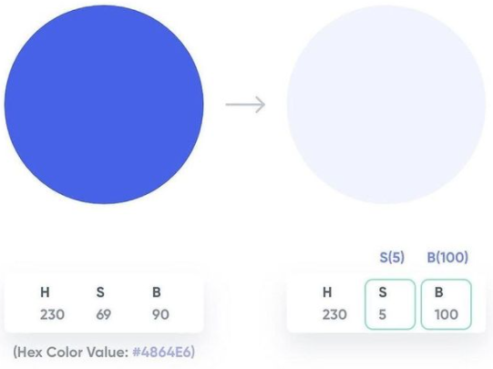
Step 2: Let's set a secondary!
Duplicate the main color and change mode to HSB in your picker. Wondering how? Easy. Set the S (Saturation) value between 5-10 points and B (Brightness) value between 95-100 points and set.
So if your primary color's HSB values are 230:69:90, let's make 'em 230:5:100.
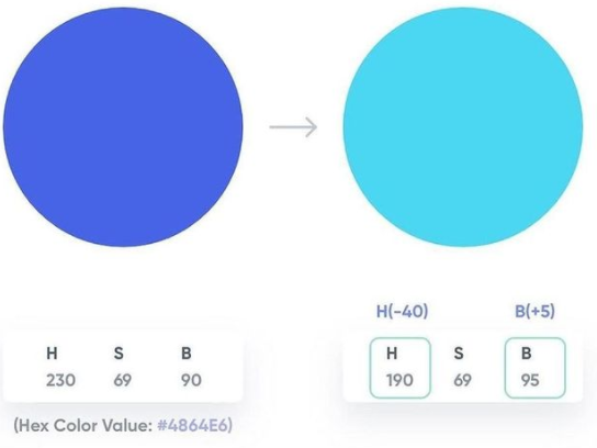
Step 3: Now let's set an accent!
Duplicate again the main color. Increase or decrease the H (Hue) value by 30-40 points and increase the B (Brightness) value by 5-10 points. So if your primary color's HSB Values are 230:69:90m let's make 'em 190:69:95.
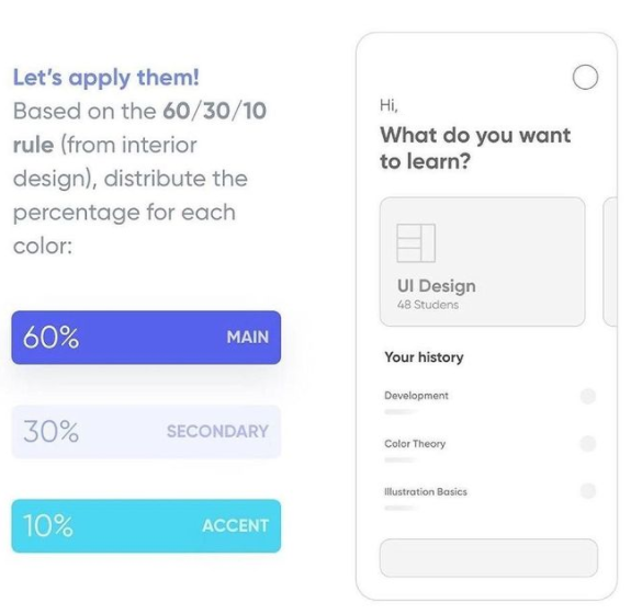
Step 4: Now we have a cool three-color scheme!
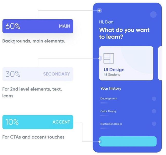
Let's apply them based on the 60/30.10 rule (from interior design), distribute the percentage for each color. So, if we talk in numbers, you can distribute the colors in the following distributions:
- Main/Primary Color: 60%
- Secondary Color: 30%
- Accent: 10%
Step 5: Distribute the colors in your layout. Here, I am sharing the almost best way to distribute these colors among your layout elements. You can refer to the following few lines:
- 60% of your primary/main color: Backgrounds, main elements
- 30% of your secondary color: For 2nd level elements, i.e. texts, icons, etc.
- 10% of your accent color: For CTAs (Call To Actions) and access touches.
Step 6: Now since you have a perfect balance, you can play around with the variations using the same colors. And believe me, it will work perfectly fine. 😍😍😍
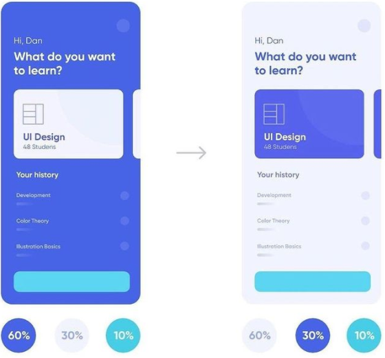
With this scheme, you can create analogous color palettes, along with a tint of greater harmony. This way your designs will look soft and fresh (and without horrible colors)


