Over the last few days I've been playing around with a few paper-inspired CSS effects in CodePen, and thought I'd share!
Experiment 1: Folded paper with taped edges
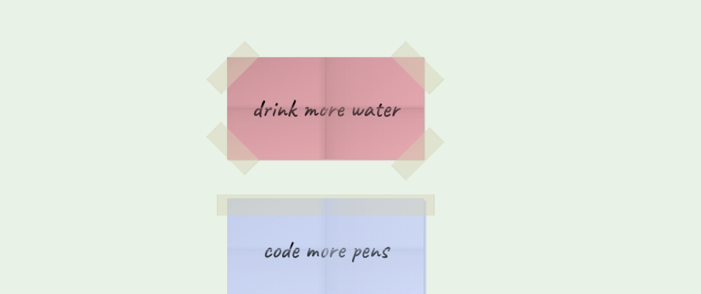
Inspired by new year's resolutions (and my lack of them), for this experiment I had a play about with a folded paper effect, and transparent layers to look like sellotape (or whatever brand of tape is popular in your country 😂).
The folded paper effect is created with an ::after pseudo element (I used ::after instead of ::before to make sure the text looked like it had been folded in the paper too), with two layered linear-gradients - one running left to right, and another top to bottom.
The tape itself has opacity set to 0.5 to give the semi-transparent effect, and I added a small dotted border on the tape ends to make it look a little serrated like it'd been cut.
Experiment 2: Pinned card
I then wanted to play about with some less crumpled paper, and had a go at a pinned card. Sticking with the 'pop it on your noticeboard' theme, it just has a simple reminder about a zoom call on the card itself.
The fun part of this - of course - was the pin. I love a bit of CSS art 😄. The different components of the pin are commented in the code so you can see how I went about it (much like all these experiments, the CSS could very usefully be tidied up in future, but hopefully you'll get the idea!). Much like the folded paper, it relies primarily on linear, and this time radial, gradients to make it look a bit more 'life like'.
Experiment 3: "Contact me" tear-off paper
Remember in the old days when you'd see adverts on noticeboards/lamp-posts/wherever with little phone number slips you could rip off and take home? I thought it might be fun to try to make one in CSS as an alternative "contact" section.
I wanted to try and make this semantic and accessible, so the contact links are all marked up as list items (this makes sure they're announced as a list to screen reader users, and show as a nice vanilla list if the CSS fails to load). I've also made heavy use of rem units, as a slightly hacky way of making sure that if a user has a larger font-size set on their browser, the content scales up without affecting the "CSS art" of it 🙂
I've tried to make some of the paper slips stick out a bit more, as if they'd been folded out from the poster slightly. To do this I used skew and - yet again - some linear gradients. It would be cool to make this interactive at some point, to let a user "tear" an item off of the list. Maybe a future experiment!


