 sanderdebr
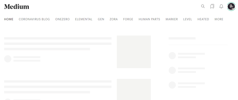
Ever seen those loading screens where you see gray bars instead of the actual content while the page is loading? These are called skeleton loading screens and used by companies like Facebook, Google, Slack, YouTube, Dev.to and others.
In this article 80 individuals were asked to rate their perceived loading time while seeing a blank page, a sekeleton screen and a spinner screen. They perceived the skeleton screen as quickest, then the spinner and as last the blank screen came. Let's create a skeleton screen together! 😀
What we'll be building (put to 0.5 view):
CSS
You could use an image to display the skeleton but this will create for additional data overhead. Plus it's not responsive. A better option is to build the screen purely with HTML andCSS.
In this example we will build a skeleton screen for a webshop. The skeleton will consists of:
- navbar with 5 items
- header with a circle and 2 squares
- 3 products
If you're wondering what that weird CSS naming conventions is I'm using, I try to use the BEM naming convention for my CSS!
Let's start with setting up our HTML, this section should be placed at the first item in our body:
   <section class="skeleton">
      <div class="skeleton__navbar">
        <div class="skeleton__nav-item"></div>
        <div class="skeleton__nav-box">
          <div class="skeleton__nav-text">Item 1</div>
          <div class="skeleton__nav-text">Item 2</div>
          <div class="skeleton__nav-text">Item 3</div>
        </div>
        <div class="skeleton__nav-item"></div>
      </div>
      <div class="skeleton__header">
        <div class="skeleton__circle"></div>
        <div class="skeleton__img"></div>
        <div class="skeleton__info"></div>
      </div>
      <div class="skeleton__products">
        <div class="skeleton__product"></div>
        <div class="skeleton__product"></div>
        <div class="skeleton__product"></div>
      </div>
    </section>
Then we create a separate CSS file which we place first thing in the head section of the document, so the skeleton div and css are loaded before the rest of the page.
Starting styles for our skeleton:
.skeleton {
  z-index: 100;
  position: fixed;
  left: 50%;
  transform: translate(-50%, 0);
  width: 100%;
  height: 100%;
  background-color: white;
}

@media (min-width: 1200px) {
  .skeleton {
    max-width: 1200px;
  }
}
Let's add some raw CSS variables and the navbar:
:root {
  --grey: #eee;
  --text: #ccc;
}

.skeleton {
  z-index: 100;
  position: fixed;
  left: 50%;
  transform: translate(-50%, 0);
  width: 100%;
  height: 100%;
  background-color: white;
}

@media (min-width: 1200px) {
  .skeleton {
    max-width: 1200px;
  }
}

.skeleton__navbar {
  width: 100%;
  height: 100px;
  background: white;
  display: flex;
  align-items: flex-end;
  justify-content: space-between;
}

.skeleton__nav-item {
  width: 100px;
  height: 50px;
  background-color: var(--grey);
}

.skeleton__nav-box {
  height: 50px;
  display: flex;
  flex-grow: 1;
  justify-content: space-evenly;
  align-items: center;
}

.skeleton__nav-text {
  color: var(--text);
}
Then we will replace the variables for a gradient and add the other elements.
:root {
  --gradient: linear-gradient(90deg, #ddd 0px, #e8e8e8 40px, #ddd 80px);
  --grey: #eee;
  --text: #ccc;
}

.skeleton {
  z-index: 100;
  position: fixed;
  left: 50%;
  transform: translate(-50%, 0);
  width: 100%;
  height: 100%;
  background-color: white;
}

@media (min-width: 1200px) {
  .skeleton {
    max-width: 1200px;
  }
}

.skeleton__navbar {
  width: 100%;
  height: 100px;
  background: white;
  display: flex;
  align-items: flex-end;
  justify-content: space-between;
}

.skeleton__nav-item {
  width: 100px;
  height: 50px;
  background-color: var(--grey);
}

.skeleton__nav-box {
  height: 50px;
  display: flex;
  flex-grow: 1;
  justify-content: space-evenly;
  align-items: center;
}

.skeleton__nav-text {
  color: var(--text);
}

.skeleton__header {
  margin-top: 2rem;
  width: 100%;
  display: flex;
  align-items: center;
  justify-content: space-between;
  padding: 2rem;
}

.skeleton__circle {
  width: 275px;
  height: 275px;
  background-color: var(--grey);
  border-radius: 50%;
}

.skeleton__img {
  width: 325px;
  height: 250px;
  background-color: var(--grey);
}

.skeleton__info {
  width: 200px;
  height: 250px;
  background-color: var(--grey);
}

.skeleton__products {
  margin-top: 2rem;
  display: flex;
  justify-content: space-evenly;
}

.skeleton__product {
  width: 200px;
  height: 200px;
  background-color: var(--grey);
}
Yay, we have a basic skeleton! Let's add some animation
Add animation
For the animation we need to add a gradient which changes position over time.
:root {
  --gradient: linear-gradient(90deg, #ddd 0px, #e8e8e8 40px, #ddd 80px);
  --animation: shine 1.6s infinite linear;
}

.skeleton__product {
  width: 200px;
  height: 200px;
  background-image: var(--gradient);
  animation: var(--animation);
  background-size: 300px;
}

@keyframes shine {
  0% {
    background-position: -100px;
  }
  40%,
  100% {
    background-position: 200px;
  }
}

Now attach it to the rest of the elements and we're done!
:root {
  --gradient: linear-gradient(90deg, #ddd 0px, #e8e8e8 40px, #ddd 80px);
  --grey: #eee;
  --text: #ccc;
  --animation: shine 1.6s infinite linear;
  --animation-header: shine-header 1.6s infinite linear;
}

.skeleton {
  z-index: 100;
  position: fixed;
  left: 50%;
  transform: translate(-50%, 0);
  width: 100%;
  height: 100%;
  background-color: white;
}

@media (min-width: 1200px) {
  .skeleton {
    max-width: 1200px;
  }
}

.skeleton__navbar {
  width: 100%;
  height: 100px;
  background: white;
  display: flex;
  align-items: flex-end;
  justify-content: space-between;
}

.skeleton__nav-item {
  width: 100px;
  height: 50px;
  background-image: var(--gradient);
  animation: var(--animation);
  background-size: 275px;
}

.skeleton__nav-box {
  height: 50px;
  display: flex;
  flex-grow: 1;
  justify-content: space-evenly;
  align-items: center;
}

.skeleton__nav-text {
  color: var(--text);
}

.skeleton__header {
  margin-top: 2rem;
  width: 100%;
  display: flex;
  align-items: center;
  justify-content: space-between;
  padding: 2rem;
}

.skeleton__circle {
  width: 275px;
  height: 275px;
  background-image: var(--gradient);
  animation: var(--animation-header);
  background-size: 300px;
  border-radius: 50%;
}

.skeleton__img {
  width: 325px;
  height: 250px;
  background-image: var(--gradient);
  animation: var(--animation-header);
  background-size: 300px;
}

.skeleton__info {
  width: 200px;
  height: 250px;
  background-image: var(--gradient);
  animation: var(--animation-header);
  background-size: 300px;
}

.skeleton__products {
  margin-top: 2rem;
  display: flex;
  justify-content: space-evenly;
}

.skeleton__product {
  width: 200px;
  height: 200px;
  background-image: var(--gradient);
  animation: var(--animation);
  background-size: 300px;
}

@media (max-width: 1200px) {
  .skeleton__navbar,
  .skeleton__header,
  .skeleton__products {
    flex-direction: column;
  }

  .skeleton__navbar {
    align-items: flex-start;
  }

  .skeleton__nav-box,
  .skeleton__nav-text,
  .skeleton__img,
  .skeleton__info,
  .skeleton__products {
    display: none;
  }

  .skeleton__nav-item {
    width: 100%;
  }

@keyframes shine {
  0% {
    background-position: -100px;
  }
  40%,
  100% {
    background-position: 200px;
  }
}

@keyframes shine-header {
  0% {
    background-position: -100px;
  }
  40%,
  100% {
    background-position: 270px;
  }
}
Disappear on page load
Next up we have to show the skeleton on page load and remove it when the page is ready.
First set the body to have hidden overflow with inline styles, so this gets loaded before all other stylesheets:
<body style="overflow: hidden;">
Then in your main javascript file, add an EventListener to the window that listens for the page to load. When loaded, remove the skeleton and give the body her overflow back! 😄
window.addEventListener("load", () => {
  document.body.style.overflow = "visible";
  elements.skeleton.style.display = "none";
});
That's all! Have fun building those skeletons. ✌️
Make sure to follow me for more tricks. 🧠