 Zoltán Szőgyényi
I've been using Tailwind CSS in a lot of my projects lately and one of the disadvantages that I've found that it does not come with a base set of components that you can use right away.
I've started a series of tutorials on how to build commonly used components with Tailwind CSS and today I want to show you how you can build a badge element.

Tailwind CSS badge component
First of all, let's start with the HTML markup. I recommend using a simple span element for the badge so that it can easily be added inside other elements as an inline element.
<span>Badge text</span>
Next up we should make it look like a badge by adding a padding, background color and text color:
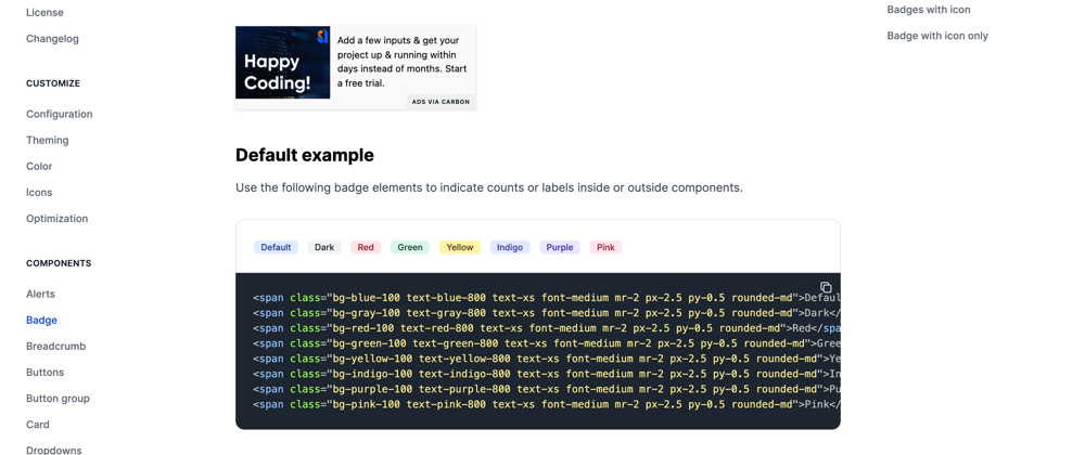
<span class="bg-blue-100 text-blue-800 px-2.5 py-0.5">Default</span>
Now let's also set the text size and font weight of the badge:
<span class="bg-blue-100 text-blue-800 text-xs font-medium px-2.5 py-0.5">Default</span>
We can make it look nicer by also adding a border radius:
<span class="bg-blue-100 text-blue-800 text-xs font-medium px-2.5 py-0.5 rounded-md">Default</span>
Awesome! Now we have created a badge element. However, what if you want to create a slightly larger badge? No problem, all you need to do is increase the padding and font size of the badge.
<span class="bg-blue-100 text-blue-800 text-sm font-medium mr-2 px-2.5 py-0.5 rounded-md">Default</span>
Badge as a link
You can also easily change the badge component to become a link by changing the span element to an anchor tag:
<a href="#" class="bg-blue-100 hover:bg-blue-200 text-blue-800 text-xs font-medium mr-2 px-2.5 py-0.5 rounded-md">Default</a>
Badge with icon
Sometimes adding an icon can improve a lot in terms of UI and even usability. I recommend using SVG icons for better performance. Here's an example:
<span class="bg-gray-100 text-gray-800 text-xs font-medium inline-flex items-center px-2.5 py-0.5 rounded-md mr-2">
  <svg class="w-3 h-3 mr-1 text-gray-500" fill="currentColor" viewBox="0 0 20 20" xmlns="http://www.w3.org/2000/svg"><path fill-rule="evenodd" d="M10 18a8 8 0 100-16 8 8 0 000 16zm1-12a1 1 0 10-2 0v4a1 1 0 00.293.707l2.828 2.829a1 1 0 101.415-1.415L11 9.586V6z" clip-rule="evenodd"></path></svg>
  3 days ago
</span>
I hope this tutorial helps you in your journey with Tailwind and your project.
Tailwind CSS Components Library - Flowbite
This Tailwind badge component is part of a larger Tailwind CSS components library that I helped develop. It is open source under the MIT license and it is also published on Github and NPM.
Learn more about Flowbite, a Tailwind CSS components library by following the quickstart guide.


