
 Westbrook Johnson
Getting your hands dirty and feet wet with Open Web Component Recommendations...sort of.
This a cross-post of a Feb 26, 2019 article from Medium that takes advantage of my recent decision to use Grammarly in my writing (so, small edits have been made here and there), thanks for looking again if you saw it there 🙇🏽♂️ and if this is your first time reading, welcome!
Welcome to “Not Another To-Do App”, an overly lengthy review of making one of the smallest applications every developer ends up writing at some point or another. If you’re here to read up on a specific technique to writing apps or have made your way from a previous installation, then likely you are in the right place and should read on! If not, it’s possible you want to start from the beginning so you too can know all of our characters’ backstories...
If you’ve made it this far, why quit now?
Make it a Component

Ok, sure, this one seems like a no brainer, I wanted web component-based UI, I chose open-wc’s generator in agreement with its choice of LitElement as a base class for building high quality, performant web components, so everything should be a component, right?
Wrong!
Even when working in web components, not everything has to be a component, sometimes it’s enough just to make it a template part (which we’ll discuss more thoroughly on the next episode of “Not Another To-Do App”). What’s more, it’s just as easy to say “that doesn’t need to be a component” even when it does. It’s important to constantly police yourself so as to make reading and understanding your code as easy as possible for future you. When it comes to making components, that means preparing code to be factored down into its own component, factored up into the parent component, or factored completely out of a project as an external dependency, as easy as possible. I found myself running into this when thinking about the input field for the new to do UI.

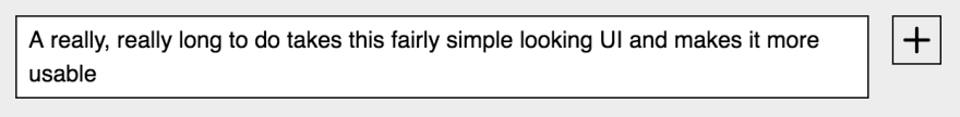
At first glance, this is very clearly an input element next to a button element to most people, right? Same here. That is until I was messing around with my app (some might call it QA [quality assurance testing]) mid-development and ran into this:

Sure, it’s just a To-Do app, why worry about this seemingly small piece of UI not being 100%? My argumentative answer to that is, “why worry about anything?” But, in reality, this is just a conversation, we’re just talking about the possibilities. Taking some knowledge I’d acquired around similar UIs in the past I started writing the code that I felt corrected this experience. Turn the input into a textarea, drop it in a container element, giving a sibling to mirror its content, hide the siblings behind it, and before long you have a growing textarea. What you also have is a lot of code that has nothing to do with writing a to-do living inside of src/to-do-write.js. Enter some self-policing...
Is this directly related to <to-do-write></to-do-write>? No. Would it make the code flow of <to-do-write></to-do-write> easier to parse by its absence? Yes. Am I using this elsewhere in my project? No. Could I see myself possibly wanting this in another project in the future? Yes. There are no definite answers in code, only what’s right for the context you’re working in at the time, and for me, the answer to these questions at that time was “make it a web component”. So, I did.
Skipping right to the final version of its delivery, implementation of this new custom element starts in the src/to-do-write.js code where we update the render() method to include my new custom element, like:
<growing-textarea>
    <textarea
        aria-label="Write the next thing you need to get done."
        id="todo"
        name="todo"
        placeholder="What needs to get done?"
    ></textarea>
</growing-textarea>
It seems a lot like a pretty normal textarea, right? The growing-textarea custom element uses the decorator pattern to upgrade that normal textarea to have superpowers. (Plug: the Decorator Pattern Plus can give it even more!)
But, how?
Let’s dive into src/growing-textarea.js to find out.
class GrowingTextarea extends LitElement {
    static get properties() {
        return {
            value: { type: String }
        };
    }
    constructor() {
        super();
        this.value = '';
        this.setValue = this.setValue.bind(this);
    }
    setValue(e) {
        this.value = e.target.value;
    }
    listenOnSlottedTextarea(e) {
        if (this.textarea) {
            this.textarea.removeEventListener(
                'input',
                this.setValue
            );
        }
        const nodes = e.target.assignedNodes();
        const [textarea] = nodes.filter(
            node => node.tagName === 'TEXTAREA'
        );
        if (!textarea) return;
        this.textarea = textarea;
        this.textarea.addEventListener('input', this.setValue);
    }
    static get styles() {
        return [
            styles,
        ];
    }
    render() {
        return html`
            <slot
                @slotchange=${this.listenOnSlottedTextarea}
            ></slot>
            <span aria-hidden="true">${this.value}</span>
        `;
    }
}
But, what’s really going on there?
It all starts with this:
<slot
    @slotchange=${this.listenOnSlottedTextarea}
></slot>
Check the lit-element based event listening on the slot element for the slotchange event. That means that any time the content for the default slot in the template of growing-textarea changes, or in other words:
<growing-textarea>
    <!--
        any changes here that don't have
        a specific [slot="..."] attribute
    -->
</growing-textarea>
That change triggers a call to listenOnSlottedTextarea. Once you get into that listener you have access to event.target.assignedNodes() which will give you an array of the nodes assigned to the slot in question. There’s a little bit of administrative work going on in there, but the net effect is being able to capture the value of the slotted textarea as it is input. That value is then applied to a mirror element that expands the height of the growing-textarea element, who’s height is now managing the height of the textarea via the CSS like the following:
:host {
    display: block;
    position: relative;
    min-height: 20px;
    width: 100%;
}
span,
::slotted(textarea) {
    min-height: 20px;
    padding: 2px 6px;
    font-size: 14px;
    line-height: 16px;
    box-sizing: border-box;
}
span {
    border: 1px solid;
    display: block;
    white-space: pre-wrap;
}
::slotted(textarea) {
    position: absolute;
    top: 0;
    width: 100%;
    height: 100%;
    border: 1px solid black;
    resize: none;
    font-family: inherit;
    z-index: 2;
}
What’s more, this element is now factored down into a format that will make publishing it into its own standalone package a snap. When you choose to do just that, don’t forget the rest of the open-wc recommendations for making your new package bulletproof when distributing it across your various project, your team, or hopefully the JS community at large. After you’re done, let me know in the comments below what sort of custom elements you’ve been making.
Disclaimer: no, the assignedNodes is not currently available x-browser, and webcomponents.js does not actively add this event to non-supporting browsers. In that we’re merely decorating the textarea with the growing-textarea custom element, this lack of support won’t actually break our application, users in those browsers will simply get a little different UX than more modern browser users. If you are not comfortable with delivering the growing text area via progressive enhancement this could put a damper on the whole approach I’ve just outlined. However, you can apply an x-browser compliant version of this code when using FlattenedNodesObserver as vended by the Polymer.js library if you’d like to opt-into broader browser coverage for this feature. You get to choose your own adventure on this one.
While I’m not going to into depth about how FlattenedNodesObserver works here, I am planning to write about at more length soon, so stay tuned.
The Short Game
As voted on by a plurality of people with opinions on such topics that are both forced to see my tweets in their Twitter feed and had a free minute this last week, a 9000+ word article is a no, no.
 WestbrookJ@westbrookj
 So, I'm writing a blog post... I've noticed that while I wasn't looking it's gotten rather long, like maybe 7000 words once complete. I'd like to say I will have much luck editing it down, but some skills I'm still developing... What should I do?12:22 PM - 20 Feb 2019


So, it is with the deepest reverence to you my dear reader that I’ve broken the upcoming conversations into a measly ten sections. Congratulations, you’re nearing the end of the first! If you’ve enjoyed yourself so far, or are one of those people that give a new sitcom a couple of episodes to hit its stride, here’s a list of the others for you to put on your Netflix queue:
- Not Another To-Do App
- Getting Started
- Test Early, Test Often
- Measure Twice, Lint Once
- Make it a Component (you are here)
- Make it a Reusable Part
- Does Your Component Really Need to Know That? (Do you?)
- Separate Things Early, Often, and Only as Needed
- Some Abstractions Aren’t (Just) For Your App
- Reusable and Scaleable Data Management/And, in the end...
- See the app in action
Special thanks to the team at Open Web Components for the great set of tools and recommendations that they’ve been putting together to support the ever-growing community of engineers and companies bringing high-quality web components into the industry. Visit them on GitHub and create an issue, submit a PR, or fork a repo to get in on the action!