 Cyd
CydTo become a better web developer you have to keep challenging yourself and keep learning new stuff. Thankfully I have amazing colleagues at Matise who are critical thinkers and always curious about new technologies, even while in self isolation. Last week I learned about the Observer api for example and I implemented it in two of our projects. This week I wanted to know how to make objects three dimensional with CSS, and in order to keep it fun I used a TARDIS as the object.
Transform styles and translating the Z axis
I started simpler of course; I did a little research and found that there are a couple of CSS properties you can use to create a 3d object.
One of the most important is transform-style, it has a default value of flat but needs to be set to preserve-3d; in order for the cube to become a cube. otherwise the sides will just be stacked on top of each other.
The perspective property lets you determine how far away the object is on the Z plane by adding any length value, which sounds really trippy. Increasing the perspective amount makes the object seem farther away. There's also a difference between the perspective property and perspective transform function, which is still a bit unclear to me to be honest.
The final property you'll need is the transform property which allows multiple transform functions like rotateY and rotateX, but also the very important translateZ property to assign positions on the z-axis per element.
Using rotate you can create a different perspective and see some of the top of the cube.
.cube {
  position: relative;
  transform-style: preserve-3d;
  transform: rotateX(-5deg) rotateY(1turn);
  // using a linear animation easing
  // to create an infinitely spinning cube
  animation: turn 12s linear infinite;
A cube has six sides (unless you count the inside, hehehehe) so I had to add 6 divs which are all 10x10em. Somehow setting translateZ to half the width of the sides creates a pretty hotpink cube.
  .side {
    position: absolute;
    width: 10em;
    height: 10em;
    background: hotpink;
    &.front {
      transform: translateZ(5em);
    }
    &.top {
      transform: rotateX(90deg) translateZ(5em);
    }
    &.right {
      transform: rotateY(90deg) translateZ(5em);
    }
    &.left {
      transform: rotateY(-90deg) translateZ(5em);
    }
    &.bottom {
      transform: rotateX(-90deg) translateZ(5em);
    }
    &.back {
      transform: rotateY(-180deg) translateZ(5em);
    }
  }
}
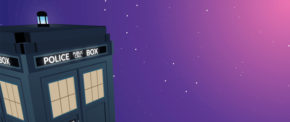
Time and relative dimension in space
After successfully creating a cube I thought it was time for the real deal; a TARDIS. I created a TARDIS before but it had just one dimension which means it just wasn't good enough, because everyone knows a Tardis should spin.
While a TARDIS is a little more complicated than a cube the principle is the same; set perspective: 800px; on the parent element and transform-style: preserve-3d; on the container element, and add 6 sides to transform.
The thing I struggled with most were things like the roof and the fact that once you've set a translateZ on a parent element the children aren't translatable on the z-axis anymore. Orrrr I was doing something wrong, please let me know if you know what.

You can do it too!
Let me know if you create any three dimensional stuff in CSS, bonus points if it's from Doctor Who. :)