 Jatin Sharma
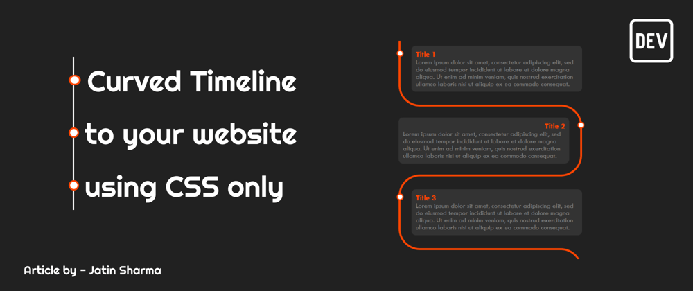
 In this article, we are gonna build a curved timeline for your website which you can use later on in your portfolio to display your work history or maybe something else you want. Let's first look at what are we building -

Now you have seen what we are up to so let's get hands in the code -
HTML
<div class="timeline">
  <div class="outer">
    <!-- .... card before this -->

    <div class="card">
      <div class="info">
        <h3 class="title">Title 1</h3>
        <p>
          Lorem ipsum dolor sit amet, consectetur adipiscing elit, sed do
          eiusmod tempor incididunt ut labore et dolore magna aliqua. Ut enim ad
          minim veniam, quis nostrud exercitation ullamco laboris nisi ut
          aliquip ex ea commodo consequat.
        </p>
      </div>
    </div>
    <!-- ..... you can add more div with "card" class -->
  </div>
</div>
In the HTML code, the timeline class is the main container and the outer class is the wrapper for all the cards. and then we have a card in which we add data.
Now let's look at the CSS -
CSS
/* Timeline Container */
.timeline {
  background: #212121;
  margin: 20px auto;
  padding: 20px;
}

/* Card container */
.card {
  position: relative;
  max-width: 400px;
}

/* setting padding based on even or odd */
.card:nth-child(odd) {
  padding: 30px 0 30px 30px;
}
.card:nth-child(even) {
  padding: 30px 30px 30px 0;
}
/* Global ::before */
.card::before {
  content: "";
  position: absolute;
  width: 50%;
  border: solid orangered;
}

/* Setting the border of top, bottom, left */
.card:nth-child(odd)::before {
  left: 0px;
  top: -4.5px;
  bottom: -4.5px;
  border-width: 5px 0 5px 5px;
  border-radius: 50px 0 0 50px;
}

/* Setting the top and bottom to "-5px" because earlier it was out of a pixel in mobile devices */
@media only screen and (max-width: 400px) {
  .card:nth-child(odd)::before {
    top: -5px;
    bottom: -5px;
  }
}

/* Setting the border of top, bottom, right */
.card:nth-child(even)::before {
  right: 0;
  top: 0;
  bottom: 0;
  border-width: 5px 5px 5px 0;
  border-radius: 0 50px 50px 0;
}

/* Removing the border if it is the first card */
.card:first-child::before {
  border-top: 0;
  border-top-left-radius: 0;
}

/* Removing the border if it is the last card  and it's odd */
.card:last-child:nth-child(odd)::before {
  border-bottom: 0;
  border-bottom-left-radius: 0;
}

/* Removing the border if it is the last card  and it's even */
.card:last-child:nth-child(even)::before {
  border-bottom: 0;
  border-bottom-right-radius: 0;
}

/* Information about the timeline */
.info {
  display: flex;
  flex-direction: column;
  background: #333;
  color: gray;
  border-radius: 10px;
  padding: 10px;
}

/* Title of the card */
.title {
  color: orangered;
  position: relative;
}

/* Timeline dot  */
.title::before {
  content: "";
  position: absolute;
  width: 10px;
  height: 10px;
  background: white;
  border-radius: 999px;
  border: 3px solid orangered;
}

/* text right if the card is even  */
.card:nth-child(even) > .info > .title {
  text-align: right;
}

/* setting dot to the left if the card is odd */
.card:nth-child(odd) > .info > .title::before {
  left: -45px;
}

/* setting dot to the right if the card is odd */
.card:nth-child(even) > .info > .title::before {
  right: -45px;
}
Codepen is Here
See the Pen css-timeline-with-curves by Jatin (@j471n) on CodePen.
Conclusion
This is just the beginning, you can customize it to the next level, and maybe I'll do in the future article to stay tuned for that if you have any suggestions then comment below.
You can now extend your support by buying me a Coffee.😊👇