Last week, I shared my vision for interactive data visualizations, and described how I approached building in interactivity into a COVID-19 world map visualization using React and D3. At that point, my app was a work-in-progress, not yet deployed. This week, I'll describe how I used the same vision to approach interactivity in bar charts, allowing users to compare the experience of multiple countries since the first day of COVID-19 cases in each country. My hope is that users will engage and interact with the data displayed on the map view, develop questions they want to investigate, and use those questions to guide a detailed analysis of data through the collections of bar graphs. Let's get started!
Missed Part 1 of this series? Check it out here:
React and D3: Dynamic COVID-19 Visualizations (Part 1: World Map)Are you antsy to just jump to the live site? First, check out a quick video demo and skim through the README.md file for a quick tour of the project.
Then explore the live site here: COVID-19 World Tracker
Comparing Country-Specific Historical Data Using the Bar Chart Visualizations

The Available Data
While the map visualizations on my tracker focus on real-time, cumulative global data, I wanted to include longitudinal data as well. I wanted a user to be able to examine the "curve" of new COVID-19 cases and each country's experience in "flattening the curve". I wanted them to be able to look across multiple countries to see rates of active and recovered cases, as well as the number of deaths. I suspected many countries would have dramatically different curves on each of these indicators, and may lead to more inquiry around each country's vulnerability to the outbreak, available resources, and political response to the outbreak as well as easing of restrictions. I also wanted to make sure that I could provide data for as many countries as possible, not just the top 10 or 20 countries that we typically hear about in the news.
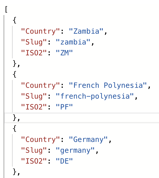
These goals led me towards using the Coronavirus COVID19 API, which sources data from Johns Hopkins University. I set up a container component, New.js, that would fetch basic country data (such as name, slug, and code).
    useEffect( () => {
        async function fetchData() {
            var requestOptions = {
                method: 'GET',
                redirect: 'follow'
              };

            const response = await fetch("https://api.covid19api.com/countries", requestOptions)
            const data = await response.json()
            setCountries(data)
        }
        fetchData();
    }, []);
I then set up the CountryDropdown component, that rendered options based on the results of the fetch:
 <select onChange={ event => {setCollection([...collection, [event.target.value.split(",")[1], event.target.value.split(",")[2], event.target.value.split(",")[0]]]);
   fetchCountry(event.target.value.split(",")[0], event.target.value.split(",")[1])}}>

<option placeholder="Choose a Collection of Countries">Choose a Collection of Countries</option>
   {props.options.map(option => (
       <option
          id={props.id}
          key={option.value}
          value={[option.value, option.name, option.flagCode]}
       >
       {option.name}
       </option>
   ))}
</select>

<NavLink
  to = {{
     pathname: `/collection`,
     countryData,
     collection
  }}>
  <button className="dark" disabled={invalid()}>View Collection</button>
</NavLink>
Each country's entry included the following information, and I needed to extract the Country and Slug keys:
As the user clicks on countries, each country's flag is displayed below and those countries are added to the collection.

When the user is finished creating their collection, another fetch request is triggered to retrieve country-specific COVID-19 data for each country in the collection, passing the country (slug) and countryName (full name) as arguments.
    const fetchCountry = (country, countryName) => {
        async function fetchData() {
            const requestOptions = {
                method: 'GET',
                redirect: 'follow'
            };

            const response = await fetch(`https://api.covid19api.com/total/dayone/country/` + `${country}`, requestOptions)
            const data = await response.json()
            setCountryData(countryData => [...countryData, {[countryName]: [data], slug: country}])
        }
        fetchData();
    }
...
The fetched data is received in the following format: For each country in the collection, we receive an array ob objects, with one object representing a day's worth of COVID data from day one of the outbreak (for that country) to the current day.

Finally, when the "View Collection" button is clicked, the NavLink passes country and collection data to the Collection component, which renders a Country component for each country. Each Country component first parses the data into a format that will be used for the D3 visualizations, and then renders the Viz component wrapped in a NavLink, which will allow the user to navigate between the dashboard (or index view) and the individual country (show view). The Viz component is merely a placeholder component to make the connection between React and D3 by rendering an empty < div > with a className of "viz" (plus a country slug), to which D3 can attach each bar graph.
import React, { useEffect } from 'react';
import DrawBar from './DrawBar'

const Viz = (props) => {

    useEffect( () => {

        DrawBar(props.countryName, props.totalCases, props.dailyData, props.id, props.caseType)
    }, [])

    return (
        <div className={"viz" + props.id} ></div>
    )
}

export default Viz
Creating Options Based on Available Data
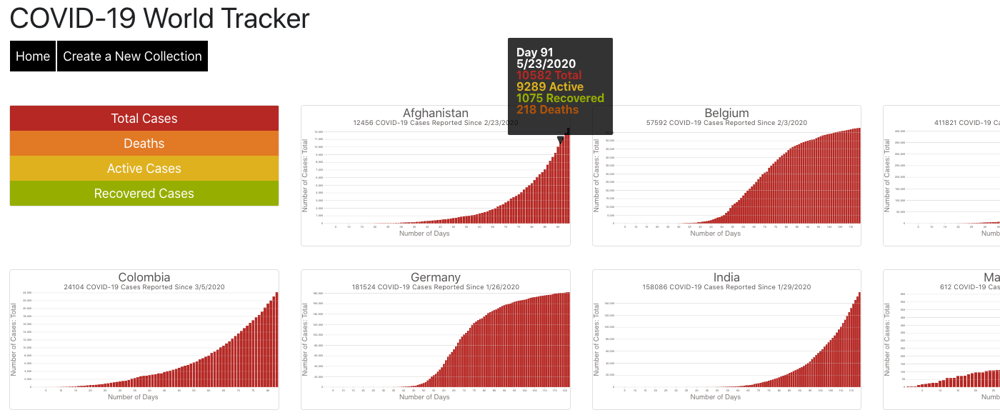
In the end, this chain of events renders us a country-comparison dashboard:
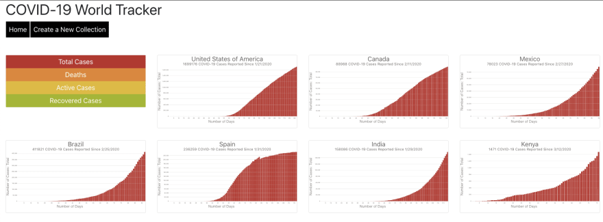
Following the structure of my map visualization on the home page, I created a vertical button menu with options that aligned to the keys in the data fetched from the Coronavirus COVID19 API. On click, the button would set the caseType according to the specific data the user wanted to see, which would cause a re-render of each Viz component, re-drawing the map using the data that matched the new caseType.
const Collection = (props) => {
    const [caseType, setCaseType] = useState("");

    return (
      <div>

        <button onClick={event => (setCaseType(event.target.value), selectAll("svg").remove())} className="deathsPerOneMillion block" value="deaths">Deaths</button>

        ...

        {props.location.countryData.map((country, index) => {
          return (
             <Country key={index} id={index} country={country} caseType={caseType} collection={props.location.countryData}/>
          )
        })}
    </div>
  )
}
Visualizing the Data Selected by the User
As the user interacts with the menu buttons, each svg is selected and removed, and then re-drawn with the new data. The DrawBar function includes all of the logic involved with making the bar graphs dynamic, taking in the following arguments:
- countryName - used for formatting the title of the graph
- totalCases - used for the subtitle of the graph
- dailyData - an array of data for the country, with one object representing each day of the outbreak
- id - the country's slug name used for attaching the chart to the appropriate HTML element
- caseType - the type of data the user has chosen (Total Cases, Recovered Cases, Deaths, or Active Cases)
Throughout the function, the caseType and other arguments are interpolated to render the correct titles and sub-titles, scale the axes appropriately, render the appropriate sized bars, and color-code the bars and tooltip text. For example, the code snippet below shows how the a group is appended the the < svg > element for a particular country, assigns bar color based on the caseType variable, sets up the xAxis based on the values from the dailyData dayCount key, and sets the yAxis and bar heights by interpolating the caseType using bracket notation. Similar interpolation patterns are repeated throughout the DrawBar function, which allows the user to customize their views by using the menu buttons on the screen.
    const svg = select(`.${vizName}`)
        .append("svg")
        .attr("preserveAspectRatio", "xMinYMid meet")
        .attr("viewBox", [0, 0, width, height])

    const g = svg.append("g")
        .attr("fill", color(caseType))
        .selectAll('rect')
        .data(dailyData)
        .join("rect")
        .attr('x', d => xScale(d.dayCount))

        .attr("y", d => yScale(d[`${caseType}`]))
        .attr("width", xScale.bandwidth())
        .attr("height", d => yScale(0) - yScale(d[`${caseType}`]))
You can view the code for the DrawBar() function in my repository
Adding Additional Interactive Features
Based on my vision for the app, it was really important for users to be able to view all of the countries at once in a dashboard view, and interact with the data with thumbnail views in order to quickly make comparisons across countries. However, that approach makes the data very challenging to read. I addressed this challenge with the following features:
I added a tooltip with data labels so that a user could hover over a bar and view the day, date, and data for each type of case. This was accomplished through creating a large HTML string.
    const tip = d3Tip()
        .attr('class', 'd3-tip')
        .offset([-10, 0])
        .html(function(d) {
            return "<p>" + "<span style='color:white'>" + "Day " + d.dayCount + "<br/>" +
                d.date.toLocaleDateString() + "<br/>" + "</span>" +
                "<span style='color:#BD2D28'>" + d.total + " Total" + "<br/>" + "</span>" +
                "<span style='color:#E3BA22'>" + d.active + " Active" + "<br/>" + "</span>" +
                "<span style='color:#A0B700'>" + d.recovered + " Recovered" + "<br/>" + "</span>" +
                "<span style='color:#BA5F06'>" + d.deaths + " Deaths" + "</p>"
        })

I wrapped each Viz component in a NavLink which allows the user to click on any graph to view the show page with an enlarged graph.
     <NavLink
         to = {{
             pathname: `/countries/${props.country.slug}`,
             countryName,
             totalCases: totalCases(),
             dailyData: parseData(dailyData, array),
             slug: props.country.slug,
             id: props.country.slug,
             collection: props.collection
         }}>
         <Viz countryName={countryName} totalCases={totalCases()} dailyData={parseData(dailyData, array)} id={props.country.slug} slug={props.country.slug} caseType={props.caseType}/>
     </NavLink>
Here, the user has all of the same interactions described above, but at a larger scale.

The user can move and back and forth between the dashboard and show page by clicking on maps, and then clicking the "Return to Collection" button.
    <NavLink
       to = {{
          pathname: `/collection`,
          countryData: props.location.collection
       }}>
       <button className="reset block">Return to Collection</button>
   </NavLink>
Final Thoughts
As a #codenewbie, I've only been coding for 9 months. I graduated from Flatiron School's Software Engineering bootcamp a month ago, and at that point, set out a few goals for myself to learn new skills and practice the skills I already had. Looking back to that goals list, this project helped me to achieve all 6 goals in a very meaningful way:
- Use Hooks as opposed to Lifecycle Methods
- Create functional components rather than reliance on class components
- Limit my use of extra frameworks and libraries
- Practice using local state and passing props rather than a Redux store
- Fetch data from external APIs
- Use D3 to create and render data visualizations
Is this project perfect? No, there is more I would like to do in terms of responsiveness and improving the user interface, especially for mobile devices. And GitHub Pages isn't playing very nicely with React-Router, so I've lost some automatic redirects. There are some areas in which I need to clean up my code and refactor. But as a #codenewbie, it's time to move on to setting new goals for myself, and accomplishing them through a new meaningful project.
If you made it this far without jumping to the live site, check it out now!
First, check out a quick video demo and skim through the README.md file for a quick tour of the project.
Then explore the live site here: COVID-19 World Tracker
Missed Part 1 of this series? Check it out here:
React and D3: Dynamic COVID-19 Visualizations (Part 1: World Map)
If you explored the site, let me know what you think in the comments below:
- How did you explore the site?
- What questions did you come up with? What did you investigate?
- Did the map view and country dashboard work together to help you develop more questions, and better understand the COVID-19 pandemic?


