
 Jhey Tompkins
Looking for an interesting text animation on your next project? In this post, we’re going to make the following text reveal animation.

To do this, we’ll leverage the power of CSS variable scope 💪
For those in camp TL;DR, scroll down for the demos & code 👍
DISCLAIMER
This effect is achievable with only HTML & CSS. I’m using a little JavaScript to enhance the markup. It makes things different on each refresh. I’ll also share a non-JavaScript version though 👍
MARKUP
The first thing we need is some markup ✅
<p>Glitchy Text Reveal!</p>
JAVASCRIPT
Here’s that JavaScript.
const { Splitting } = window
const RESULTS = Splitting()
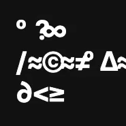
// Set of characters we can use to glitch through
const GLITCH_CHARS = '`¡™£¢∞§¶•ªº–≠åß∂ƒ©˙∆˚¬…æ≈ç√∫˜µ≤≥÷/?░▒▓<>/'.split('')
// Loop through our Splitting results and apply CSS variables.
// The results contain an Array of spans that are the characters.
for (let r = 0; r < RESULTS.length; r++) {
const CHARS = RESULTS[r].chars
for (let c = 0; c < CHARS.length; c++) {
// We are going to inline 10 CSS variables
for (let g = 0; g < 10; g++) {
CHARS[c].style.setProperty(
`--char-${g}`,
`"${GLITCH_CHARS[Math.floor(Math.random() * GLITCH_CHARS.length)]}"`
)
}
}
}
We are using the brilliant Splitting.js to slice up our text into spans.
This enables us to select individual characters 😎 Once we have the result, we loop over the character elements and apply inline CSS variables. These variables dictate what glitchy characters should show.
The resulting markup for a character might look something like this.
<span
  class="char"
  data-char="G"
  style="
    --char-0:'˙';
    --char-1:'§';
    --char-2:'º';
    --char-3:'∞';
    --char-4:'˙';
    --char-5:'▒';
    --char-6:'˙';
    --char-7:'µ';
    --char-8:'£';
    --char-9:'<';">
    l
</span>
CSS
First, we need to style up a pseudo-element to duplicate our character. Then, we hide the original.
[data-char] {
  color: transparent;
  position: relative;
}
[data-char]:after {
  --txt: attr(data-char);
  animation-duration: 0.2s;
  animation-delay: 0.5s;
  animation-timing-function: steps(1);
  animation-fill-mode: backwards;
  content: var(--txt);
  color: var(--color);
  position: absolute;
  left: 0;
  top: 0;
}
Note how the content is being filled with a CSS variable 👍
Here’s the trick. We are going to leverage CSS variable scope to create a "One animation fits all" type of scenario. We define one set of keyframes that will switch out the content property. How does it know what to switch to? It will reference those inline variables we set earlier 😉
@keyframes glitch-switch {
  0% { content: var(--char-0); }
  10% { content: var(--char-1); }
  20% { content: var(--char-2); }
  30% { content: var(--char-3); }
  40% { content: var(--char-4); }
  50% { content: var(--char-5); }
  60% { content: var(--char-6); }
  70% { content: var(--char-7); }
  80% { content: var(--char-8); }
  90% { content: var(--char-9); }
  100% { content: var(--char-0); }
}
That’s it!
It’s not very interesting though is it? Let’s play with animation-iteration-count to change the effect. How about a random iteration count defined by an inline CSS variable?
We could inline a count variable like this;
CHARS[c].style.setProperty('--count', Math.random() * 5 + 1)
And then apply it in our CSS;
animation-iteration-count: var(--count);
Giving us something like this! 🎉
ACCESSIBILITY
It’s worth mentioning how to make this accessible. The simplest solution will be to duplicate the text and apply aria-hidden to our glitchy text 👍
THAT’S IT!
A CSS glitchy text reveal in 3 minutes! Be sure to check out the demo for different timing behaviors.
As always, any questions or suggestions, please feel free to leave a response or tweet me 🐦! And be sure to connect with me on the socials! 🤓
And here’s that CSS only version 😉 You’d thought I forgot hadn't you? Until next time 👋


