This is a series of articles about Flutter and the little time I am dedicating to grasp it, you can find part 1 here.
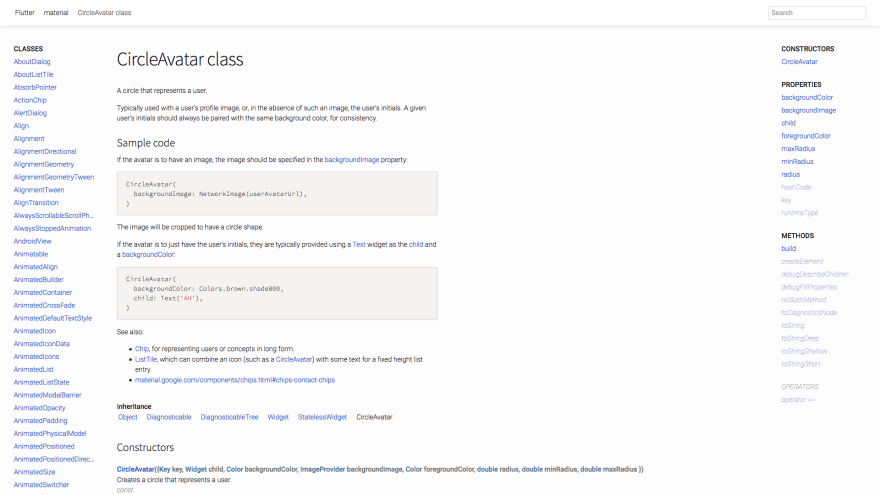
The online Flutter documentation is okayish. Well, it's not great. There's a lot of blue on white, lots of empty space (which doesn't feel harmonized at all), no syntax highligthing and for the love of all the Norse deities there are no images or screenshots of the widgets! How I am, as a total newbie in mobile development, supposed to figure out what a CircleAvatar (ok maybe wrong example) looks like?? I don't want to have to create an app, slog through the aforamentioned documentation, figure out how to use the widget just to see that I definitely do not need it because it wasn't what I thought.
Give me images, give me GIFs.
Yes, there's an Android app called Flutter Gallery which showcases some of the controls but... well you know.
Look at how sad this looks like:
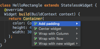
While following Flutter's Udacity (more disappointment is coming, don't worry) I found a nice IDE addition for Android Studio that is totally missing from Flutter's extension for Visual Studio Code:
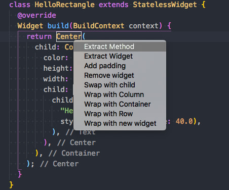
Update - 2018-10-21: Visual Studio's Dart/Flutter plugin has the same functionality, triggered by pressing Cmd/Ctrl + .:
thanks @dantup for pointing me in the right direction
Since everything (borders, layouts, paddings and so on) is a widget, those nice shortcuts could save time.
Moving on to Android - iOS and Flutter I think that if you want a native looking app you need to structure your code to have separate sets of widgets for each platform. It still saves time instead of having two separate apps but I thought Flutter had a unique set of widgets that rendered natively depending on which platform it was running on. Like an abstraction layer one level up. The ultimate abstraction. I guess that's almost science fiction. To be fair: except from Google apps none of the apps on my phone look "Material(y)" and you can minimize the separation between the two platforms by clever programming. Even the demo app built by the course customizes the widgets so that they don't look "basic".
Moving on with the course you learn that screen transitions are really easy (but maybe are really easy with the native SDKs as well, I have no idea): Flutter has a navigator and you push widgets on this navigator's stack. Reminds me a lot of Vue Router. Bonus: if you add an AppBar you get the back button for free which goes back to the previous screen. Basically like Vue Router and the container browser. Well done, no disappointment here.
Another thing that reminds me of Vue (or reminds me of you?) is the concept of stateful widget. If you write it correctly Flutter will know when to redraw and when not to. There's a counter part in stateless widgets (like Vue's functional components I guess) when you don't need to manipulate state.
A critique to Dart and a lot of code I see around in tutorials: I don't like how this is implicit. It should be clear at a glance if what I'm looking at is a local variable or a class attribute. You can still use it though, you just need to be disciplined about it. Another think I don't love is the "default" import style:
import 'package:flutter/material.dart';
this imports the entire package into your module's namespace. The equivalent in Python would be:
from flutter.material import *
This doesn't help the newbie that much. If you have many of this imports it's not funny to have to use the search engine to know where a class comes from. Fortunately Dart supports aliased imports, like:
import 'package:flutter/material.dart' as material;
it's just that the code I've seen around doesn't use them.
Another feeling I got by following the course is that at some point someone will write a UI designer tool that generates scaffolding code with hooks to override in a subclass. Writing the whole code by hand is fine and dandy but as a non designer with lame skills in UI design I wanted to shoot myself when the course said: "and now let's refactor this". And it was a unit converter. I can't imagine a complex app. This, without such tool, requires a lot of discipline and code separation.
The main disappointment of this article though is relative to the course itself. As I mentioned it was split in two lessons. Lesson 2 reminds me of some university courses in which the topic was "everything that didn't fit the first part of the subject, but with fewer explanations". You go from tutorial to "here's your giant pile of 50 widgets I haven't told you about, now refactor the app" in point five seconds. The course is free but frustration and disappointment aren't.
Two things they could have mentioned but were taken for granted: how to style dropdowns or how to use them at all, why the business logic is totally immersed in the widget's state. It's a feast of unexplained widgets you have no idea how to use unless you google them which sends you to stackoverflow and if you're lucky there's someone with an explanation. I honestly got bored after a while and started compiling the final version of the exercises instead of doing them. You can imagine how much I actually learned...
I even got annoyed at some point. I'm okay with reverse engineering a piece of code because I have to, but this is supposed to be a tutorial so I really didn't want to. For example, on the backdrop exercise I only understood WTF I had to do by running the app. I'm sure my attitude towards being nice to this course was getting lost on the way but hey, I'm not the one that wrote that the only requirement is "You should have at least one year of programming experience, ideally with an object-oriented language like Java, Python, or Swift.".
And it's not all :-D These are my notes for the lesson after that one: There's a video of 3 minutes and 41 seconds in which they type fast some code explaining you quickly three ways to responsive design. At the end they even say "great, now you can design and build your app for different screen orientations and sizes". What?! Did you really make me a master of mobile responsive design in Flutter in less than 4 minutes? I don't think so because I've already forgotten half of what you typed.
I was on the point of no return. The Udacity course went from "hey little kittie cat" to "take this pill and I'll show you the green words scrolling on the black screen Matrix style" in a few videos.
I honestly tuned out a little and decided to fast track through the remaining episodes to get to the end. So I guess I'll have to find a better Flutter course in the future because this was not worth it.
A nice thing about Flutter I picked up while fuming: it uses tree shaking during compilation to remove unused code in packages. I feel like Flutter integrated more than a few concepts from the JS world and this is a good thing. When you see different worlds incorporating the best parts of each other is always a good thing ™.
In the course there's a "special episode" which is designed to make the learner familiarize with JSON parsing, assets and other things and in this the pace is humane. They only dump on you futures and async programming without explanation (good thing they work the same everywhere so I had no issues following :D). Ok, there's an explanation, it's just that it comes in the lesson after that. Thanks for nothing.
Note to future self: learn Dart before Flutter.
Well, this is everything. The disappointment is more about the Udacity course than about Flutter itself.


