 Saurabh Daware 🌻
Note: This article is only intended to explain how I am loading my site. These steps may change as per your use case (Building an E-Commerce website with Vanilla JavaScript is not a great idea)
Hi, everyone!
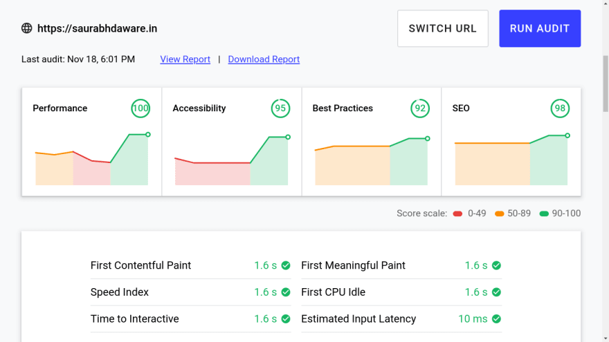
So my old portfolio used to load in 4.2 seconds and had a performance score of 43 so I decided to rebuild (and redesign) my portfolio site and now it loads in 1.6 seconds and has 100 lighthouse score! (the link to the website is at the end of this article)
It is built using Vanilla JavaScript and does not use any external script or stylesheet (except the one for google font).
Here are performance insights from lighthouse
TLDR
So for better performance, I am :
- Using
rel="preload"
<link rel="preload" href="assets/css/index.css" as="style" media="all" onload="this.onload=null;this.rel='stylesheet'">
- Split CSS into
index.css&mobile.cssand loadingmobile.cssin mobiles only
<link rel="stylesheet" href="assets/css/mobile.css" as="style" media="screen and (max-width:768px)">
- Lazy loading images
- Using CDN (I'm using Cloudinary It also provides me a way to change the width of the image in request time so I load the image of the same size of the one to be rendered.)
- Using OffScreen Canvas (to be honest don't use it, its experimental and only works in chrome. I managed to do some workarounds that ignore the offscreen canvas and load the same file as a normal script in unsupported browsers)
Here's how I improved the performance
Table of Content
Preloading Resources
When you hit a link in your browser, the browser starts parsing index.html file but by default browsers halt the parsing when they come across <script>, <link>, <style> tags as they can alter the paint of the document. Thus blocking the initial paint.
By preloading the resources you can load the file without blocking the first paint. So the loading of these files starts as usual but the paint is created before the CSS or scripts are loaded.
Super cool right? well, with great power comes great responsibility!
You don't want your website to look like this on the first load no?
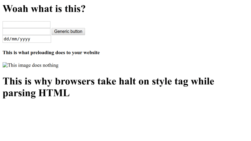
Since we are painting screen without loading CSS, This is how the website will appear for first few milliseconds.
How to handle this?
This is how I do:
When the user loads my website all I want to show is a blue screen then load the content when CSS is loaded
index.html
<head>
    <!-- Other head tags -->
    <link rel="preload" href="assets/css/index.css" as="style" media="all" onload="this.onload=null;this.rel='stylesheet'">
    <style>
        html,body{
            background-color: blue;
        }
        .lazyload, .main-container{
            display:none;
        }
    </style>
</head>
<body>
    <header>
        <!--Header content -->

        <h1 class="lazyload">Hi, I am Saurabh welcome to my website!</h1>
    </header>
    <main class="main-container">
        <!-- Main Content -->
    </main>
    <!-- Remaining HTML -->
</body>
This keeps the main-content and some text from header hidden
Then in index.css I do.
.lazyload, .main-container{
    display: block !important;
}
which overwrites the rules in <style> and displays the content
I am not exactly using the same code as I explained above. I do some animations to make the text appear so the output looks kind of different than what it would look with the code above

Splitting CSS
If your media query for the mobile is too large, it makes sense to have a separate file for it since the code is completely useless to load on desktops.
<link> tag provides us option to load css file only in the device that matches the media attribute value
<link rel="stylesheet" href="assets/css/index.css" as="style" media="all">
<link rel="stylesheet" href="assets/css/mobile.css" as="style" media="screen and (max-width:768px)">
With this mobile.css file will only load in the device that matches screen and (max-width:768px)
Image Optimization
Lazy loading
Fun fact: Browsers will soon have loading="lazy" attribute in IMG tag. Till then this is what I'm doing:
<img id="projectimage-1" src="placeholder.webp">
<img class="lazyimage" data-cover="projectimage-1" style="display:none;" src="actualimage.webp">

<script>
function loadProjectImage(e){
    const image = e.target;
    document.getElementById(image.dataset.cover).src = image.src;
}
document.querySelectorAll('.lazyimage')
    .forEach(imgEl => imgEl.addEventListener('load', loadProjectImage))

</script>
Using CDN
CDN or Content Delivery Network respond faster with the image than your usual server.
Apart from this advantage, there are some customizations that Cloudinary (CDN that I use) provide that helped me in faster optimizations.
Having .webp extension is good for websites since it provides better image optimizations, with cloudinary you can simply change .png or .jpg in image URL with .webp and it generates webp image for you!
Also, cloudinary provides a way to resize images by passing parameters in the URL
This is how a cloudinary image URL looks like:
https://res.cloudinary.com/saurabhdaware/image/upload/c_scale,w_300/v1552455020/saurabhdaware.in/projects/eotm-portfolio.webp
In this, w_300 represents the image with width 300. Changing the value will give you an image with that width. So you can dynamically change this value in JavaScript to load the image exactly of the same size of your render.
And Hey, Cloudinary! if you're reading this, please pay me :3
Bonus
Also, apart from these factors, I've used OffScreenCanvas to render header animations in the web worker but since it is an experimental feature I don't really think so it is the right time yet to have it in your production.
And I won't say that not using libraries made it fast. But yes, Not using framework allowed me to have better control over files so I could decide which files to preload and when to load which file and how to bundle them together.
However, You can use libraries and still load the website fast. You just need to handle it properly but yes in case of small websites like portfolio, it does make sense to avoid having these huge libraries which are larger than your whole website itself.
And DONE 🎉💃
I hope you liked the article!
My Portfolio Link: https://saurabhdaware.in
(Hovering or tapping on some elements in the website may create surprising results 😉)
I would love to receive some feedback on my portfolio site🌻
Oh, and I also redesigned my website logo
Thank You!