
 Shuvo
ShuvoWe all know that we can use box-shadow to add shadows to our HTML elements. eg
.box{
    box-shadow: 2px 3px 10px rgba(0, 0, 0, .5);
}

But did you know that we can achieve the same using drop-shadow filter. You simply have to pass the shadow value in the drop-shadow function
.box{
    filter: drop-shadow(2px 3px 10px rgba(0, 0, 0, .5));
}

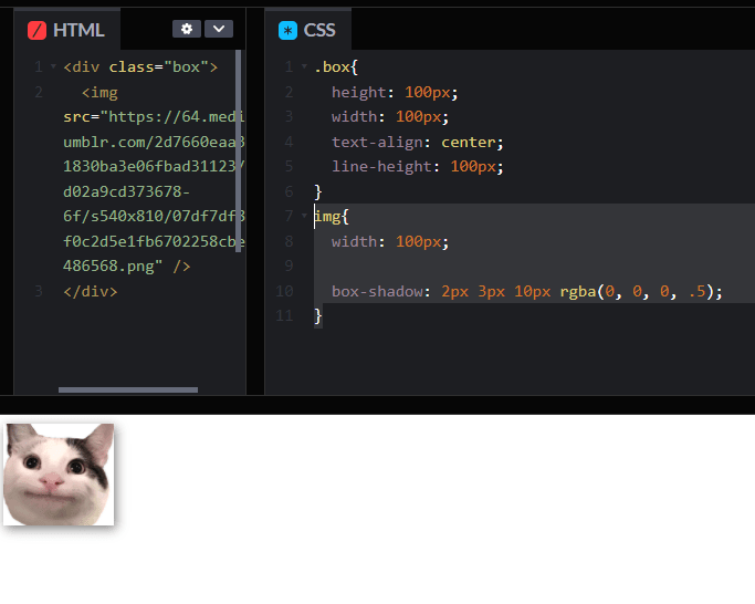
Although in this example both box-shadow and drop-shadow does the same thing. But if we were to add box-shadow on a PNG image you will see the shape of box-shadow is rectangular/box.
img{
  box-shadow: 2px 3px 10px rgba(0, 0, 0, .5);
}
While if we add drop-shadow to a PNG, the shape of the shadow will be same as the shape of the visible area of the PNG.
img{
    filter: drop-shadow(2px 3px 10px rgba(0, 0, 0, .5));
}

Make sure you checkout my other articles and YouTube channel

Was it helpful? Support me on Patreon


