Collecting information from prospective clients is the bread and butter of any online business. That being said, facilitating the ease and fluidity of collecting that information from the user perspective is imperative.
In addition to the UI/UX considerations, there is also the importance of data input standardization. For example, how do you store phone numbers in your database. Is it 555-444-3333 or (555) 444-3333 or 555.444.3333 or +15554443333? Using a good masking Javascript library will assist you in asserting the format you desire.
During my many many years of web development, I’ve developed a set of rules I used when it comes to designing web forms. And I’ve so graciously decided to share those rules with you here today!
Rule 1: Take the Guess-Work Out of Input Formatting
As I indicated previously with the phone number example, you’re going to want to use some form of input formatting for the data fields you intend to collect. This not only makes the user experience more fluid, but also allows you to standardize the format of the data you want to collect.
There are a handful of input masking libraries available. The one I use most is jquery.mask, which depends on the jquery library. There are also vanilla JS libraries available as well, such as imask.js.
Example: Masking Phone Number Input via Jquery.Mask
HTML:
<input type="tel" id="phone-number" placeholder="(000) 000-0000">
JavaScript:
$("#phone-number").mask('(000) 000-0000');
Result:

Code Example: https://designly.biz/snippets/jquery-mask-phone-number
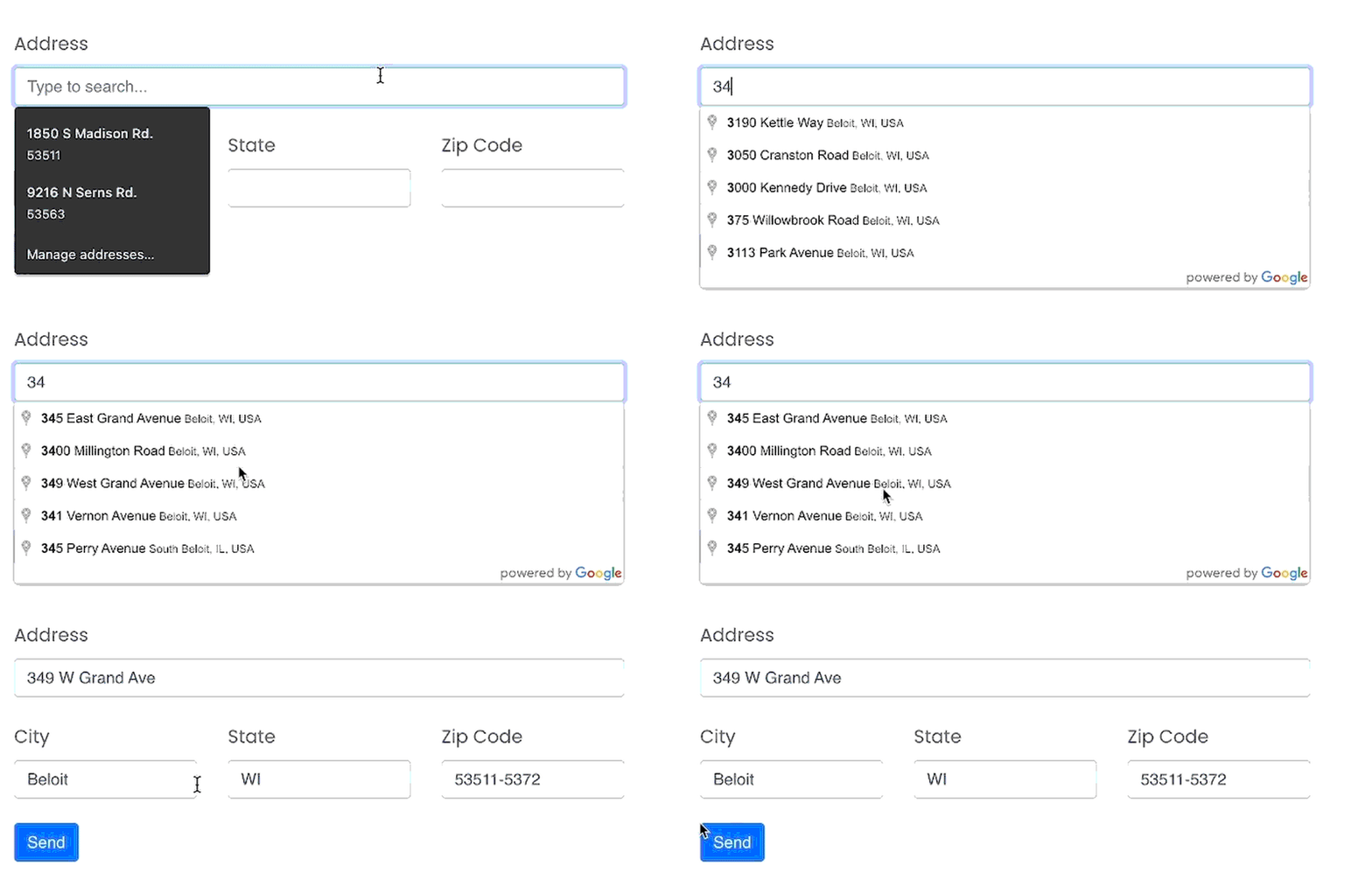
Rule #2: Use Google Maps Autocomplete for Address Input
Address standardization is a common practice, especially by eCommerce companies. Ensuring that you’ve received a deliverable address from your client is key to providing the best user experience.
There are a number of address correction services out there. There is, of course PostalPro, by the USPS. But that costs a lot of money. I prefer to use the Google Places Autocomplete API to achieve both address standardization, as well as the autocomplete features, which further streamlines the user’s form entry experience. The Google Cloud API is mostly free. The non-premium quota is up to 6,000 requests per minute and unlimited requests per day, so unless you’re Amazon, the free version will most likely do!
You’ll need to create a Google Cloud account and generate an API key to use the Places Autocomplete API.
Example: Google Places Autocomplete API
HTML:
<div class="row">
    <div class="col-12 mb-4">
        <label for="address">Address</label>
        <input type="text" id="address" class="form-control"
        placeholder="Type to search...">
    </div>
    <div class="col-4 mb-4">
        <label for="city">City</label>
        <input type="text" id="city" class="form-control">
    </div>
    <div class="col-4 mb-4">
        <label for="state">State</label>
        <input type="text" id="state" class="form-control">
    </div>
    <div class="col-4 mb-4">
        <label for="zip">Zip Code</label>
        <input type="tel" id="zip" class="form-control">
    </div>
    <div class="col-12 mb-4">
        <button type="button" id="btn-submit" class="btn btn-primary">
            Send
        </button>
    </div>
</div>

<script src="https://maps.googleapis.com/maps/api/js?key=YOUR_API_KEY&libraries=places">
JavaScript:
document.addEventListener("DOMContentLoaded", function(){
    var addr = document.getElementById("address");
    var options = {
        componentRestrictions: {
            country: ["us"]
        },
        fields: ["address_components", "geometry"],
        types: ["address"],
    }
    ac = new google.maps.places.Autocomplete(addr, options);
    ac.addListener("place_changed", fillInAddress);
});

function fillInAddress() {
    const place = ac.getPlace();
    let address1 = "";
    let zipcode = "";
    for (const component of place.address_components) {
        const componentType = component.types[0];

        switch (componentType) {
            case "street_number": {
                address1 = `${component.long_name} ${address1}`;
                break;
            }

            case "route": {
                address1 += component.short_name;
                document.querySelector("#address").value = address1;
                break;
            }

            case "postal_code": {
                zipcode = `${component.long_name}${zipcode}`;
                break;
            }

            case "postal_code_suffix": {
                zipcode = `${zipcode}-${component.long_name}`;
                document.querySelector("#zip").value = zipcode;
                break;
            }
            case "locality":
                document.querySelector("#city").value = component.long_name;
                break;
            case "administrative_area_level_1": {
                document.querySelector("#state").value = component.short_name;
                break;
            }
        }
    }
}

$(document).ready(function () {
    $(".after-submit").hide();

    $("#username").onEnter("tab");
    $("#password").onEnter(submitForm);

    $("#btn-do-again").click(function(){
        $("input").val("");
        $(".after-submit").hide();
        $(".before-submit").fadeIn();
    });
});

Code Example: https://designly.biz/snippets/maps-autocomplete
Rule #3: Use the Appropriate HTML Type Attributes for Input Fields
HTML 5 has a variety of input element types that can be utilized to enhance the user experience. Some of them are rather clunky without using additional JavaScript libraries, while others work well out-of-the-box.
HTML Input Types (Full List):
| button | checkbox | color | date | datetime-local | email | file | hidden | image | month | number | password
| radio. | range. | reset. | search | submit. | tel
| text. | time. | url. | week. |
Choosing the proper input type is particularly useful on mobile devices. For example, if you specify input type email, a mobile keyboard will pop up with functions conducive to entering an email address.
Mobile Email Example:

Code Example: https://designly.biz/snippets/input-types
As you can see, a customized soft keyboard appears on this iPhone. Note the @ symbol next to the spacebar. Had you used input type text, the user would have had to take additional steps to enter the @ symbol.
Mobile Phone Example:

Code Example: https://designly.biz/snippets/input-types
Again, a custom keyboard appears with only digits. A modifier key also appears that allows entering other symbols such as — + # etc.
You can use the tel input type for other types of input as well, such as zip codes or other numerical entries.
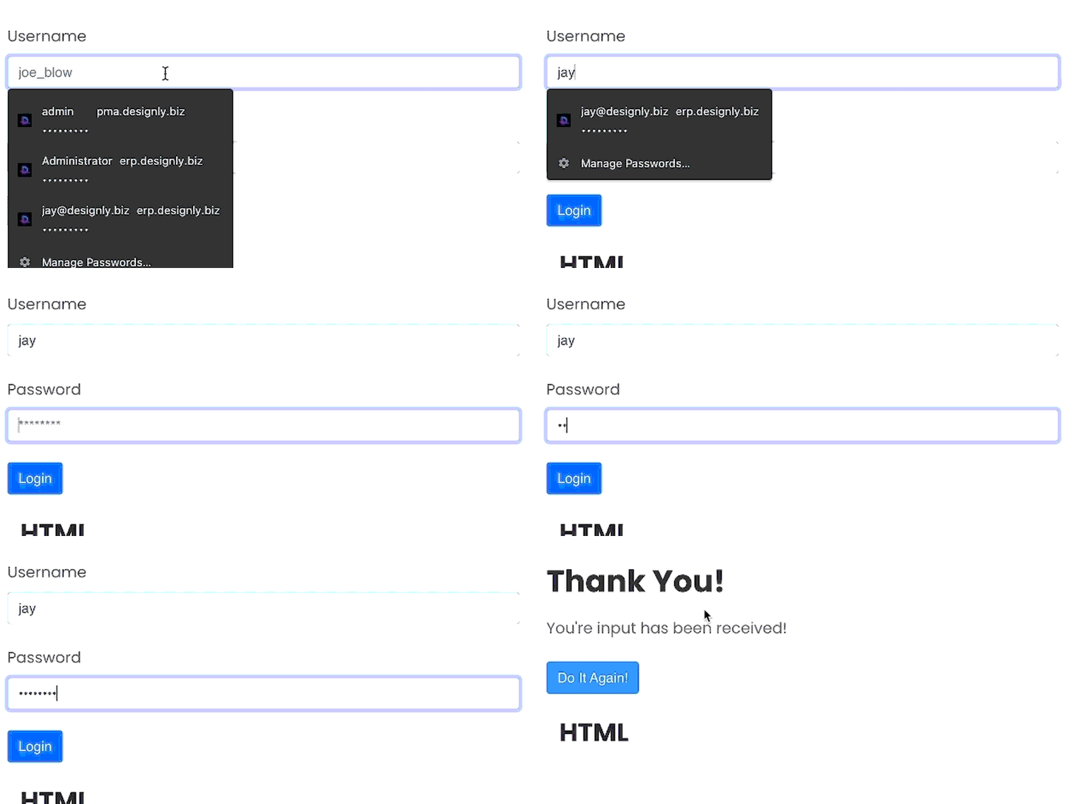
Rule #4: Handle the Operation of the Enter Key
As a computer programmer, I am a keyboard-oriented user, which means I keep my hands off my mouse as much as humanly possible. When I’m in an input field, I expect the enter key to either advance to the next field or submit the information I entered.
I wrote a jQuery plugin called jQuery.onEnter.js. You can include it in your project using the following CDN:
[https://cdn.jsdelivr.net/npm/@designly/jquery.onenter@1.0.0/jquery.onEnter.min.js](https://cdn.jsdelivr.net/npm/@designly/jquery.onenter@1.0.0/jquery.onEnter.min.js)
Enter Key Input Example:
HTML:
<div class="row">
    <div class="col-md-6 col-sm-12">
        <div class="row before-submit">
            <div class="col-12 mb-4">
                <label for="username">Username</label>
                <input type="email" id="username" class="form-control" placeholder="joe_blow">
            </div>
            <div class="col-12 mb-4">
                <label for="password">Password</label>
                <input type="password" id="password" class="form-control" placeholder=" ********">
            </div>
            <div class="col-12 mb-4">
                <button type="button" id="btn-submit" class="btn btn-primary">
                    Login
                </button>
            </div>
        </div>
        <div class="row after-submit">
            <div class="col-12 mb-4">
                <h2>Thank You!</h2>
                <p>You're input has been received!</p>
            </div>
            <div class="col-12 mb-4">
                <button type="button" id="btn-do-again" class="btn btn-primary">
                    Do It Again!
                </button>
            </div>
        </div>
    </div>
</div>

<script src="https://cdn.jsdelivr.net/npm/@designly/jquery.onenter@1.0.0/jquery.onEnter.min.js">/script>
JavaScript:
$(document).ready(function () {
    $(".after-submit").hide();

    $("#username").onEnter("tab");
    $("#password").onEnter(submitForm);

    $("#btn-do-again").click(function(){
        $("input").val("");
        $(".after-submit").hide();
        $(".before-submit").fadeIn();
    });
});
Result:

Code Example: https://designly.biz/snippets/enter-key
Rule #5: Don’t Use Overly-Complicated CAPTCHA Challenges
It’s necessary these days to use a CAPTCHA challenge to keep the bots at bay. CAPTCHA stands for Completely Automated Public Turing Test To Tell Computers and Humans Apart. Alan Turing was a turn-of-the-century genius who is responsible for modern day computer science.
Although we must use these types of checks to stop bots from flooding our inboxes and filling up our databases with garbage, your CAPTCHA test needn’t be overly complex.
Here is an example of what not to do:
The above text is indecipherable by both computer and humans alike! Having such an insurmountable hurdle on your website would be essentially UI/UX suicide.
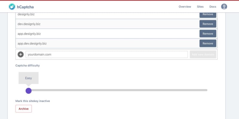
There are some really good CAPTCHA services out there that can help you balance between convenience and security. Google reCaptcha is one, but I stopped using it long ago due to Google’s awful privacy practices. Instead, I now use hCaptcha, which is super easy to set up and completely free.
hCaptcha Challenge Example:
HTML:
<div class="row">
    <div class="col-md-6 col-sm-12">
        <div class="row">
            <div class="col-12 mb-4">
                <div class="h-captcha" data-sitekey="YOUR_HCAPTCHA_KEY"></div>
            </div>
            <div class="col-12 mb-4">
                <button type="button" id="btn-submit" class="btn btn-primary">
                    Send
                </button>
            </div>
        </div>
    </div>
</div>

<script src="https://www.hCaptcha.com/1/api.js">
Result:

Code Example: https://designly.biz/snippets/captcha
This particular hCaptcha challenge is set to easy mode. Higher-level challenges may have the user click on several series of images before approving the test. Unless you’re a major site like Amazon or Google, this type of complexity is simply not required. And of course, if you start experiencing bot attacks, you can always log into hCaptcha and change your difficulty setting.
Rule #6: Test, Test, Test and Test Again!
Once you’ve designed your form, it’s imperative that you test it on a variety of platforms and browsers. Both Google Chrome and Firefox have some nice web developer tools for testing your site on mobile devices. But it’s also important you test your site on actual mobile devices as well, both Android and iOS.
If you follow these rules when designing your web forms, you can be sure that your potential customers will be able to connect with you in a comfortable and user-friendly manner. After all, that’s the whole point: getting new customer leads!
Thank you for reading. For more great website development information, please visit our Blog!


