
 Jollen Moyani
TL;DR: Let’s see how to use Syncfusion React Data Grid and other components to streamline billing and inventory management in a supermarket setting. This blog covers creating a React app, integrating Syncfusion components, and configuring features like automatic invoice generation, smart billing, and versatile payment options for a more efficient and user-friendly retail experience.
In the competitive world of retail, particularly in supermarkets, efficient billing and invoicing are essential for enhancing customer satisfaction and streamlining operations. This article explores how to use Syncfusion React Data Grid and other components to enhance billing and invoicing processes in a supermarket, making them more efficient and user-friendly.
We’ll see how to use the React Data Grid to generate an invoice with automatic calculations based on your inventory details. Our step-by-step guide lets you easily set up and configure the Data Grid to meet your specific needs.
Why choose Syncfusion React Data Grid?
Are you seeking a robust and powerful data grid to satisfy your UI requirements? If so, I will give you reasons to choose Syncfusion React Data Grid and why it is the best data grid.
- High performance: Load millions of records in seconds with optimized performance.
- Seamless data binding: Easily bind various local and remote data sources like JSON, OData, WCF, and RESTful web services.
- Adapts to any resolution: Adapts to any resolution, working seamlessly on desktops, touch screens, and mobile devices (iOS, Android, Windows).
- Flexible editing: Simplify CRUD operations with support for business objects or remote data services.
- Custom templates: Create custom user experiences with a wide range of template options.
- Customizable themes: Choose from 5+ built-in themes (Fluent, Tailwind CSS, Bootstrap, Material, Fabric) and customize them with the Theme Studio tool.
- Easy export and printing: You can export data to Excel, PDF, and CSV and print all rows or the current page alone.
- Globalization and localization: Format dates, currency, and numbers for different locales.
- State-of-the-art features: Enjoy features like lazy load grouping, freeze columns, powerful filtering, bulk editing, responsive columns, and state management.
- Web accessibility: Fully supports web accessibility, making it usable for people with disabilities.
- Ease of use: Minimal configuration required, with intuitive API names that simplify usage.
Our target audience
The React Data Grid component simplifies the analysis of your business data and helps manage daily data transitions. It also enables you to examine user data, product information, or any values within specific time frames, whether daily or otherwise.
Additionally, it supports real-time apps with autofill capabilities and allows exporting information for hard copy documentation. Here are some examples of users and organizations that benefit from using our React Data Grid component:
- Accountants and bookkeepers
- Construction companies
- Property management companies
- Medical practice
- Educational institutions
- Event management companies
- Software development firms
- Transportation and logistics companies
- Manufacturing companies
- Travel agencies
- Insurance agencies
- Real estate agencies
- Hospitality businesses
- Fitness centers and gyms
- Consulting firms
- Photography studios
Building your app environment
Prerequisites
- node.js 16.0
- If you have not previously installed the React packages or if you have installed a version of node.js older than Node 16 on your machine, you can run the following command to install them.
npm install -g create-react-app
Create a React app
Let’s create a React app by executing the following command.
npx create-react-app my-app
cd my-app
npm start
Or
yarn create react-app my-app
cd my-app
yarn start
Run the following command to set up a React app in a TypeScript environment.
npx create-react-app my-app --template typescript
cd my-app
npm start
Besides using the npx package runner tool, you can also create an app using the npm init command. To begin with the npm init, upgrade the npm version to npm 6+.
npm init react-app my-app
cd my-app
npm start
Note: In the following demo, we’ll create the app in a TypeScript environment.
Add Syncfusion React packages
Once you have created the React app, install the required Syncfusion React component packages. All Syncfusion React (Essential JS 2) packages are published on the NPM public registry. So, choose the component that you want to install.
In this demo, we’ll use the following Syncfusion React components to create an inventory and billing insights app.
- Data Grid
- TextBox
- TextArea
- AutoComplete
- Button
- Masked TextBox
- DateTime Picker
- Popup
- Numeric Textbox
- Card
For this, we need to install the following Syncfusion packages individually.
npm install @syncfusion/ej2-react-grids–save
npm install @syncfusion/ej2-react-inputs–save
npm install @syncfusion/ej2-react-buttons–save
npm install @syncfusion/ej2-react-calendars–save
npm install @syncfusion/ej2-react-dropdowns–save
npm install @syncfusion/ej2-react-popups–save
If you find it tedious to install the packages one by one, we recommend copying and pasting the following packages in your package.json dependencies section.
package.json
{
  "name": "quickstart",
  "version": "0.1.0",
  "private": true,
  "dependencies": {
    "@syncfusion/ej2-react-grids": "*",
    "@syncfusion/ej2-react-inputs": "*",
    "@syncfusion/ej2-react-buttons": "*",
    "@syncfusion/ej2-react-calendars": "*",
    "@syncfusion/ej2-react-dropdowns": "*",
    "@syncfusion/ej2-react-popups": "*",
    . . .
}
Adding CSS reference
After installing the required Syncfusion component packages in your app, import the required themes based on the components used.
The Syncfusion React component comes with built-in themes, which are available in the installed packages. It is quite simple to adapt the Syncfusion React components based on the app style by referring to any of the built-in themes. Since we are using many components to create this app, we’ll refer to the common CSS file, which contains all the component CSS through CDN.
index.html
<link href="https://cdn.syncfusion.com/ej2/25.2.3/material3.css" rel="stylesheet" />
Ensuring seamless app implementation
Once you have configured all the initial setups, you can begin implementing the app step by step.
Creating customer profile viewer
This section covers the process of fetching existing customer details or adding new customers, along with their billing numbers and purchase dates and times.
The bill number is automatically generated when entering the product using the following function.
const generateBillNo = (): string => {
   // Logic to generate Bill No.
   const randomNo: number = Math.floor(100000 + Math.random() * 900000);
   return randomNo.toString();
};
When we input the existing customer ID, all the customer information, such as name, phone number, and address, will automatically populate. If the customer ID is not found, a popup will appear, indicating the customer is unavailable. In such cases, we should manually add the customer details through the add (+) button.
Refer to the following image.

We’ll use the following Syncfusion React components within this section to input the bill number and customer information.
- TextBox : To automatically generate a bill number and populate the customer’s name.
- AutoComplete: To retrieve existing customer information.
- Button: To add new customer information.
- Masked TextBox: To display the customer’s phone number.
- TextArea: To show the customer’s address.
- DateTime Picker: To display the current date and time.
Generating inventory details using the React Data Grid
In this section, we will explain the process of generating inventory details using the React Data Grid component.

To implement the inventory details UI, we should enable the following Grid features:
- Editing: This demo uses inline editing to enter product details.
- Show add new row feature in grid editing: This feature enables the add new row option to be displayed always in the grid.
- Command column editing: To add CRUD action buttons in a column to perform operations on individual rows.
- Sorting : To sort values in ascending and descending order.
- Toolbar: To enable the Delete icon in the toolbar to delete the selected items in the list.
- Print: To easily generate and print the grid content.
- Aggregate: This feature allows us to aggregate values from the Grid data.
We should inject the required modules into the app to use the above-listed features in the React Data Grid. Refer to the following code example.
<GridComponent
 . . .
 <Inject services={[Aggregate, Toolbar, Edit, Sort, CommandColumn]} />
</GridComponent>
The invoice app is primarily built around the Data Grid’s editing and aggregation feature. The Grid has built-in support for the following types of editors.
- TextBox
- Numeric TextBox
- CheckBox
- Dropdown List
- Date Picker and
- DateTime Picker
For more details about grid cell edit types, refer to the documentation.
You can also render any custom component instead of the default Grid edit types using the edit template feature. In this demo, we’ll use the editTemplate feature to display the AutoComplete, Numeric TextBox, and TextBox components.
Now, let’s proceed with the steps to implement invoice generation.
-
Entering the product ID: Here, we have used the React AutoComplete component to fetch the product ID and details.

-
Entering the product name: If you are unaware of the product ID, you can type the product name directly, and all the product information will be displayed. We have used the React TextBox component for this purpose. Additionally, we have dynamically rendered another Grid to display the product information as values are entered into the TextBox component.
 In the above image, when we type character a in the Product Name textbox, the external grid displays the product names containing character a.
When we type the next characters in the external grid, based on that value, the Grid will show the Product details so you can select the exact product. Refer to the following image.
In the above image, when we type character a in the Product Name textbox, the external grid displays the product names containing character a.
When we type the next characters in the external grid, based on that value, the Grid will show the Product details so you can select the exact product. Refer to the following image. 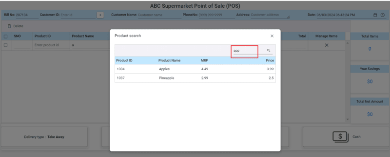
-
Entering value in the Quantity column: Once the product is selected, the focus will automatically move to the quantity column.
 If you enter a value in the quantity column, the total value will be automatically calculated based on the MRP, Price, Tax Rate, and the value subtracted from the Discount columns.

Smart bill analyzer using React Card component
Once you have entered all inventory details, the React Grid automatically calculates and displays the total number of products, your total savings, and the total value using the Grid’s Aggregate feature with the React Card component.

Versatile payment and delivery options
Follow these steps to create versatile payment and delivery options using the React Button and Popup components.
- After filling in all the produce details, you can select the Delivery type as Take-Away or Door Delivery.
- The confirmation dialog will be displayed when choosing the Card Payment or UPI Payment option. Refer to the following image.

If you select the Cash option, a popup will appear to help you calculate the remaining balance from the total amount given by the customer.
If you select the Door Delivery option, you should enter the customer details at the top of the invoice. If you attempt to print the invoice without filling in the customer details, an alert popup will appear, as shown in the following image.

When you enter an existing Customer ID, the invoice app will automatically populate the customer’s name, address, and phone number. Otherwise, the following popup will be displayed if you enter a new value and press the Enter key.

After clicking the + (add) icon, a form will appear to enter the new customer’s details. After entering the customer details, press the Save button.

If you enter the existing customer ID, the matching ID details will be shown.

Once you select the required Customer ID, the other details, such as Customer Name, Phone Number, Address, and Date and Time, will be filled automatically.

After choosing the payment mode, press the Print Bill option.

Quick invoice bill creation
This section explains how to initiate the print option in the React Data Grid for the inventory and customer details mentioned above.
By default, the React Data Grid can print data in table format. However, if you wish to customize the printing format by adding extra header or footer information during printing, we recommend using the beforePrint event of the Grid and customizing it according to your needs.
Refer to the following image.

Run the sample
Finally, to run the app, execute the following command in your command prompt.
npm start
Common errors while executing the React app
|
Error |
Solution |
|
Module not found: Can't resolve 'module' |
This indicates that the required module is either not installed properly or is missing. Therefore, we recommend installing all dependency modules correctly by executing either the npm install or yarn install command after deleting the package.lock.json file. |
|
npm ERR! ENOENT: no such file or directory
|
This error suggests that the specified directory or file is unavailable on your machine or permission for execution was denied. To resolve this, ensure that the file exists and that proper permissions are enabled to access the file or directory. |
|
npm ERR! Failed at the project-name@0.1.0 start script
|
This error occurred due to a problem with the start script defined in your package.json file. It's essential to validate the start script and execute it correctly set up to run your app. Also, ensure that all dependencies are installed properly. |
|
npm ERR! EADDRINUSE: address already in use
|
This error indicates that the port number has already been used. You can choose another port or stop the existing running app. |
|
npm ERR! Invalid package.json
|
This error indicates the syntax issue occurred in your package.json file. To resolve this, ensure all the syntax properly. |
GitHub reference
Also, check out the complete code example for inventory and billing management with React Data Grid on GitHub.
Conclusion
Thanks for reading! In this blog, we’ve seen how to use the Syncfusion React Data Grid for efficient inventory and billing management. Experiment with the steps outlined in this blog, and share your thoughts in the comments section below!
If you’re already a Syncfusion user, the latest version of Essential Studio is available on the License and Downloads page. We offer our new users a 30-day free trial to explore all our components’ features and capabilities.
You can always contact us through our support forums, support portal, or feedback portal. We are always happy to assist you!


