 GrahamTheDev
Yes, you heard me right, my GitHub readme has light and dark modes and is even responsive. In this article I will briefly cover the tricks I used to make this happen (and the things that made it difficult!)
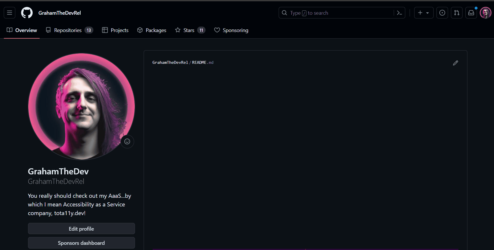
But first, let's have a look at what my profile looks like at different screen sizes and colour preferences (or go try out GrahamTheDevRel's profile on GitHub for yourself!
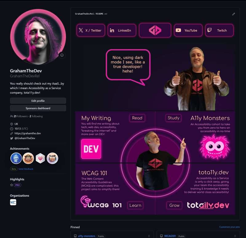
Dark Mode
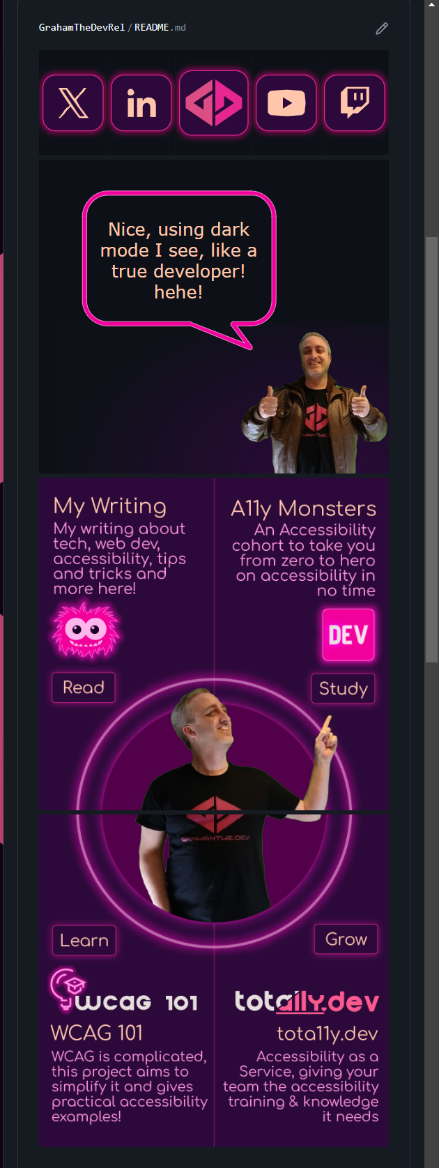
Mobile
Notice the different button design and layouts for the sections below.
Those buttons were a lot harder to create than you might think!
Light Mode
I couldn't help but have a different message on the hero section, I am only joking of course! 🤣💗
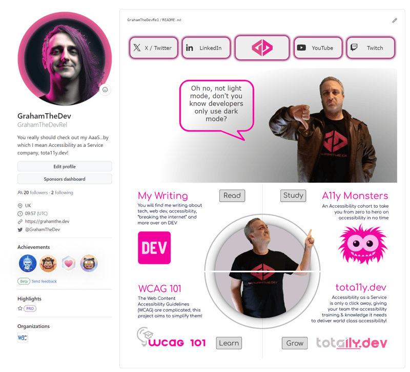
Oh...and did I mention it is animated?
Bear in mind that those first 5 buttons are each individual images! Took a little fiddling to get it right!
Some tricks used!
OK, so you didn't come here just to see my profile! (and if you did, love you too! 🤣💗)
No, you came to learn some tricks so you could do it yourself right?
Well, there is one "trick" and then just one HTML feature that you need to be able to do this yourself.
Let's start with the most interesting one:
The trick to make responsive buttons and images!
The buttons and the hero image on the website are the interesting part.
To make them work we use a SVG feature not many people will have heard about, <foreignObject>.
<foreignObject> and SVGs for the win!
This is the biggest trick to making things responsive.
You see, within a markdown file we are very limited as to what we can do (which is why we see people using <table> etc. for layouts...ewww).
But SVGs have a unique feature, <foreignObject>.
This allows you to include many things within an SVG, including HTML and CSS.
With that we have a lot more power!
You can see that in this demonstration CodePen (click the buttons to change the size of the outer container, which represents the available space on the page for the image):
CodePen Demo for CSS in SVG
Make sure to check out the html panel, all of the tricks are in there!
The key part of this is here:
 <svg xmlns="http://www.w3.org/2000/svg" fill="none">
        <foreignObject width="100%" height="100%">
            <div xmlns="http://www.w3.org/1999/xhtml">
                <!--we can include <style> elements, html elements etc. here now, with a few restrictions! Note it must be in xHTML style (so <img src="" /> not <img src="" > to be valid -->
            </div>
       </foreignObject>
</svg>
From there we can use an inline <style> element and standard HTML elements to construct a responsive image.
But you may notice one other thing about the markup used in that demonstration.
The images gotchya!
There is a reason I have the images (both the SVG bubble and the image of me) as data URLs.
This is because of something called a Content Security Policy (CSP) and the way it is implemented on GitHub.
Now I won't explain CSPs, but in essence they have a rule that says "hey, no images can be loaded from anywhere other than the current context".
Not a problem for a normal image, but this is an image within an image and the "context" for that image is itself.
So if we try to include another image within our SVG it will come from a different place and break our SVG.
Luckily, data URIs are counted as the same context / origin.
So that is why they are used within our example and another thing to consider if you want to implement this yourself!
Last trick, the <picture> element and no whitespace.
I mean, this isn't even a trick!
The last 4 boxes in my readme are responsive (and honour colour preferences), but they use standard media queries to work.
The only consideration here was trying to find a break point that worked, which happened to be 768px on GitHub.
Then I created 4 sets of images:
- dark mode and desktop
- dark mode and mobile
- light mode and desktop
- light mode and mobile.
Large or small image
To get the right image we use media="(min-width: 769px) for desktop (large) image or media="max-width: 768px) for our mobile (small) image on each of the sources we put in our <picture> element.
Light and dark mode
To grab light or dark mode we use the prefers-color-scheme media query.
Combining our queries and sources
Then we just set up our <picture> element to pick the source that we want using a combination of (** width query **) and ( colour preference):
<picture>
  <source media="(min-width: 769px) and (prefers-color-scheme: light)" srcset="readme/light-tl@2x-100.jpg">

  <source media="(max-width: 768px) and (prefers-color-scheme: light)" srcset="readme/light-tlm@2x-100.jpg">

  <source media="(max-width: 768px) and (prefers-color-scheme: dark)" srcset="readme/dark-tlm@2x-100.jpg">

  <img src="readme/dark-tl@2x-100.jpg" alt="You will find me writing about tech, web dev, accessibility, breaking the internet and more over on DEV! Purple and neon pink design with Graham pointing at the next section" width="50%" title="My writing on DEV">
</picture>
Not difficult as such, but time consuming creating 4 variations of images.
No white space
There was one last issue I had.
The bottom section is actually made up of 4 different images (yes, I had to create 16 different images for it...).
The reason for this is that each section is a clickable link.
Not complicated, but there is a small gotchya to be aware of.
If you want to have two images directly touch each other side by side (so both images are 50% width), you have to remove all white space between the anchors, the picture elements and even the sources inside those picture elements.
Otherwise GitHub will add some margin to your elements and they will not be on the same line.
Also, despite me removing all the white space I hit another limitation, there is still an 8px gap between the first row and second row that you cannot remove sadly (hence the line between!).
Wrapping up!
I may do some more in depth explanations of Content Security Policies, <picture> element tricks and, of course <foreignObject> in the future.
This was meant to be more of an introduction to the concepts so you could play with them yourself, not a tutorial.
But now that you know about the tricks I used I want to see you build a prettier GitHub readme than mine!
And if you do, please do share it in the comments! 💪🏼🙏🏼💗
Happy coding everyone! 💗


