I thought B2B ecommerce sites would be world champions of managing product categorizations due to their often large and complicated product assortments. I was entirely wrong.
Many shops seem to have neglected to put energy into product categorization altogether, which is quite alarming given that this is the first main navigation mechanism for many B2B sites aside from their search bars.
Yet, after studying the setup of more than 500 B2B ecommerce sites as part of our B2B launch at Medusa, I did recognize a pattern of best (and worst) practices when working with product categorization in B2B ecommerce.
Below is my recollection shared in 5 simple ways the best B2B companies approach product categorization:
- #1 - MECE sub-categories: Product sub-categories should be Mutually Exclusive and Collectively Exhaustive.
- #2 - Rule of three: Have at maximum three layers of product categories showcased on your site (especially in the dropdown navigation).
- #3 - Three seconds to comprehend: Systemize and structure your categories in a way that takes less than 3 seconds to comprehend.
- #4 - KISS navigation: When your catalog is large and diverse, keep the navigation simple and clean with to-the-point category names.
- #5 - Cross-categories with purpose: Use cross-categories when you purposefully want to emphasize a trait across many categories
What is Medusa? Medusa provides bespoke, modular and open commerce infrastructure for developers. If you want to build nested product categories with Medusa, stay tuned for our next Product Releases. Read more.
What is a product category?
Let us quickly define a product category. By Product Category, I refer to a group of similar products that share related characteristics. The category label sums up the product underneath it.
For example, the category of Car tires could contain both winter and summer tires in different sizes. Tires could also be a sub-category of a larger category referring to Cars of a car manufacturer shop.
The good, the bad, and the product-category-mesh
The way that most B2B pages choose to categorize products can best be described as a product-category-mesh.
Many shops, take the first step of bundling their products into categories (Hurrah!). But from that point on they just bundle it all together in one big mesh, leaving it to the customer to navigate their way through the assortment.
Sometimes I saw this leading to the creation of +1,000 categories with no clear linkages that made it easy for the customer to navigate unless using the search function.
In many instances, this random bundling led to category overlaps, making it unclear for users where and how to start.
Take the example below from a tool manufacturer and try to figure out for yourself whether the electrical saw was stashed under Electrical, Power Tools, Hand Tools, Cutting Tools or Machinery.
If this is the worst practice, let us see how some companies managed to turn this for the better.
5 Rules for Best Product Categorization
#1 - MECE sub-categories
The above example quickly becomes a problem for B2B shops that have large and complex product catalogs with several thousand products.
One effective way some ecommerce sites avoided the mesh was to bundle all categories into main, sub, and sub-sub-… categories.
These categories must be MECE (Mutually Exclusive, Collectively Exhaustive). Meaning that categories cannot overlap (mutually exclusive) while they still have to cover the full product assortment (collectively exhaustive). See example below.
Indiamart applies this type of segmentation to its product assortment. Despite an assortment of several million products, they still manage to make it easily digestible by breaking it down into six distinguishable business areas (Building & Construction, Electronics & Electrical, Drugs & Pharma etc…).
Beneath that, they further segment each business area into high-level product categories (e.g. Solar & Renewable Energy Products, Office Automation Products & Devices) and then further down into individual product categories (e.g. Solar Panels and Water Pumps).
#2 - Rule of 3
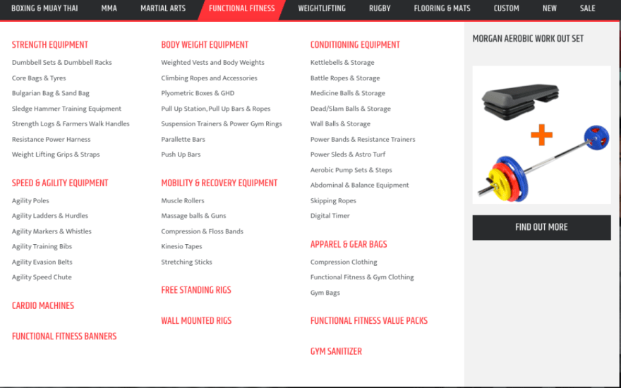
When trying to make this type of product (sub-)categorization, the golden rule seems to be 3. For the vast majority of shops that applied the sub-categorization, they had at maximum 3 category layers; one main category with up to two levels below.
See an example below from Morgan Sports (supplier of fitness equipment) which has 8 main categories with two layers underneath. For instance, Functional Fitness > Strength Equipment > Dumbbell Sets & Dumbbell Racks.
The 3-layer-categorization rule does not always apply when moving deeper into the product grid, but rarely will you see more than 3 layers upfront in the dropdown navigation.
When you want customers to dig deeper into a category with thousands of products, it can be useful to start using more advanced product filtering, which can make it extremely easy to navigate a larger product assortment.
A good example of this can be seen below from Blake Envelopes, which breaks down its product categories in easy-to-navigate filtering whenever customers enter the product grid. Read more about their advanced product filtering processes, here.
#3 - 3 seconds to comprehend
Another problem encountered with many of the categorizations was simply that the categorization was too complex to decode easily. This puts the B2B customer in a position, where the person has to spend a lot of time comprehending how to navigate the assortment in the first place.
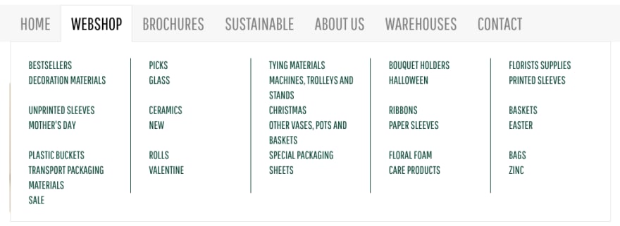
Below is one example of a dropdown without any meaningful logic to it, which leaves the customer questioning which direction to move.
Ideally, a product categorization should be easy to comprehend within 3 seconds. This is all about systemizing the categorization in a meaningful way based on attributes like:
- Product types
- Application areas
- Format and sizes
- Customer types
- etc...
A prime example of this in a B2B context comes again from Blake Envelopes. They break down their assortment into multiple categories at once (e.g. envelope size, color, type etc...) for the customer to easily find the system most meaningful to their own situation. They also combine it with a lot of visual elements to make the categorization very easy to decode even from a quick look at it.
#4 - KISS navigation
Granted, Blake Envelopes benefits from its product simplicity (envelopes), and not all B2B brands share that luxury.
However, some stores managed to still make their product categories easy to navigate despite large and complex catalogs. The secret? The Keep It Simple Stupid (KISS) principle was applied throughout their assortment.
Their product catalogs most often were based on product types, with simple alphabetical orders to systemize sub-categories. No fancy titles, no overly visual designs or anything similar.
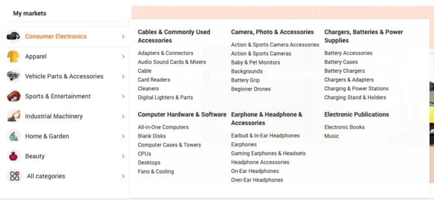
Below is an example from Alibaba.com showcasing a very lean and simple setup despite guarding several thousand products underneath each sub-category.
Notice, as well, that even the world's largest B2B commerce sites stick to only 3 layers of product categories in their category dropdowns (the same goes for other large B2B sites such as Amazon and Eworldtrade).
Does KISS mean you cannot spice up your categorization when having a large B2B product catalog? Absolutely not. Below are a few examples of how some B2B ships add creativity to the categorization via cross-categories.
#5 - Cross-categories with purpose
Although the MECE principle applies to the overall categorization, there are a few examples of categories that can be used to collect products across different category types
The three most common types of categories are:
- Most popular: Guided by total sales (in $) or number of items sold.
- Discounts: Often just filtering all discounted products across the site. In some instances, only selected products are displayed here to bring special attention to products the shop wants to get rid of quickly.
- New arrivals: This category was used not only in seasonal shops (e.g. fashion and beauty) but also in more traditional B2B product sites where B2B purchasers might be looking primarily to stay updated on new additions to the catalog.
Whether the above cross-categories make sense obviously depends on the business type and the type of B2B customers expected. In all regards, these methods are great to use when you have a specific target to optimize for. For example, you can use this method to bring attention to your newest collection, clearing inventory with discounts, or similar.
Aside from the above more traditional cross-categories, I also experienced a few more “exotic” cross-categories in a few stores. Namely:
- Delivery time: An interesting cross-category was Delivery Time (found in DHgate). This one caters to the need for quick delivery, which is more associated with B2C-styled shops. In some instances, this category might prove useful when quick replenishment and/or assortment replacement is needed.
- Trending searches: Some of the largest B2B shops had this category included (for example, Snapdeal and Made-in-China.com) to improve customer navigation. One of the more nuanced variations of it comes from ec21, which almost treats Top Searching Keywords as a subcategory of its own (see below).
Similar to the other cross-categories, these can be highly beneficial when you purposefully emphasize a trait across many categories, e.g. highlighting delivery time as a strength or hinting customers to top queries.
Conclusion
Too many B2B companies today do not focus enough on their ecommerce product categorization, despite it being one of the primary ways of site navigation.
Below are 5 simple rules that I learned that made some B2B ecommerce sites stand out on product categorization:
- #1 - MECE sub-categories: Product sub-categories should be Mutually Exclusive and Collectively Exhaustive.
- #2 - Rule of three: Have at maximum three layers of product categories showcased on your site (especially in the dropdown navigation).
- #3 - Three seconds to comprehend: Systemize and structure your categories in a way that takes less than 3 seconds to comprehend.
- #4 - KISS navigation: When your catalog is large and diverse, keep the navigation simple with to-the-point category names and less distracting visuals.
- #5 - Cross-categories with purpose: Use cross-categories when you purposefully want to emphasize a trait across many categories
For more articles on how to build a great B2B ecommerce experience, check out our articles on:


