What is Theme UI?
As the official site says, Theme UI is a library to building consistent, themeable React apps based on constraint-based design principles.
It allows you to style any component in your application with typographic, color, and layout values defined in a shared theme object.
Theme UI includes Emotion (CSS-in-JS library) with additional utilities for simple styling MDX documents, works with Styled System and Typography.js, supports mobile-first responsive approach.
In this post I will show you how to create some basic components (like Text and Button) using Theme UI in Gatsby.
Use Theme UI in Gatsby
Install Gatsby plugin for adding Theme UI context:
yarn theme-ui gatsby-plugin-theme-ui @emotion/core @mdx-js/react
Add the following package to gatsby-config.js
module.exports = {
 plugins: ['gatsby-plugin-theme-ui'],
}
Theme UI uses a theme configuration object to provide color, typography, layout, and other shared stylistic values through the React context.
This allows components within your site to add styles based on a predefined set of values.
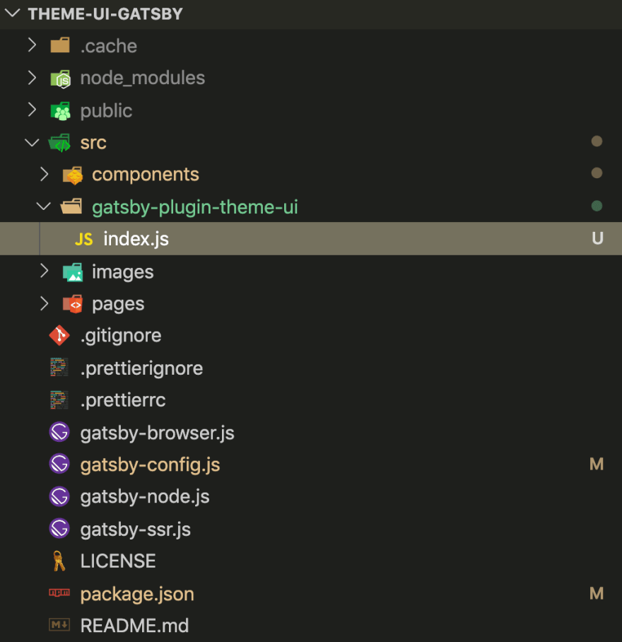
To customize the theme used in your Gatsby site, create src/gatsby-plugin-theme-ui directory in your project, and add an index.js file to export a theme object (it’s called shadowing)
Create your theme object
Add colors object to the file:
export default {
  colors: {
    text: "#333",
    background: "#fff",
    primary: "#639",
    secondary: "#ff6347",
    white: "#fff",
  },
}
Add some base typography.
Core typographic values can be stored in the following theme keys:
- fonts (font families)
- fontSizes
- fontWeights
- lineHeights
- letterSpacings
export default {
  colors,
  fonts: {
    base: "system-ui, sans-serif",
    secondary: "Menlo, monospace",
  },
  fontWeights: {
    normal: 400,
    medium: 500,
    bold: 700,
  },
  lineHeights: {
    normal: 1.5,
    medium: 1.4,
  },
  fontSizes: {
    xs: 12,
    sm: 16,
    md: 32,
    lg: 48,
    xl: 64,
  },
  letterSpacings: {
    normal: "0",
    wide: "0.25em",
  },
}
Add values for use in margin and padding.
export default {
  ...,
  space: [0,  8,  16,  32,  64],
}
</code></pre>
Add an array of breakpoints. Each breakpoint should be a string with a CSS length unit included.
These values will be used to generate mobile-first (i.e. min-width) media queries, which can then be used to apply responsive styles.
breakpoints: ["768px", "1025px", "1290px"],
To define the styles used across multiple buttons, typographic elements, or any elements, we can use Variants feature.
Let's define primary and secondary variants for buttons and use colors from the theme.
buttons: {
  primary: {
    color: "white",
    bg: "primary",
    "&:hover": {
    color: "primary",
    bg: "white",
    },
  },
  secondary: {
    color: "text",
    bg: "secondary",
    "&:hover": {
    color: "secondary",
    bg: "text",
    },
  },
},
Create UI components
To style elements by referencing values from the theme object, use the sx prop in JSX. This custom function is enabled by including a comment on the top of the file.
Let’s create a Button component.
button.js:
/** @jsx jsx */
import { jsx } from "theme-ui"

const Button = ({ variant = "primary", ...props }) => (
  <button
    {...props}
    sx={{
      appearance: "none",
      display: "inline-block",
      textAlign: "center",
      fontSize: ["xs", "sm"],
      m: 0,
      px: 3,
      py: 2,
      border: 0,
      borderRadius: 4,
      variant: `buttons.${variant}`,
    }}
  />
)

export default Button
The fontSize property is using array as a value which is a shorthand syntax for writing mobile-first responsive styles. ‘m’, ‘px’, ‘py’ properties are shorthands for applying margin and padding defined in theme.space.
To read more about how the values are converted and for a reference of supported CSS properties, see the @styled-system/css. Variant is a prop passed to sx (button variants are defined in theme.buttons).
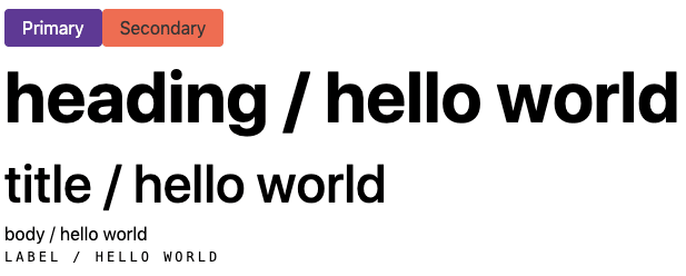
Render variants of buttons in pages/index.js. First of them is primary (as a default value for a variant prop), and in the second one, we passed ‘secondary’ to variant prop.
import Button from "../components/button"

const Index = () => (
  <>
    <Button>Primary</Button>
    <Button variant="secondary">Secondary</Button>
  </>
 )

export default Index
The result is:
Variants can also be used to create type styles.
Let’s create groups of texts using reference to other values defined in the theme or adding new styles.
{
  ...,
  text: {
    heading: {
      fontFamily: "base",
      fontWeight: "bold",
      lineHeight: "medium",
      fontSize: ["lg", "xl"],
    },
    title: {
      fontFamily: "base",
      fontWeight: "medium",
      lineHeight: "medium",
      fontSize: ["md", "lg"],
    },
    body: {
      fontFamily: "base",
      fontWeight: "normal",
      lineHeight: "normal",
      fontSize: "sm",
    },
    label: {
      fontFamily: "secondary",
      fontWeight: "normal",
      lineHeight: "normal",
      fontSize: "xs",
      letterSpacing: "wide",
      textTransform: "uppercase",
    },
  },
}
Create Text component in text.js:
/** @jsx jsx */
import { jsx } from "theme-ui"

const Text = ({ variant = "heading", ...props }) => (
  <p
    {...props}
    sx={{
      m: 0,
      variant: `text.${variant}`,
    }}
  />
)

export default Text
And render variants of them in pages/index.js:
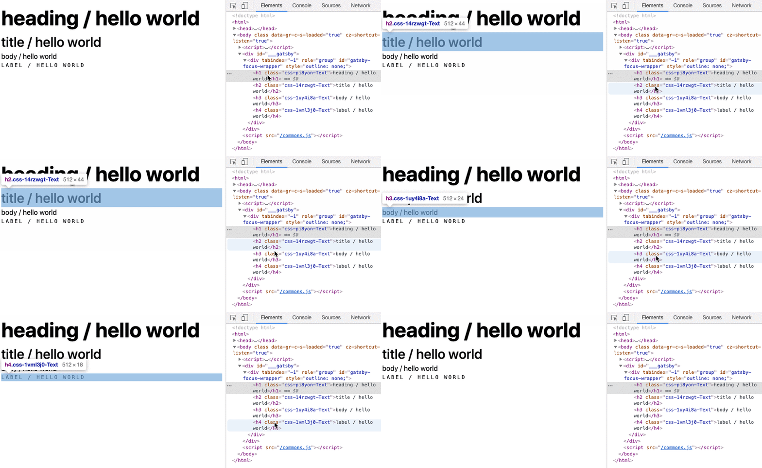
The result is:
Styled component
The typography looks pretty well but it’s not SEO-friendly. All the Text components are paragraphs and sometimes we would like to have the possibility to transform them into headings.
Let's make our typography more flexible.
There are two ways to render UI with any tag and both of them are really similar.
The second way is using Styled component. Import Styled and change static ‘p’ tag to Styled.p component in your text.js:
/** @jsx jsx */
import { jsx, Styled } from "theme-ui"

const Text = ({ variant = "heading", ...props }) => (
  <Styled.p
    {...props}
    sx={{
      m: 0,
      variant: `text.${variant}`,
    }}
  />
)

export default Text
The following examples in pages/index.js render <p> that are styled like headings elements.
<p>The following examples in pages/index.js render <code><p></code> that are styled like headings elements.</p>
It’s a great solution in which we can also use from styles defined in theme.styles object (in this example it could be in theme.styles.p.
The minus is that not all HTML elements are available with the dot notation syntax. For a full list of keys available, see the Theme Specification docs.
The second option is styled.
styled is a way to create React components that have styles attached to them. It’s available from @emotion/styled.
Install @emotion/styled package to enable creating Styled components.
yarn add @emotion/styled
Import styled and create your styled component. You can write some CSS styles inside:
/** @jsx jsx */
import { jsx } from "theme-ui"

import styled from "@emotion/styled"

const StyledText = styled.p`
  margin: 0;
`

const Text = ({ variant = "heading", ...props }) => (
  <StyledText
    {...props}
    sx={{
      variant: `text.${variant}`,
    }}
  />
)

export default Text
As in ‘Styled’ way, the Text components will be rendered with the appropriate tags defined in ‘as’ prop.
You can change an HTML component as you want. This can also be used to style components like Link which can be internal or external links.
For example, you can create a simple ‘anchor’ styled component to external links and change them to the Gatsby Link component (to match internal links) when you will need it.
<Link as={Link} to="about" variant="label">
  heading / hello world
</Link>
Conclusion
Theme UI includes a lot of features that can help you build your site. It can be used to extend existing Gatsby themes or styling MDX content without the need to add global CSS to your site.
It supports to create a user-configurable dark mode or any number of other color modes. You can style your page without creating components or use pre-build UI components (like layouts, grid, buttons, form, etc.) from optional package @theme-ui/components.
I really recommend looking into Theme UI documentation to get to know more about this wonderful tool.


