 Pascal Thormeier
HTML5 and modern JavaScript make a lot of things a lot easier than they used to be back in the days. Complex things don't require a lot of hacks anymore, many things come out of the box.
There's a lot of off-the-shelf WYSIWYG (What You See Is What You Get, a.k.a. "rich text") editors, like CKEditor. They offer a ton of features and several guides, features and plugins for all kinds of frameworks, but their code bases are usually huuuge. I mean, the CKEditor 5 repository has around 2000 JS files totalling in around 300k lines of code - mind-boggling, isn't it?
And probably unnecessary: Most use cases don't require a PDF or even a Word export, real-time collaboration, maths and chemistry integration, revisions, automatic creation of bibliographies, or a full-blown Excel clone. When you only want some basic text editing - why not build your own WYSIWYG editor once?
In this post, I will explain how to create your own WYSIWYG markdown editor for Vue!
Getting started
This editor will use markdown: It's a simple syntax, can be styled however I want and is a lot safer to persist and output again than plain HTML.
First, I need a few packages. Namely @ts-stack/markdown and turndown. @ts-stack/markdown to display markdown as HTML and turndown to transfer HTML back into markdown.
Next, I create a basic Vue component that supports v-model and call it WysiwygEditor.vue. I can already use a <div> here with the attribute contenteditable. I also add some Tailwind styling to make it look nice.
<!-- WysiwygEditor.vue -->
<template>
  <div>
    <div
      @input="onInput"
      v-html="innerValue"
      contenteditable="true"
      class="wysiwyg-output outline-none border-2 p-4 rounded-lg border-gray-300 focus:border-green-300"
    />
  </div>
</template>

<script>
export default {
  name: 'WysiwygEditor',

  props: ['value'],

  data() {
    return {
      innerValue: this.value
    }
  },

  methods: {
    onInput(event) {
      this.$emit('input', event.target.innerHTML)
    }
  }
}
</script>
This component can now be used like this:
<!-- Some other component -->
<template>
  <!-- ... -->
  <wysiwyg-editor v-model="someText" />
  <!-- ... -->
</template>
<!-- ... -->
This would look like this:

The div now basically behaves like a textarea with a tiny difference: It produces HTML.
Putting the "rich" into "rich text"
You probably know the buttons to make text bold, italic or underlined and to add lists, headings, etc. from programs like Google Docs or Word. Let's add those next. For this I installed fontawesome icons and add the buttons right above the textarea-div. But first: Some styling:
.button {
  @apply border-2;
  @apply border-gray-300;
  @apply rounded-lg;
  @apply px-3 py-1;
  @apply mb-3 mr-3;
}
.button:hover {
  @apply border-green-300;
}
I will already add the click listeners and implement the methods used a bit later on.
<!-- WysiwygEditor.vue -->
<template>
  <!-- ... -->
    <div class="flex flex-wrap">
      <button @click="applyBold" class="button">
        <font-awesome-icon :icon="['fas', 'bold']" />
      </button>
      <button @click="applyItalic" class="button">
        <font-awesome-icon :icon="['fas', 'italic']" />
      </button>
      <button @click="applyHeading" class="button">
        <font-awesome-icon :icon="['fas', 'heading']" />
      </button>
      <button @click="applyUl" class="button">
        <font-awesome-icon :icon="['fas', 'list-ul']" />
      </button>
      <button @click="applyOl" class="button">
        <font-awesome-icon :icon="['fas', 'list-ol']" />
      </button>
      <button @click="undo" class="button">
        <font-awesome-icon :icon="['fas', 'undo']" />
      </button>
      <button @click="redo" class="button">
        <font-awesome-icon :icon="['fas', 'redo']" />
      </button>
    </div>
  <!-- ... -->
</template>
<!-- ... -->
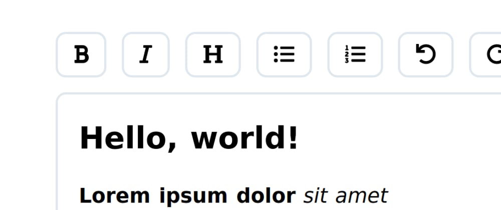
The editor now looks like this:

Amazing. Now I need to add actual functionality to this thing. For this I will use document.execCommand, which is more or less made for creating WYSIWYG editors. Even though MDN states that this feature is deprecated, most browser still offer some support for it, so for the most basic functions, it should still work out.
Let's implement the applyBold method:
methods: {
  // ...

  applyBold() {
    document.execCommand('bold')
  },

  // ...
}
Ok, that's pretty straight forward. Now the rest:
  // ...

  applyItalic() {
    document.execCommand('italic')
  },
  applyHeading() {
    document.execCommand('formatBlock', false, '<h1>')
  },
  applyUl() {
    document.execCommand('insertUnorderedList')
  },
  applyOl() {
    document.execCommand('insertOrderedList')
  },
  undo() {
    document.execCommand('undo')
  },
  redo() {
    document.execCommand('redo')
  }

  // ...
The only method popping out here is applyHeading, because I explicitly need to specify here which element I want. With these commands in place, I can continue to style the output a bit:
.wysiwyg-output h1 {
  @apply text-2xl;
  @apply font-bold;
  @apply pb-4;
}
.wysiwyg-output p {
  @apply pb-4;
}
.wysiwyg-output p {
  @apply pb-4;
}
.wysiwyg-output ul {
  @apply ml-6;
  @apply list-disc;
}
.wysiwyg-output ol {
  @apply ml-6;
  @apply list-decimal;
}
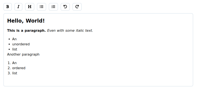
The finished editor (with some example content looks like this:
To make things behave a little nicer, I also need to set an empty paragraph as default for empty content and make the default "line break" be a paragraph, too:
  // ...
  data() {
    return {
      innerValue: this.value || '<p><br></p>'
    }
  },

  mounted() {
    document.execCommand('defaultParagraphSeparator', false, 'p')
  },
  // ...
Adding in the markdown
So, I want to put markdown into the editor and get markdown out of it. I start by defining some markdown string to see what happens:
# Hello, world!

**Lorem ipsum dolor** _sit amet_

* Some
* Unordered
* List


1. Some
1. Ordered
1. List

Yup, nothing happens. Remember the @ts-stack/markdown lib I installed earlier? Let's use it:
import { Marked } from '@ts-stack/markdown'

export default {
  name: 'WysiwygEditor',

  props: ['value'],

  data() {
    return {
      innerValue: Marked.parse(this.value) || '<p><br></p>'
    }
  },

// ...
And now the input will be rendered as HTML:

Awesome! Now in order to get markdown out of the component, I use turndown:
import TurndownService from 'turndown'

export default {

// ...

  methods: {
    onInput(event) {
      const turndown = new TurndownService({
        emDelimiter: '_',
        linkStyle: 'inlined',
        headingStyle: 'atx'
      })

      this.$emit('input', turndown.turndown(event.target.innerHTML))
    },
// ...
Let's see if it works by outputting the markdown we receive in a preformatted div:
<!-- Some other component -->
<template>
  <!-- ... -->
  <wysiwyg-editor v-model="someText" />

  <pre class="p-4 bg-gray-300 mt-12">{{ someText }}</pre>
  <!-- ... -->
</template>
Awesome! Done! Let's put this thing to the test:


Seems to be working!
For reference, here's the entire component:
<template>
  <div>
    <div class="flex flex-wrap">
      <button @click="applyBold" class="button">
        <font-awesome-icon :icon="['fas', 'bold']" />
      </button>
      <button @click="applyItalic" class="button">
        <font-awesome-icon :icon="['fas', 'italic']" />
      </button>
      <button @click="applyHeading" class="button">
        <font-awesome-icon :icon="['fas', 'heading']" />
      </button>
      <button @click="applyUl" class="button">
        <font-awesome-icon :icon="['fas', 'list-ul']" />
      </button>
      <button @click="applyOl" class="button">
        <font-awesome-icon :icon="['fas', 'list-ol']" />
      </button>
      <button @click="undo" class="button">
        <font-awesome-icon :icon="['fas', 'undo']" />
      </button>
      <button @click="redo" class="button">
        <font-awesome-icon :icon="['fas', 'redo']" />
      </button>
    </div>

    <div
      @input="onInput"
      v-html="innerValue"
      contenteditable="true"
      class="wysiwyg-output outline-none border-2 p-4 rounded-lg border-gray-300 focus:border-green-300"
    />
  </div>
</template>

<script>
import { Marked } from '@ts-stack/markdown'
import TurndownService from 'turndown'

export default {
  name: 'WysiwygEditor',

  props: ['value'],

  data() {
    return {
      innerValue: Marked.parse(this.value) || '<p><br></p>'
    }
  },

  mounted() {
    document.execCommand('defaultParagraphSeparator', false, 'p')
  },

  methods: {
    onInput(event) {
      const turndown = new TurndownService({
        emDelimiter: '_',
        linkStyle: 'inlined',
        headingStyle: 'atx'
      })
      this.$emit('input', turndown.turndown(event.target.innerHTML))
    },
    applyBold() {
      document.execCommand('bold')
    },
    applyItalic() {
      document.execCommand('italic')
    },
    applyHeading() {
      document.execCommand('formatBlock', false, '<h1>')
    },
    applyUl() {
      document.execCommand('insertUnorderedList')
    },
    applyOl() {
      document.execCommand('insertOrderedList')
    },
    undo() {
      document.execCommand('undo')
    },
    redo() {
      document.execCommand('redo')
    }
  }
}
</script>
Takeaway thoughts
That was fun. A WYSIWYG editor in 87 lines of Vue is quite small. The component behaves like an input using v-model which is more added convenience. In my opinion, for a hobby project, this editor is sufficient for small cases where there's not much content.
In client projects though, I'd rather use an off-the-shelf solution, because of better maintainability, features and support. But building this thing was great learning opportunity, nevertheless!
I hope you enjoyed reading this article as much as I enjoyed writing it! If so, leave a ❤️ or a 🦄! I write tech articles in my free time and like to drink coffee every once in a while.
If you want to support my efforts, buy me a coffee ☕ or follow me on Twitter 🐦!