 Matt Angelosanto
Written by Chinedu Imoh ✏️
What is theming?
Theming is the generic name for everything that styles an application to make it look appealing, attractive, and suit your tastes or needs. It’s what makes your app beautiful, and as personal preferences differ, the specifics behind this can vary across different people.
Factors like text styles, text colors, icon styles, and more all contribute to the theme of an application. Everything that makes an application appealing to users comes from theming, and honing your knowledge of Flutter themes will go a long way toward making you a more proficient Flutter developer.
What can you use to theme an app in Flutter?
Flutter’s MaterialApp comes with a default light blue theme. You see it when you launch the default counter app: it’s plain blue and white.
However, as we highlighted earlier, there are many ways to theme an application that range from altering the look of simple text and icon style, to using styling widgets like the Container widget, TextButton, or RawMaterialButton. There is also complex switching between light and dark theme modes in an application.
All of these contribute to the overall theme of an application. This article will touch on each of these methods for theming a Flutter application.
Theming widgets and containers
In this section, we’ll discuss how to style widgets and containers in Flutter by styling a text widget and the Container widget. Flutter provides a TextStyle class that contains several properties that can modify the look and feel of the text widget.
Text("I went for a walk")
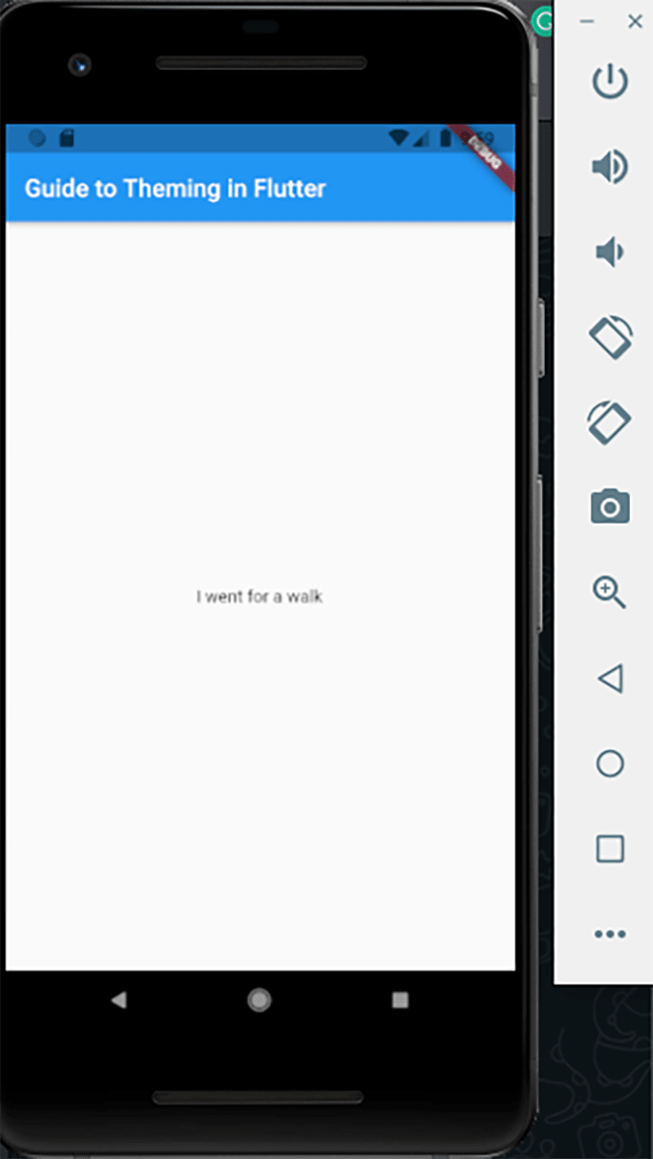
Flutter renders this text on the screen with the default color, size, structure, and weight. We can now add some styling to enhance the look and feel of the app. We’ll do that by adjusting the properties that the TextStyle class offers.
 Text("I went for a walk",
 style: TextStyle(
   color: Colors.blue,
   weight: FontWeight.bold,
   fontSize: 18,
   ),
  ),
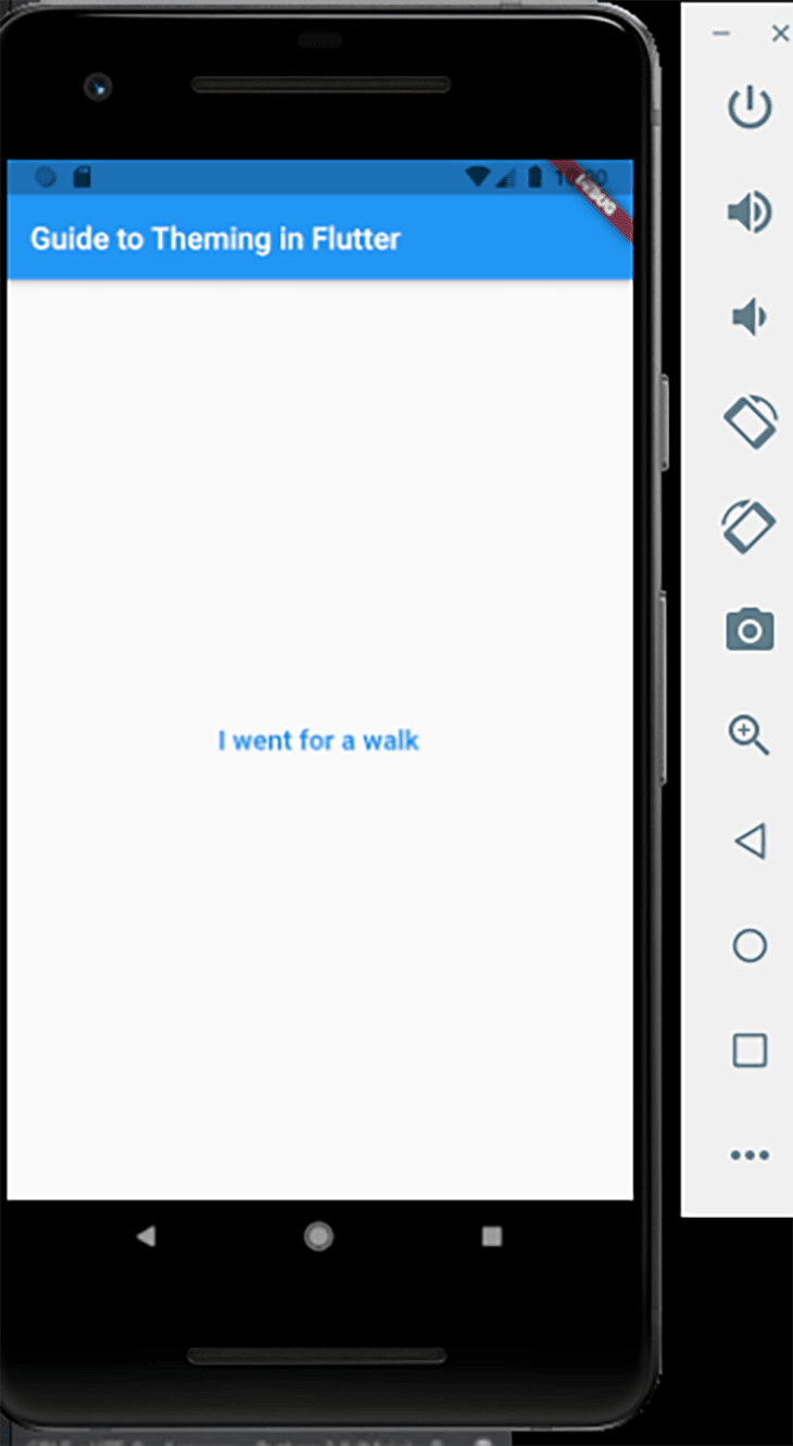
By adjusting the properties of the TextStyle class, we have changed the look and feel of the text, and added interest to the overall theme of the application.
The process for styling the Container widget is similar to what we did for TextStyle; however, we achieve styling here by adjusting the properties of the BoxDecoration class, which are then passed to the decoration parameter of the Container widget.
Container(
  height: 48,
  margin: const EdgeInsets.all(16),
  decoration: BoxDecoration(
  color: Colors.grey[300],
  borderRadius: const BorderRadius.all(
   Radius.circular(16),
  ),
  border: Border.all(
   color: Colors.blue,
   width: 2,
  ),
  ),
 );
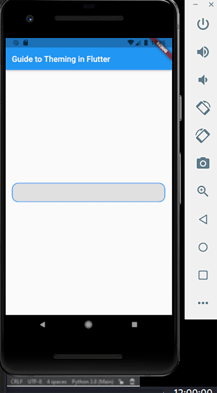
Above, we assigned the container a color (grey) and gave it a blue border by adjusting the borderColor property. That gives us a blue line that is 2px in width around the container itself.
Another styling choice we made in the code block above is altering the border radius; we gave it a circular border radius of 16px. That provides the container with an excellent rounded shape at the edges instead of the flat edges that comes with the default container.
Lastly, we gave the entire container a margin of 16px, which leaves a space of 16px on each side of the container.
Using the Material ThemeData class
Both of the previous scenarios we've discussed — the TextStyle class and the Container widget — deal with the styling of a single component for that particular screen, and do not affect the styling of other TextStyle classes or Container widgets.
Now, suppose we desire to share a specific theme — including the color, brightness, weight, icon styles, and text styles — across our entire app. We can achieve that using the ThemeData class, which provides us with many features to meet our tastes.
Consider the code block below.
MaterialApp(
 title: 'Guide to Theming in Flutter',
 theme: ThemeData(
 brightness: Brightness.dark,
 primaryColor: Colors.lightBlue[800],
 accentColor: Colors.cyan[600],
 fontFamily: 'Georgia',
 textTheme: TextTheme(
  headline1: TextStyle(fontSize: 50, fontWeight: FontWeight.bold),
  headline6: TextStyle(fontSize: 30.0, fontStyle: FontStyle.italic),
  bodyText2: TextStyle(fontSize: 18.0, fontFamily: 'Hind'),
 ),
 ),
 home: MyHomePage(),
);
The ThemeData class provides properties we can modify to adjust the theme of our application. The brightness property deals with the theme’s overall brightness and affects the text colors in the app, as text color becomes black with Brightness.light and white with Brightness.dark.
The primaryColor property affects the background color for significant parts of the app, including toolbars, tab bars, and app bars.
The accentColor property affects the foreground color for widgets, and also refers to the secondary color. The font family, as well as the different categories for the textTheme, have all been modified, as seen in the code block above.
Flutter assigns values to each of the headline and bodyText categories by default, but each of them can be adjusted to fit our taste in design.
To specifically use any of the declared themes in any part of the app, we simply have to call the one we want, as shown below.
Container(
 color: Theme.of(context).accentColor,
 child: Text(
 'Theming in Flutter',
 style: Theme.of(context).textTheme.headline6,
 ),
),
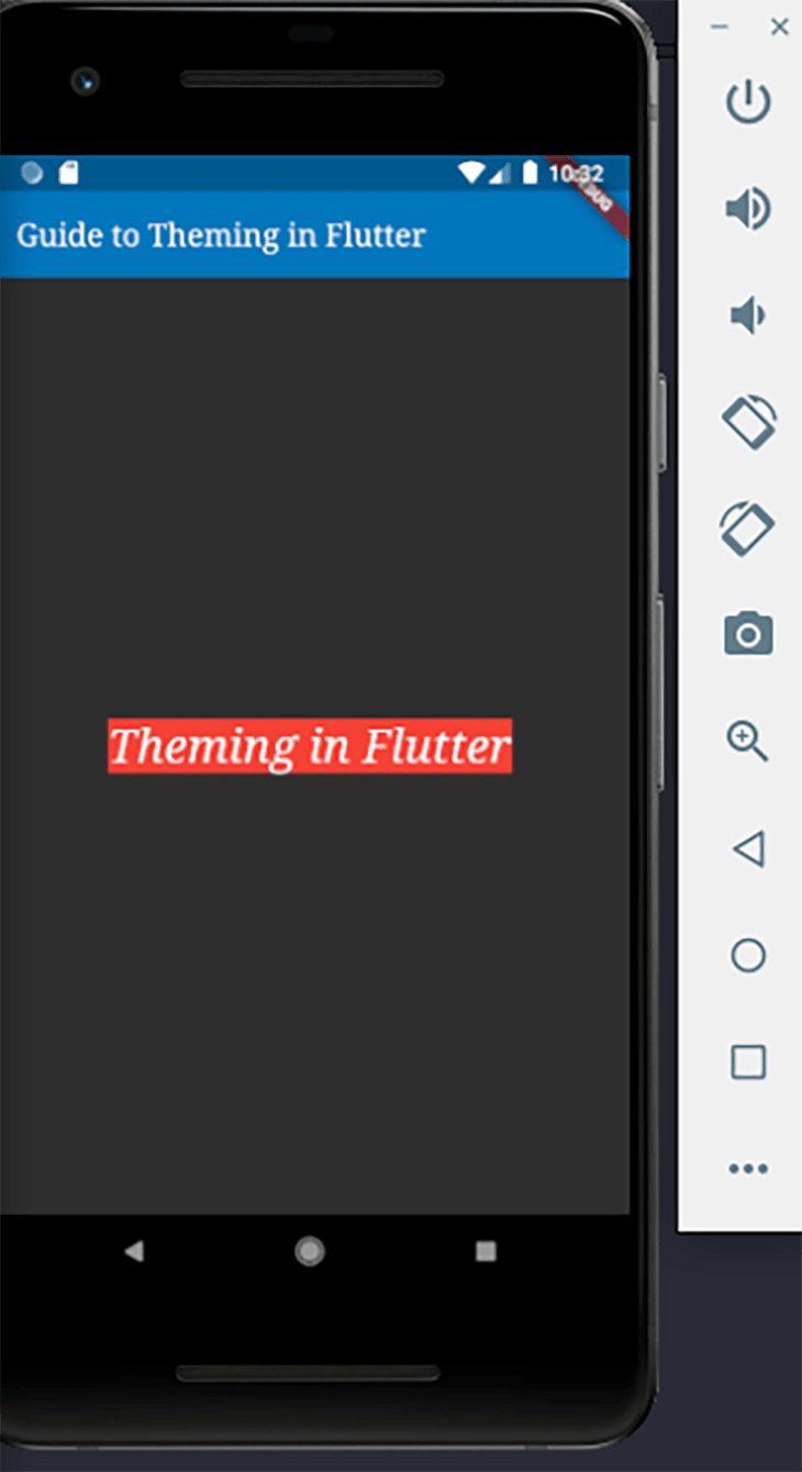
Above, we style the text with the declared headline6 values, meaning the font size will be 36 and the font style will be italics. This method for styling is pretty handy and reduces the number of lines of code that will repeat across the app if we were to style each of them individually.
Light and dark theme modes
The last type of theming we’ll discuss is the implementation of light and dark theme modes for Flutter apps. Dark theme modes are commonly used in applications to save energy for battery life and reduce stress to the eyes in low-light physical settings.
In this tutorial, we’ll make use of the adaptive_theme package to facilitate this. This package provides many excellent out-of-the-box functionalities to ensure the smooth setting and transitioning of different theme modes. It also gets the most current theme used every time the app restarts.
In addition to adaptive_theme, we’ll also make use of the Riverpod package.
Start by adding the code below under the dependencies block in the pubspec.yaml file.
dependencies:
 adaptive_theme: ^2.2.0
 flutter_riverpod: ^0.14.0+3
Run the flutter pub get command in the terminal. This command will get both packages downloaded and ready to use in your codebase.
flutter pub get
Head over to the main.dart file and import the adaptive_theme and Riverpod packages.
import 'package:adaptive_theme/adaptive_theme.dart';
import 'package:flutter/material.dart';
import 'package:flutter_riverpod/flutter_riverpod.dart';
Create a variable named savedThemeMode to access the user’s most recently used mode at the restart of the application. Make the main block asynchronous and await the getThemeMode function that the adaptive_theme package provides.
The next thing to do is wrap the entire app in a ProviderScope class to access the providers used in the app.
Future<void> main() async {
 WidgetsFlutterBinding.ensureInitialized();
 final savedThemeMode = await AdaptiveTheme.getThemeMode();
 runApp(ProviderScope(child: MyApp(savedThemeMode: savedThemeMode)));
}
Create a variable to receive the savedThemeMode from the main block above. Wrap the entire MaterialApp with an adaptive_theme class, which gives us access to its properties so that we can customize the light and dark theme modes for the application.
class MyApp extends StatelessWidget {
 final AdaptiveThemeMode? savedThemeMode;
 // ignore: use_key_in_widget_constructors
 const MyApp({this.savedThemeMode});
 @override
 Widget build(BuildContext context) {
 return AdaptiveTheme(
  light: ThemeData(
  brightness: Brightness.light,
  primaryColor: Colors.green,
  scaffoldBackgroundColor: Colors.white,
  ),
  dark: ThemeData(
  brightness: Brightness.dark,
  primaryColor: Colors.red,
  scaffoldBackgroundColor: Colors.black,
  iconTheme: const IconThemeData(
   color: Colors.black,
  ),
  ),
We pass ThemeData to the light property for the adaptive_theme class, into which we put all the variables we wish to customize. We then customize the brightness, primaryColor, and scaffoldBackgroundColor. The same thing gets done to the dark property. We modify the properties inside the ThemeData class and pass them to the property provided by adaptive_theme.
Next is the initial property we pass in the savedThemeMode, and if peradventure is null (e.g., if the app is newly installed), it defaults to the light theme mode. Then, lastly, we pass the MaterialApp class to the builder function and pass the declared themes to its properties.
 initial: savedThemeMode ?? AdaptiveThemeMode.light,
  builder: (theme, dark) {
  return MaterialApp(
  title: 'Article Light/Dark Theme',
  theme: theme,
  darkTheme: dark,
  home: const HomePage(),
  );
  },
 );
 }
}
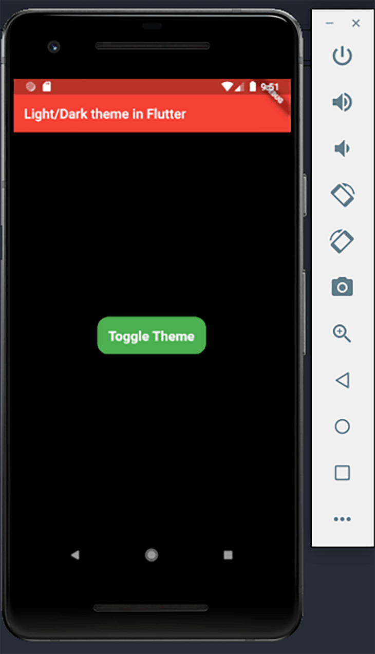
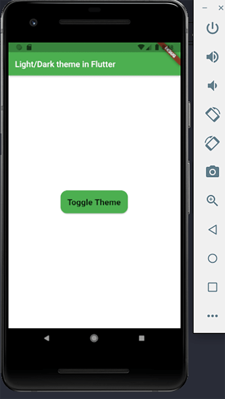
To switch between the light and dark theme modes, we will use a RawMaterialButton and pass in the toggleMode function of the adaptive_theme to its onPressed property. This button allows the user to switches between the two modes by clicking or tapping the button.
class HomePage extends StatelessWidget {
 const HomePage({Key? key}) : super(key: key);
 @override
 Widget build(BuildContext context) {
 return Scaffold(
  appBar: AppBar(
  title: const Text('Light/Dark theme in Flutter'),
  ),
  body: Column(
  mainAxisAlignment: MainAxisAlignment.center,
  children: [
   Center(
   child: RawMaterialButton(
    child: const Text(
    'Switch Modes',
    style: TextStyle(
     fontSize: 20,
     fontWeight: FontWeight.bold,
    ),
    ),
    onPressed: () {
    AdaptiveTheme.of(context).toggleThemeMode();
    },
    fillColor: Colors.green,
    padding: const EdgeInsets.all(16),
    shape: RoundedRectangleBorder(
    borderRadius: BorderRadius.circular(16),
    ),
   ),
   ),
  ],
  ),
 );
 }
}
Finally, the images below show the light and dark theme modes as they’ll appear when toggled.
Conclusion
Customizing various properties to create your desired theme can be pretty exciting, especially as it makes the app relate to your taste in design. With what you've learned so far, you can now style individual classes, the Container widget, and even give your app custom light and dark theme modes.
LogRocket: Full visibility into your web apps

LogRocket is a frontend application monitoring solution that lets you replay problems as if they happened in your own browser. Instead of guessing why errors happen, or asking users for screenshots and log dumps, LogRocket lets you replay the session to quickly understand what went wrong. It works perfectly with any app, regardless of framework, and has plugins to log additional context from Redux, Vuex, and ngrx/store.
In addition to logging Redux actions and state, LogRocket records console logs, JavaScript errors, stacktraces, network requests/responses with headers + bodies, browser metadata, and custom logs. It also instruments the DOM to record the HTML and CSS on the page, recreating pixel-perfect videos of even the most complex single-page apps.