
 Matt Angelosanto
Written by Matthew Croak ✏️
When it comes to building an application, having effective data visualization engages the user by making data easy to read and understand.
In this post, we’ll cover how to implement data visualization in React Native using Victory.
What is Victory?
Victory is a data visualization library for React. It contains various component-based data visualization tools that are interactive, opinionated, and also fully overridable. It is robust and relatively simple to implement with both a React and React Native application.
This post assumes you have a working knowledge of React Native. If you do not, here's how to get started.
Creating a Victory chart in React Native
Now, let’s create your first chart! First, initialize a React Native project.
npx react-native init VictoryRN
Next, we can install victory-native.
npm install victory-native
You should also install react-native-svg in order to link the native dependencies of React Native SVG to the iOS and Android projects:
react-native install react-native-svg
Now that you’ve initialized your React Native app and installed your dependencies, let’s start adding some charts. First, let’s import some victory-native modules that we’ll be using with the following code:
import { VictoryBar, VictoryChart, VictoryTheme } from "victory-native";
We’ll need some dummy data to feed to our chart. This data is represented by an array of objects.
const data = [
 { year: '2011', earnings: 13000 },
 { year: '2012', earnings: 16500 },
 { year: '2013', earnings: 14250 },
 { year: '2014', earnings: 19000 }
];
Finally, let’s add our first Victory chart component, like so:
<VictoryChart width={350} theme={VictoryTheme.material}>
 <VictoryBar data={data} x="quarter" y="earnings" />
</VictoryChart>
On the website, it says that VictoryChart is a wrapper component that renders a given set of children on a set of cartesian or polar axes. VictoryBar is a bar chart component provided by Victory. After adding the above code, our app should look like this:
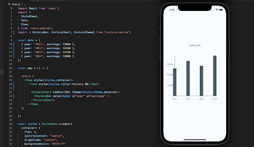
Viola, your first Victory chart! Now that we have the basic chart implementation down, let’s experiment with dynamic charting. We want our chart to be able to update in real-time as the data updates. We can also add radio buttons to change the chart type being used.
Making Victory charts dynamic in React Native
One of the great things about Victory charts is how they can work dynamically with updated state values. “They can respond to state changes and animate to show any new data. Unlike other libraries such as D3.js, it does not need direct control of the DOM,” says Matt Crouch.
This is important because with React, interacting directly with the DOM is an anti-pattern. Deciding whether React or your third-party library should update the charts can get a bit fuzzy.
Now, let’s see this dynamism in action! First, let’s move our data into our component’s state using React Hooks and store it as chartData.
const [chartData, setData] = useState(data)
Next, let’s add a button that, when clicked, adds another data object to our chartData.
const addData = () => {
 var d = [...chartData]
 var obj = {year: `${maxYear}`, earnings: Math.random() * (20000 - 10000) + 10000}
 d.push(obj)
 setData(d)
 maxYear++
}
In this function, we’re creating a new object to be added to chartData, the year is maxYear, a global variable that is the year after the most recently used one. For earnings, I’m generating a random number between 10,000 and 20,000 by utilizing Math.random().
Once we have our object constructed, we can add it to d (the variable used so we don’t mutate chartData directly) and then set that as our new chartData. The last thing we need to do is increment maxYear by one. Now we can apply our new function to a React Native Button component. See below.
<Button onPress={addData} title="Add Earnings"/>
To tidy up, we can include another button that resets our chart to its original state. onPress will call our reset function, which simply resets chartData to data and maxYear back to 2015.
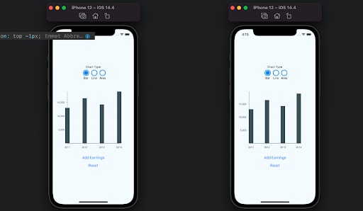
Now that our app dynamically adds data to the chart, let’s take it a step further and allow the user to change the type of chart that is used to visualize the available data. For this, we can store the value for our chart type in our component state.
const [chart, setChart] = useState(0)
We can now install react-native-simple-radio-button, then add the provided component from that library, RadioForm.
<RadioForm
 radio_props={radio_props}
 formHorizontal={true}
 labelHorizontal={false}
 buttonColor={'#2196f3'}
 onPress={(value) => setChart(value)}
/>
Our radio_props is an array of objects. Each object has a label and a value that will correspond to the radio buttons in our RadioForm component.
const radio_props = [
 {label: 'Bar', value: 0},
 {label: 'Line', value: 1},
 {label: 'Area', value: 2}
]
Now that we can change our chart type, we can choose from the different imported chart types depending on what is selected.
<VictoryChart width={350}>
 {chart === 0
   ? <VictoryBar data={chartData} x="year" y="earnings" />
   : null
 }
 {chart === 1
   ? <VictoryLine data={chartData} x="year" y="earnings" />
   : null
 }
 {chart === 2
   ? <VictoryArea data={chartData} x="year" y="earnings" />
   : null
 }
</VictoryChart>
Let’s see what our app looks like now that we’ve added some new functionality.

Perfect! Now we have a dynamic app with multiple visualization options. This works fine, but the conditional rendering is a bit repetitive. Let’s try to refine this.
DRY conditional rendering
The above conditional rendering is not very DRY (Don’t Repeat Yourself). I found that the best solution is to initialize a variable and then conditionally decide which chart is applied to our variable before the return statement.
var MyChart = <VictoryBar data={chartData} x="year" y="earnings" alignment="start"/>

if (chart === 1){
  MyChart =  <VictoryLine data={chartData} x="year" y="earnings" />
} else if (chart === 2){
  MyChart = <VictoryArea data={chartData} x="year" y="earnings" />
}
Once we have our chart change logic down, let’s see how it looks with our chart wrapper, VictoryChart.
<VictoryChart width={350} domainPadding={10}>
         {MyChart}
 </VictoryChart>
Perfect. One prop to note for VictoryChart is domainPadding. It’s simple, but I found it to be important because without setting it equal to 10, the bars were not placed correctly. Notice the first example below is without domainPadding, and the second example has a domainPadding of 10.
Now let’s look at the data prop. In our example, our data objects are rather simple, but if you want to get more out of them, you can add more key/value pairs to the data objects.
{ x: 1, y: 1, label: "first", symbol: "star", opacity: 0.5, fill: "blue" }
Here we have our x and y properties pointing to a number instead of a string. The charts can render the x and y values literally (as is the case above), or they can find values based on specified keys (like in our example, which uses earnings and year).
This is good for custom data because we don’t have to transform key-value pairs to adhere to the literal x and y interpretation. All we have to do is specify which keys correspond to the x- and y-axes, which can be declared on the conditionally rendered chart component.
You can also include styles and symbols for the data objects. However, in the latest version of Victory, these styles are not automatically applied, so you need to add a style prop to your chart, which is an object that renders style functionally.
See below.
style={{
    data: {
      fill: ({ datum }) => datum.fill,
      opacity: ({ datum }) => datum.opacity
    }
  }}
It’s important to note that with charts that render the data as one dataset (such as VictoryArea and VictoryLine), datum is not a valid prop. Instead, you’d write the styles like so.
style={{ data: { fill: "#c43a31" } }}
If you want to better customize colors and use a gradient for your VictoryArea as opposed to one color, you can use a few components provided by react-native-svg.
import {Defs, LinearGradient, Stop} from "react-native-svg";
Defs will be our rapper. This component is “used to embed definitions that can be reused inside an SVG image”. LinearGradient is nested inside a Defs component and is used to generate the actual LinearGradient rendered in the app. Within LinearGradient, we will have multiple Stop components. A <stop> element “defines a color and its position to use on a gradient.”
Below is our code to incorporate the linear gradient for our VictoryArea chart. It will be placed just above {MyChart} inside VictoryChart.
<Defs>
   <LinearGradient id="gradientStroke" >
     <Stop offset="0%" stopColor="red"/>
     <Stop offset="25%" stopColor="orange"/>
     <Stop offset="50%" stopColor="gold"/>
     <Stop offset="75%" stopColor="yellow"/>
     <Stop offset="100%" stopColor="green"/>
  </LinearGradient>
</Defs>
Now, in order for this to work with our area chart, we’ll need to add something to our style prop for the VictoryArea component.
style={{
  data: {
    fill: 'url(#gradientStroke)',
    ...
  }
}}
url(#gradientStroke) is what connects the fill style for our area chart to the various color stops defined in our LinearGradient component (with the ID gradientStroke). Here is what our VictoryArea chart will look like when we implement the current linear-gradient UI.
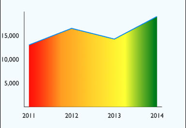
Right now, the gradient doesn’t correspond to our specific categories. It will simply render the colors as parts of the entire graph at 25% increments. If you want it to pick a color and respond to the size of each category (like if you add more data dynamically), you can use the below code, along with a predefined list of colors.
const genStops = () => {
    var percentage = 100 / chartData.length
    //initialize at 0%
    var stops = [<Stop offset="0%" stopColor={colorArray[0]}/>]
    chartData.forEach((x, i)=>{
      console.log(pickColor(i))
      var stop = <Stop offset={`${percentage * (i + 1)}%`}
                       stopColor={pickColor(i)}
                 />
      stops.push(stop)
    })
    return stops
  }

  const pickColor = (i) => {
    var index = indexHelper(i, colorArray.length)
    return colorArray[index]
  }

  const indexHelper = (a, b) => {
    //start from beginning of color array when chartData gets too long
    return a >= b ? indexHelper(a - b, b) : a
  }

  const stops = genStops()
Then inside your LinearGradient component, instead of including the individual Stop components, you can just include {stops}. Now the colors of your gradient chart correspond to the categories and are not hardcoded and applied to the chart as a whole.
The last feature I’d like to cover is animation. This is the prop you can pass to your charts to control the animation style in which they will be rendered (as opposed to just having them render immediately).
In order to add animation to your chart, the animate prop is a great place to start. This prop is an object that accepts a few properties, of which we’ll be using duration, easing, and onLoad.
Duration refers to how long (ms) the animation takes, easing is the animation style, and onLoad is an object that can also specify animate properties. These props are applied to data that is loaded or updated.
animate={{
  onLoad: {duration: 1000},
  duration: 1000,
  easing: "bounce"
}}
You can apply the animate prop to either VictoryChart or the child charts. Personally, I found there were issues when transitioning between chart types when I applied the animations to VictoryChart, whereas if I added them to the child charts directly, I had no issues. See the chart below with the animate properties.

For more on animations, check out the animations guide for Victory charts.
Conclusion
Victory is a robust and effective data visualization library that isn’t too rigid in its composition. It’s opinionated but also offers enough flexibility so that developers get more out of the charts beyond the built-in functionality.
Victory is also advantageous because it doesn’t directly interact with the DOM like some other libraries. This allows for better runtime, less UI conflict, and is optimal for React Native.
All of the source code for this project can be found on GitHub.
LogRocket: Full visibility into your web apps

LogRocket is a frontend application monitoring solution that lets you replay problems as if they happened in your own browser. Instead of guessing why errors happen, or asking users for screenshots and log dumps, LogRocket lets you replay the session to quickly understand what went wrong. It works perfectly with any app, regardless of framework, and has plugins to log additional context from Redux, Vuex, and ngrx/store.
In addition to logging Redux actions and state, LogRocket records console logs, JavaScript errors, stacktraces, network requests/responses with headers + bodies, browser metadata, and custom logs. It also instruments the DOM to record the HTML and CSS on the page, recreating pixel-perfect videos of even the most complex single-page apps.


